Yuko Shimazu Yuko Shimazu Yuko Shimizu

Award winning Japanese illustrator based in New York City and instructor at School of Visual Arts.

Visualizing Nightmares

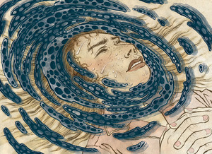
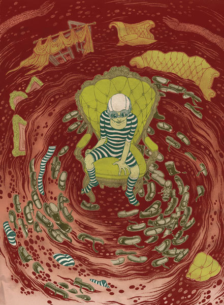
Bostonia Magazine (August 2009): Colored Version
Drawing nightmares is tricky.It is easy to draw a nightmare you had last night, but when it comes to drawing the bigger ‘idea’ of nightmares, all of a sudden, it is not that visual.
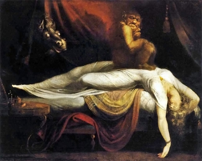
Besides, there is this iconic nightmare painting already exist by the master of the genre: Fuselli (please see below).

When Ronn Campisi, an AD who works with multiple publications around Boston area, called me for an assignment on this topic for Bostonia Magazine (alumni magazine of Boston University), it was a bit of struggle at first.

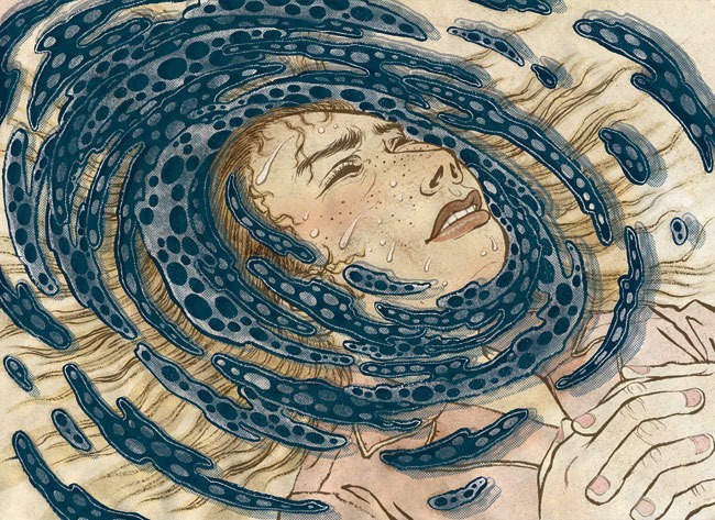
After getting rid of really cliché ideas that initially came and went in my head, I settled with two rather simple ideas of drawing the gloominess of the experience of nightmares rather than trying to illustrate too literary.  And, I tried to stay away from Fuselli imagery as much as possible.

We were pretty happy with the final result. This illustration got accepted into this year’s Communicaton Arts illustration annual, which was a nice surprise at the end.  Thank you Ronn and CA!

Bostonia Magazine (August 2009): Fuselli
The ultimate icon of nightmare images by Fuselli
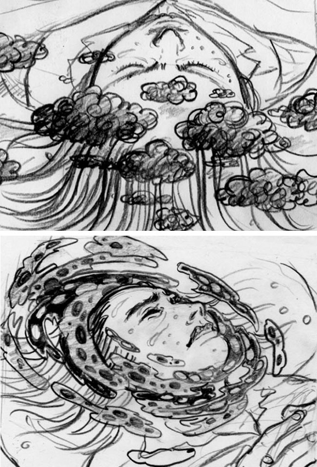
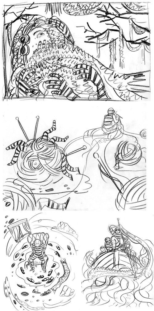
Bostonia Magazine (August 2009): Sketches
Two sketches. I could have done either one of them, but the bottom one probably had a better composition.
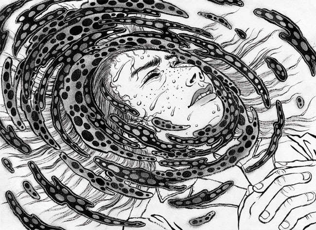
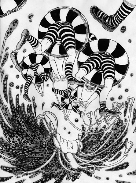
Bostonia Magazine (August 2009): Watercolor
Drawing as it was scanned in. Black india ink on watercolor paper.
Bostonia Magazine (August 2009): Swirl
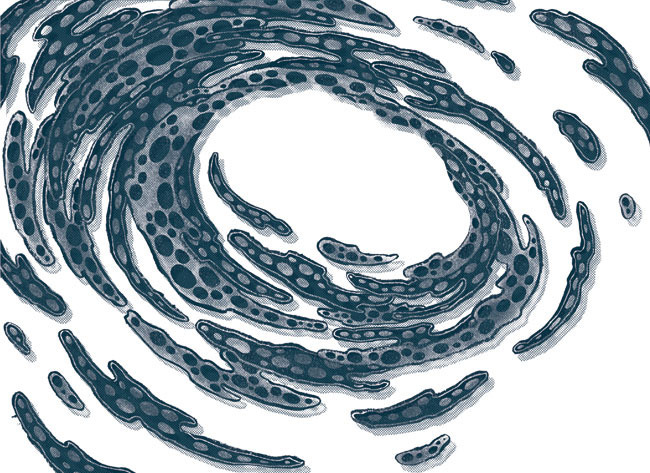
Then using Photoshop I tediously cut out the swirl part to pop it up more from the rest of the drawing.
Bostonia Magazine (August 2009): Final Artwork
This is the final colored version.
Bostonia Magazine (August 2009): Spread
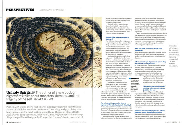
Bostonia Magazine page layout. Ronn did an amazing job, and the illustration got accepted into this year’s Communication Arts illustration annual. Thank you Ronn!

Reality Check!

Plan Adviser (August 2009): Illustration
“Reality check: things are not looking so great when you wake up.”This was the line I received from AD SooJin Buzelli to come up with this illustration for PLANADVISER Magazine.

What I love about working with SooJin (as all the fellow Drawgers know) is that she knows the illustrators do our best job when we have the biggest freedom.

Well, to be honest, I thought maybe this idea was a bit too out-there, but she didn’t seem to mind it!

By the way, side track… I am still learning how to be a better blogger… I have only posted one (ONE!) post last month.. I am trying to be better at posting from now on…

Plan Adviser (August 2009): Sketches
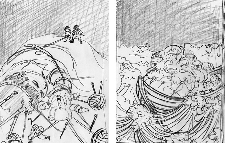
Two sketches submitted. I really didn’t mind working on either one. The other one may have been fun too.
Plan Adviser (August 2009): India Ink With Japanese Calligraphy Brush On Watercolor Paper
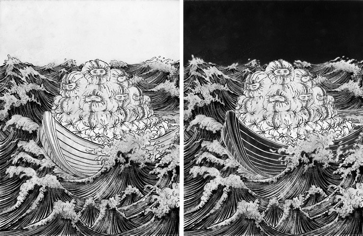
Next is the drawing stage. India ink with Japanese calligraphy brush on watercolor paper. Original image size is about 17″ x 22″. Yes, I draw quite large… The left is the original drawing as it was scanned in. The right is after the basic Photoshop value tweak before proceeding to the actual coloring stage, which is a time consuming process, but necessary to make the colors work well in the final.
Plan Adviser (August 2009): Revision
SooJin only asks revisions if it is absolutely necessary. The very small, but very effective revision she wanted was to drop the blue color of the ocean into the kid’s eyes, so they pop more. Totally worked. Thank you SooJin.
Plan Adviser (August 2009): Final Submission
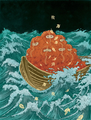
Final illustration. I added the golden leaves for compositional purposes, and also to enhance the concept.
Plan Adviser (August 2009): Cover
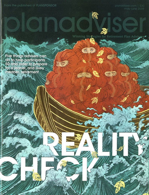
Final cover. I love how the type is doing hide-and-seek in between the waves.
Plan Adviser (August 2009): Spread
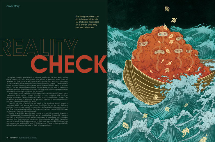
Interior spread layout.

You Look Great In It!

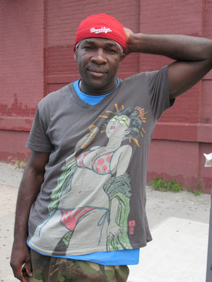
Gap (PRODUCT) RED: Brookyln Boxer John Douglas
OK, so I have to be absolutely honest. I do NOT wear t-shirts. They look horrible on me. Over the years, many t-shirt design gigs came and went without fruitful results. It probably has something to do with my t-shirt illiteracy.But that does not mean I don’t like t-shirts on other people. In fact, they look great on almost everyone, well, other than me.

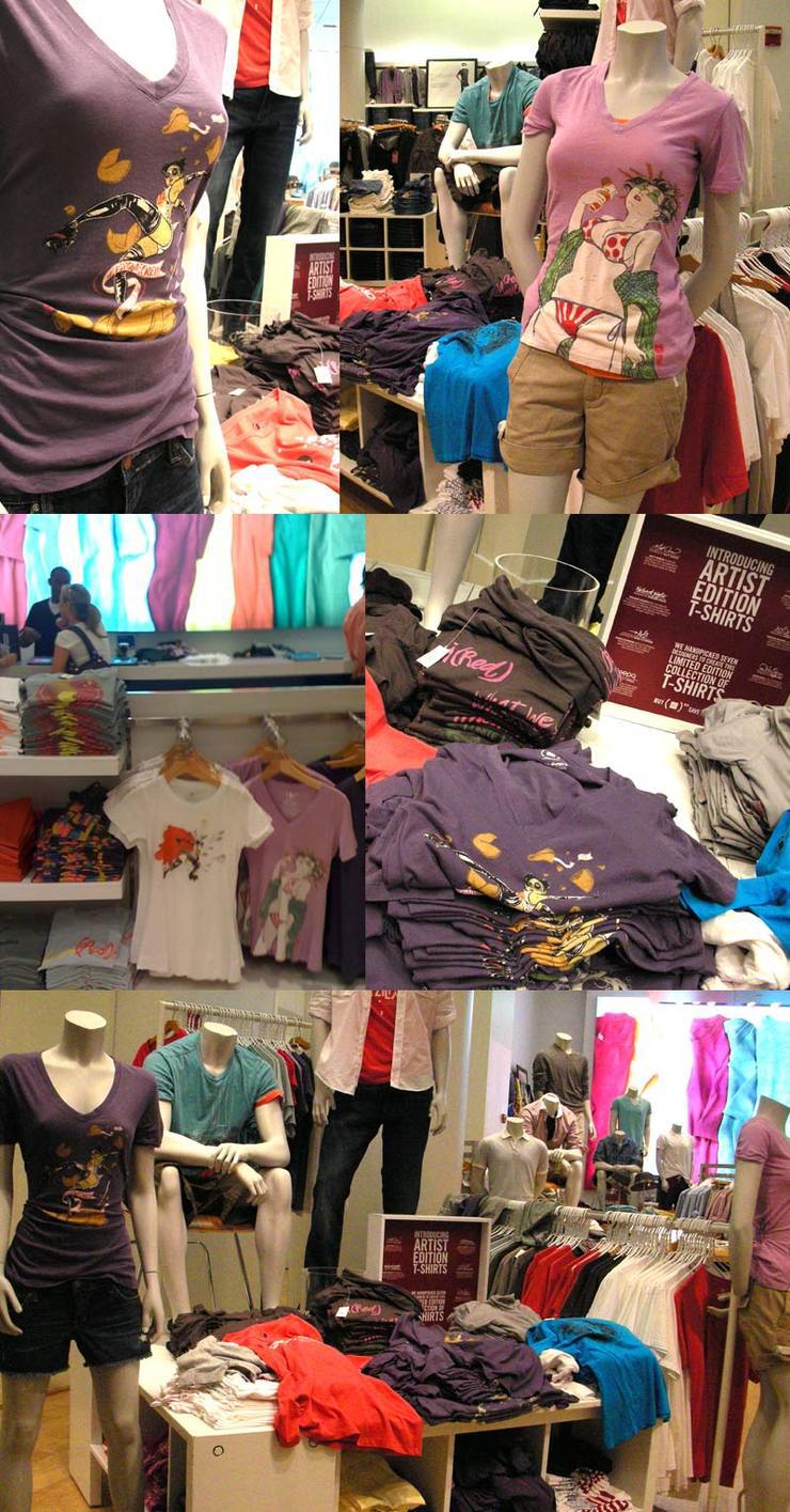
The Gap (PRODUCT) RED was patient enough to work with such a person like me to come out with my first (I hope it is not going to be the last!) four designs this season.

I cannot explain my excitement seeing people looking great in them, especially knowing that the proceeds will help women and children affected by AIDS in Africa.

Thank you, thank you and thank you, for those who bought, and those great design and technical team at The Gap  who transformed my digital files into awesome shirts.

Brooklyn-based boxer John Douglas posing cool in The Gap shirt.
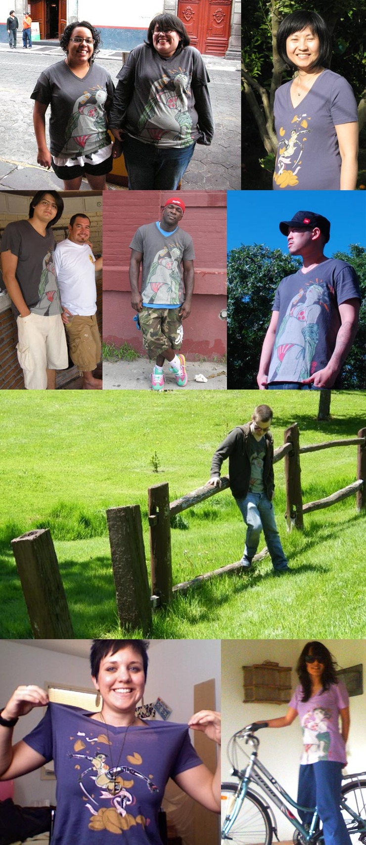
Gap (PRODUCT) RED: Different People Trying Shirts
Top row from left: Yausi Mora and Emilia Casana in Puebla, Mexico, Yuki Ikezi from Santa Clara, California. second row: Juan Carlos Vazquez Padilla in Acapulco, Mexico, John Douglas in Brooklyn, NY, Jack Tse in New York. third row: Michael Thorner from Toronto, Canada. Bottom row: Sam Gorrie in Las Vegas, Nevada, Aida Aguilera Rocha from Xalapa, Mexico.
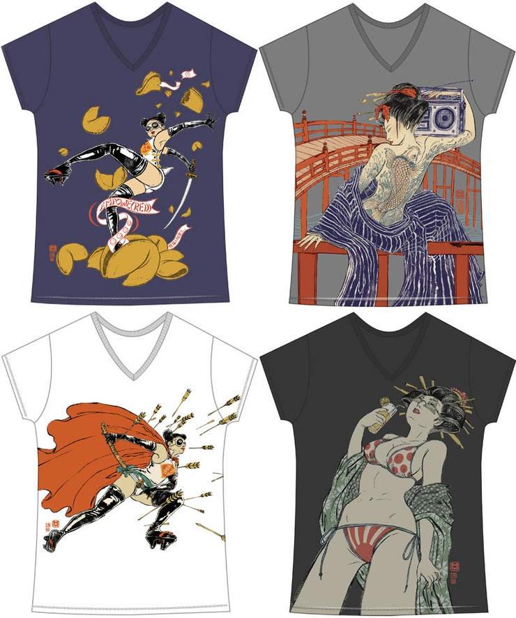
Gap (PRODUCT) RED: Shirt Collection
There are four designs in total. All of them in women’s sizes and right two are also available in men’s sizes. Top left was original image created for this project, and the other three are pre-existing images adjusted for the shirts.
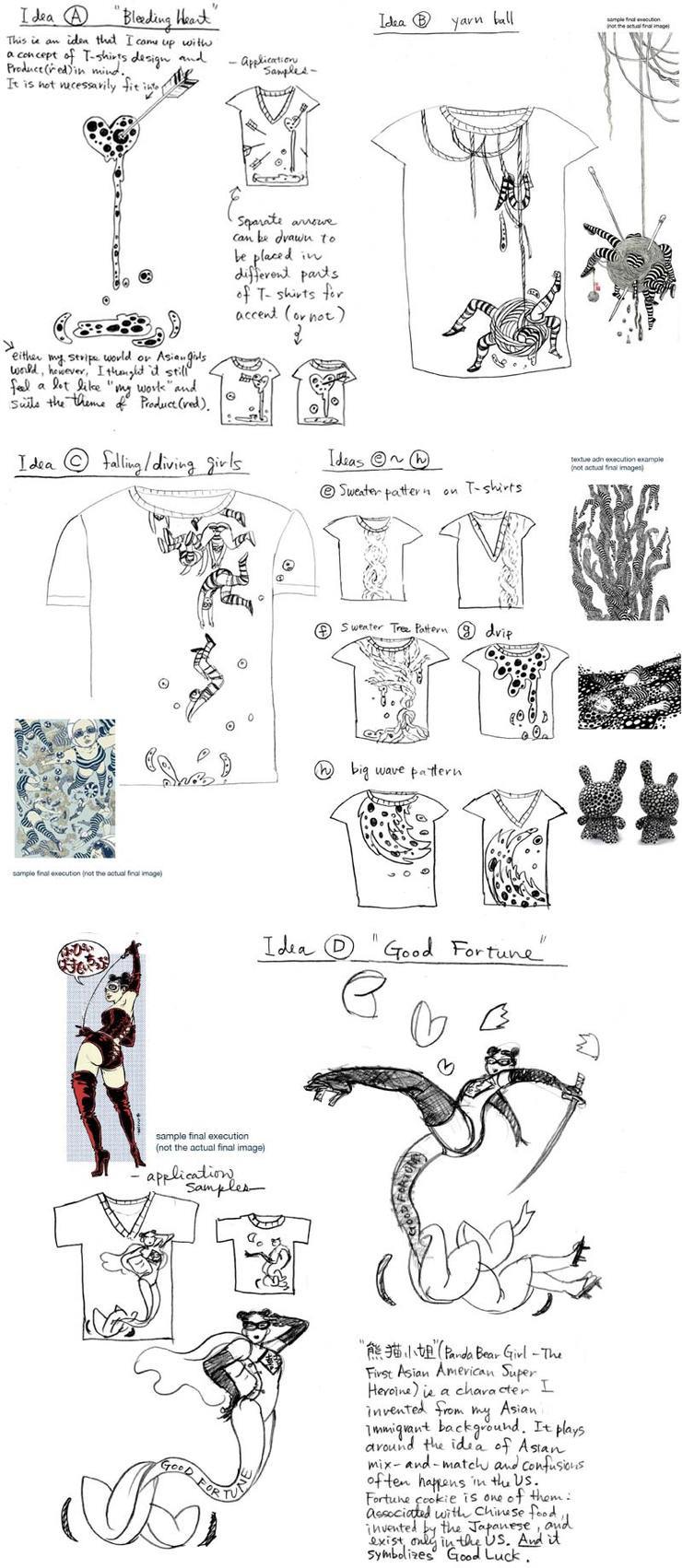
Gap (PRODUCT) RED: Sketches
There is only one shirt that was created originally for the project (fortune cookie). Yes. But that does not mean I didn’t squeeze my t-shirt-dummy-brain to come up with various ideas. In fact, I think some of them are not at all bad although they were not made into the production.Anyone interested in realizing them into final products? Well, contact me and let me know. We can discuss!

Read more about (PRODUCT) RED, how it helps Africa, and to purchase shirts here.

Gap (PRODUCT) RED: Store
I have to say, it is a different kind of excitement I feel when I see my work on wearable objects and displayed in stores like this!!

Drawing For Comic Books

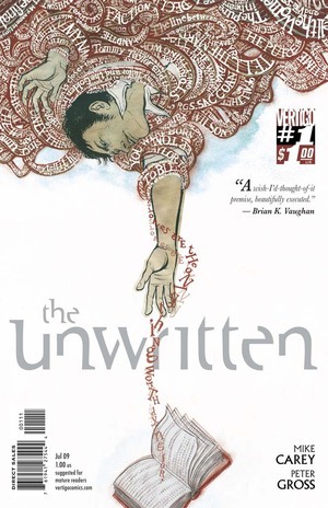
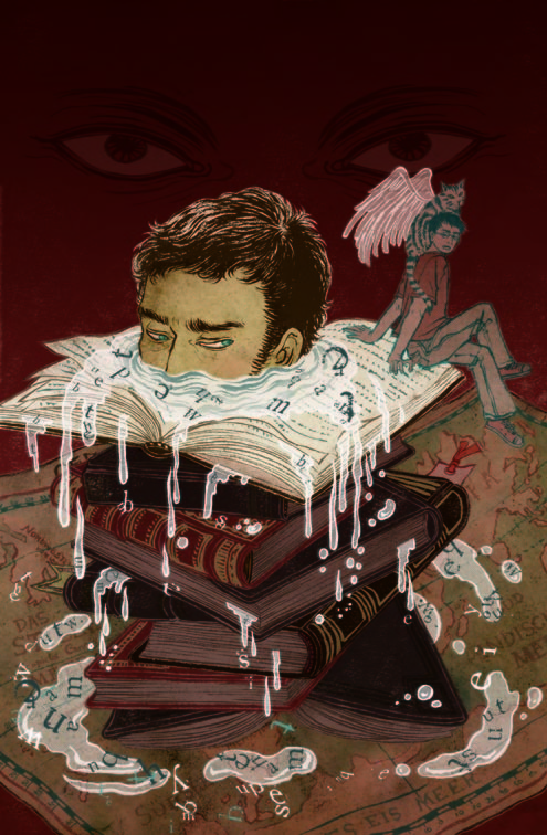
The Unwritten (June 2009): Main Cover
I dreamed of becoming a comic artist when I was child. Just like any other Japanese kid growing up in economic growth of 1960s and 70s.  It was the first golden age of manga and anime: Astro Boy, Cyborg 009, Galaxy Express 999…. When I was in college, I even drew my first (and the last) 40 page comic (note: I was a business major, not art) which made me realize I was not a story-teller and comics were probably not my calling.  I stopped reading comics and dreaming of one day creating one.About 20 years since then, I am back to comics. But completely in a new way.I love challenge. I love working on different projects and push myself to a new direction. Working on covers for new DC Vertigo series The Unwritten is a perfect way to revisit my childhood dream.

Luckily I was able to team up with the best of the best, and the nicest of the nicest (writer: Mike Carey, artist: Peter Gross, editor: Pornsak Pichetshote). Story is extremely well written, intelligent, interesting, also a really good page turner. I just heard that the first issue completely sold out in just ten days after initial release. Wow!

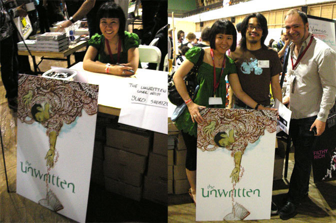
PS: If anyone is interested, I will be at MoCCA Festival‘s DC Vertigo booth signing the covers this Saturday from 1-2PM.

The Unwritten (June 2009): Tommy
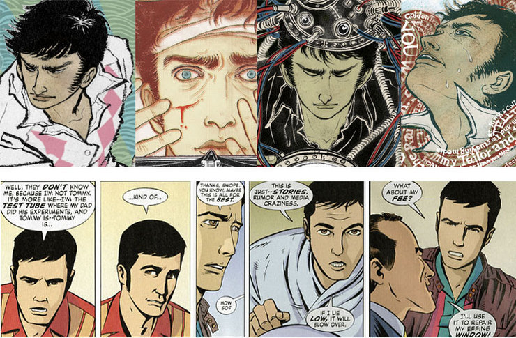
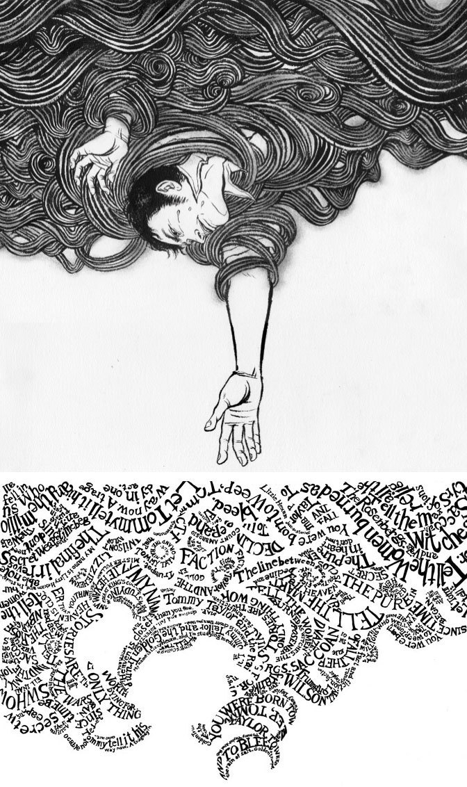
One of the challenges of being comic cover artist is to recreate and re-interpret the story and the character without too far removed from the original. Bottom row is the main character Tommy drawn by Peter. Top row is variations of Tommy drawn by me. He has long sideburns and chooses bowling shirts as everyday fashion.
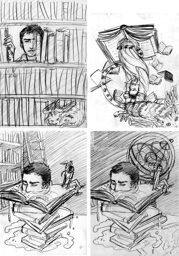
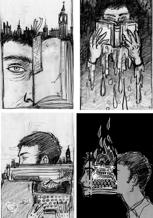
The Unwritten (June 2009): First Sketches Of Tommy
It took a while to warm up to the new series. It is always difficult on the first few issues when I am not used to the story and characters are not developed fully yet. First 4 sketches were OK, but not great…
The Unwritten (June 2009): First Cover
The first first cover. Both the editors and I were not feeling it… So we decided to ditch it and start from scratch.
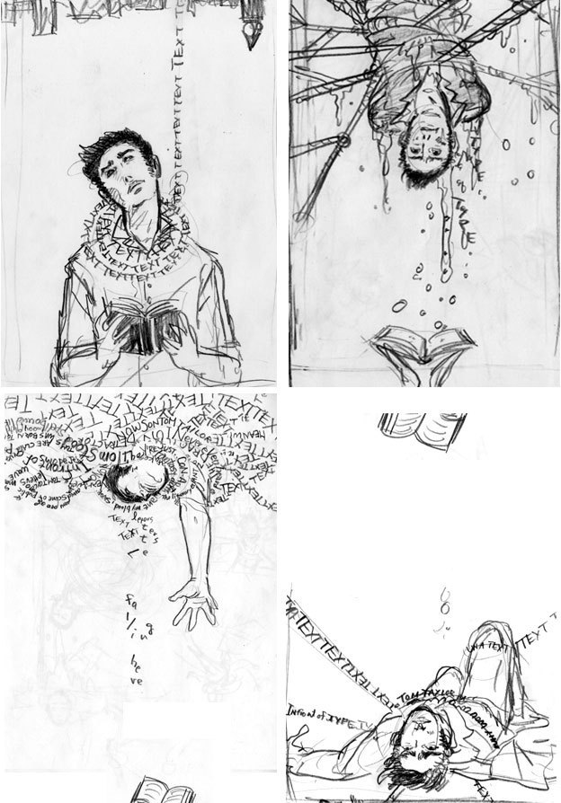
The Unwritten (June 2009): Unused Sketches
More sketches that didn’t fly… But looking back, I do like some of them a lot.
The Unwritten (June 2009): 2nd Sketches Of Tommy
Finally, everyone agreed on the bottom left one.
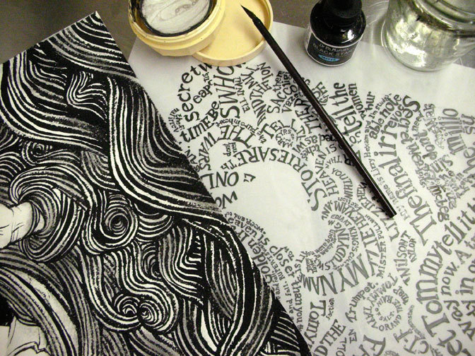
The Unwritten (June 2009): Dr. Ph. Martin's Black Star With India Ink
The first step of final illustration is to draw with india ink (Dr. Ph. Martin’s Black Star) with Japanese calligraphy brush.
The Unwritten (June 2009): Black & White Cover
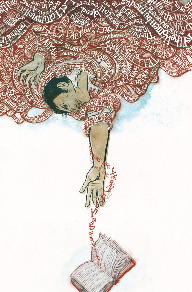
In this case, drawings were in three separate sections: main drawing, letter layer and a book. They are scanned in and put together on Adobe Photoshop.
The Unwritten (June 2009): Colored Cover
PS (June 6, 2009):
Thank you for those who stopped by to MoCCA DC Vertigo Booth today. Here are some photos. Right is with my editor Pornsak Pichetshote and long-time friend and an amazing colorist Jose Villarrubia.
The Unwritten (June 2009): Booth

Diapers, No Joke

Libero: Cover
“We want you to design diapers.” When the e-mail came in, I thought it was a joke. Or, at least a mistaken identity. Apparently, the original designer of Hello Kitty has the same name, and I often get e-mails from people who get us mixed up. After writing back politely to make this clear, they wrote back immediately and said “no”. The e-mail was intended to be sent to me. This is how I ended up designing diapers which is coming out in Sweden next week from Libero, one of the biggest baby product manufacturers in Europe.I am not a big fan for “cute and colorful things for kids” mentality. I did not grow up with lots of Sanrio characters, and children’s books I adored as a child were not what you see in bookstores now a days.

The client obviously has seen my site and know I do a lot of powerful women theme, funny sex illustrations and all the other not-so-kids-friendly stuff.

Libero: Diapers 1
Libero: Diapers 2
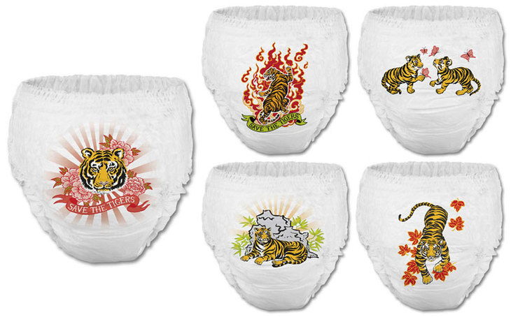
Final products. There are five designs, images on both front and back of the diapers.Libero, apparently, is known for its’ unconventional, edgy, and experimental concepts and designs. Like fashion houses, they have Spring-Summer and Fall-Winter collections where they put out limited edition products. Looking at their past designs were fun: drawing of big gold bling on the back, character designed poo and pee drawn in sweet way, things like that. OK, I can do this!

Their spring collection this year is “Save The Tigers”. Rather than having cute character of tigers, they decided to go traditional and Asian. Perfect for me.

You can see their funny commercial and other things on libero.se

Big thank you to the nicest people at ad agency Forsman & Bodenfors and filmmaker Anders Hallberg who kindly filmed “making of” video.

Libero: Tiger Sketches
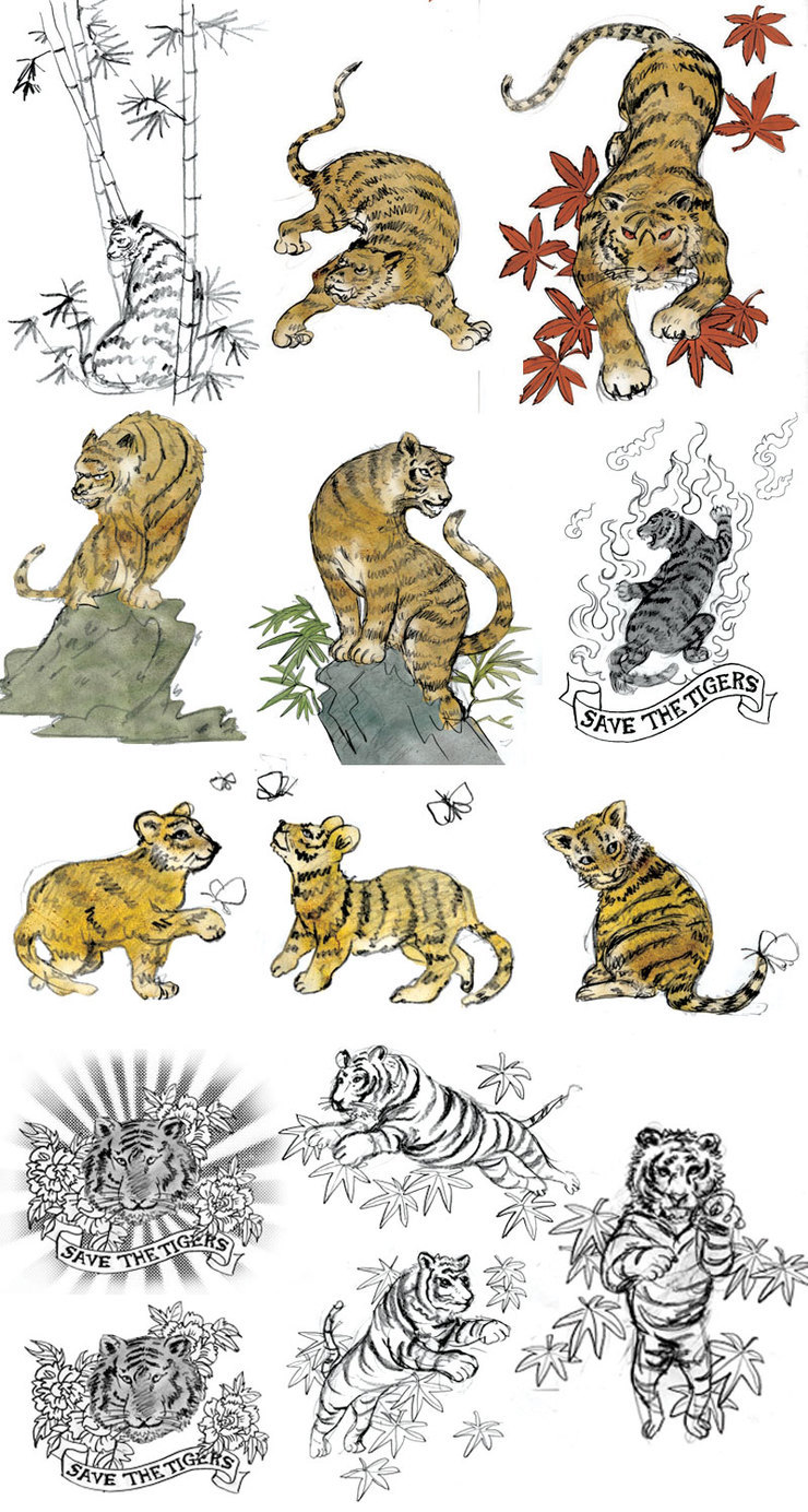
Some of the sketches. Quickly done with pencil on paper, and color was added on Photoshop.
Libero: Unused Tiger Sketches
Ha ha ha. These were killed versions. They are supposed to be Japanese maple leaves, and they do actually look that way, but of course, they didn’t want take that risk, and I understand. I changed them to more puffy red leaves.

How Unromantic!

Week In Review (April 2009)
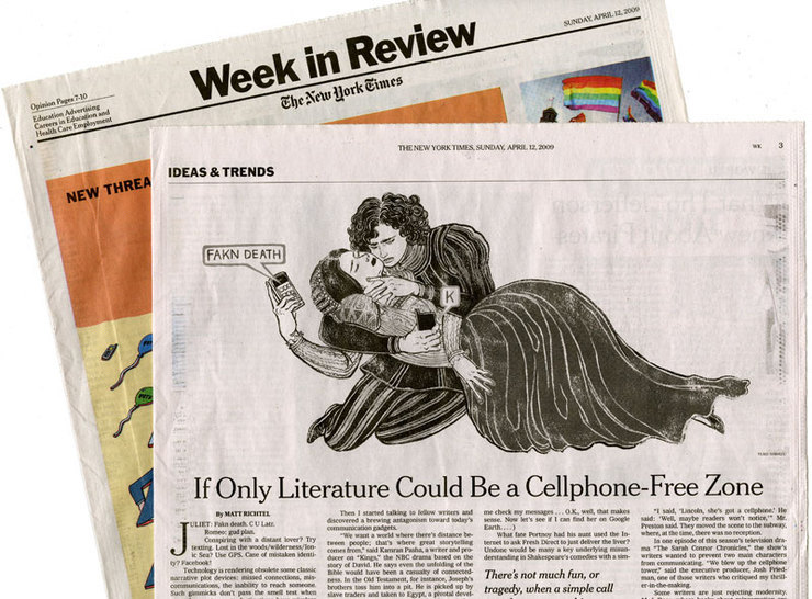
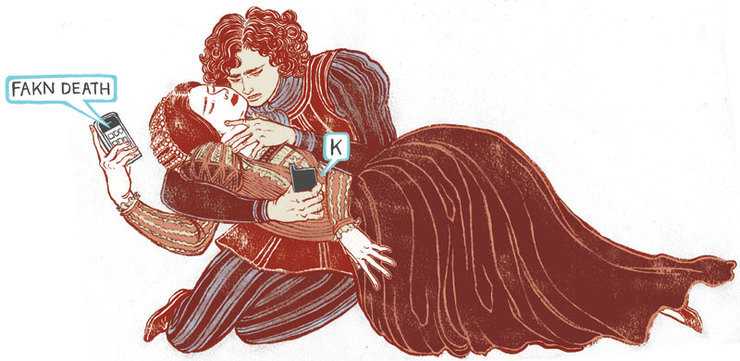
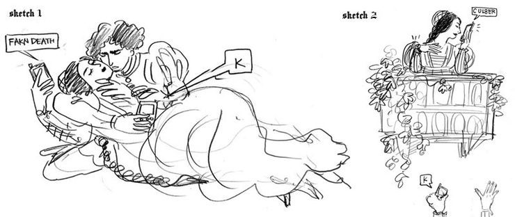
A lot of the world famous classics won’t work if there were cell phones or characters knew how to text message. Casablanca or Romeo and Juliet would have had happy endings. If Joseph had a cell phone there was no Judaism. It sounds like a joke, but these technologies forever changed how the writers would create stories.This was the article I illustrated for the last Sunday’s The New York Times Week In Review. It was a little goofy illustration. Not an epic kind of work. But I had a lot of fun.All my illustrator peers know about this, but in case the readers here are aspiring illustrators or art students, I will explain a bit how it works with a job like this.

For a newspaper illustration, we usually have less than a day from start to finish. Yap. In this particular case AD Aviva Michaelov called me the evening before it was due on Thursday for Friday end of the day deadline, but I was working on another deadline for Friday so I asked if it is OK to send the sketches on Friday AM.

Week In Review (April 2009): Sketches
I try to give at least two ideas to pick from. I actually liked the right one, because you can do so much more with layout.
Week In Review (April 2009): Olivia Hussey
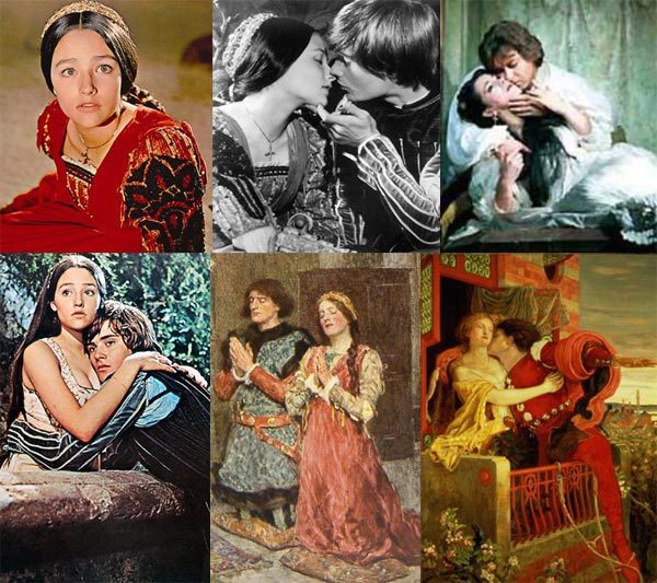
References I downloaded from internet. I used the top right for reference of the pose, and faces and costumes from that famous film (remember Olivia Hussey??), Romeo’s hair style from bottom two paintings, etc. Mix and match!After my other deadline wad done on Friday morning, I spent about 1 hour coming up with ideas. Sketches are rough, but everyone knows it has a tight deadline, so it is OK. I got an approval by early PM, worked on drawing and coloring for the rest of the afternoon. There was a minor revision, but everything was done by 7PM. There are two versions of finals: b/w to be printed in the actual paper, and color to be used on the web.
Week In Review (April 2009): Watercolor Sketch
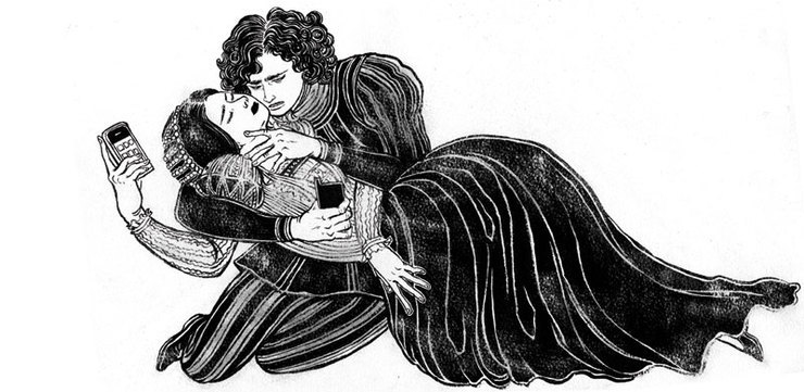
This is the original b/w drawing with ink on watercolor paper, without any computer coloring or editing.
Week In Review (April 2009): Black & White Sketch
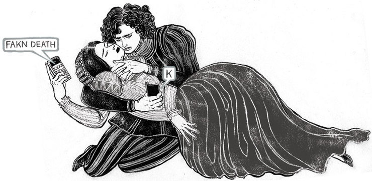
And this is the final b/w image for print. Bubbles were drawn separately and added. Also some harsh blacks were toned down so Romeo and Juliet are separated more into two figures.
Week In Review (April 2009): Color Sketch
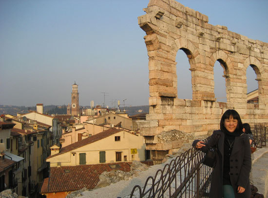
Finally the color version used only for website. We found out that the print was in b/w before I started coloring, so I made two versions. It was not too much more work, and I don’t love the way color image prints as b/w. So, it worked out for both parties.By the way, if anyone is interested, you can actually visit (what is supposed to be) Juliet’s house in Verona, Italy. Balcony was later added to make it look more authentic, but still fun to see where Juliet lived. Besides, Verona is a stunningly beautiful walled city with lots of fabulous wine bars and real Roman coliseum!
Week In Review (April 2009): Verona, Italy
This is a view of Verona from the top of the coliseum. It is not the most common tourist destinations, but it definitely worth a trip. (No, I did not go there for a research of this job. I wish.)

Mexico Bound…

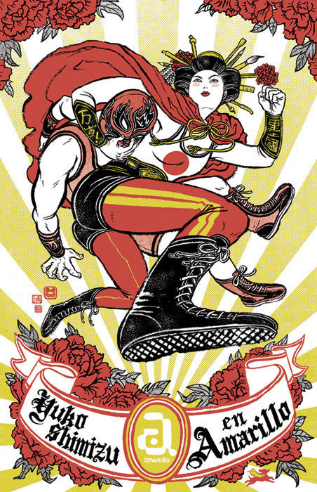
Amarillo Poster
Day light savings time has started, but it feels like there is no end to New York winter. I am flying out to Mexico tomorrow. To Xalapa, a town I have never heard of, but looked really nice on limited information I got from internet search.Amarillo Centro de Diseño, a design organization located in this town had invited me to have a talk and a show for Mexican illustrators and designers.  If anyone who is reading this happened to be near by, please come by. Here is the info.

Amarillo asked me to create a poster to announce the talk. I wanted to make “Japan meets Mexico” theme, but wanted to avoid the common stereotypes. So, no sombrero, no cactus, no pyramid, no tacos and, sorry Marcos, No Chihuahuas. At the end I decided to go with, one of my Mexican obsessions: Lucha Libre. Amarillo means yellow in Spanish, so it totally looks like that’s my figher name, or something. Let’s leave it as that.

Posters are currently being printed one by one by hands of silk-screeners of Xalapa. I am very excited.

I will be back on Monday. I will let you know how it went.

Lucha
I downloaded bunch of Lucha Libre images for references and inspirations. Yes, including Nacho Libre poster!
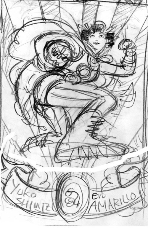
Amarillo: Very Rough Sketch
Here is the pencil rough poster idea I created before proceeding to the next step.
Amarillo: Screen Anime
If you stare at this image for about 10 seconds, you are supposed to see the three color separation process I made for the silk screeners.
Amarillo
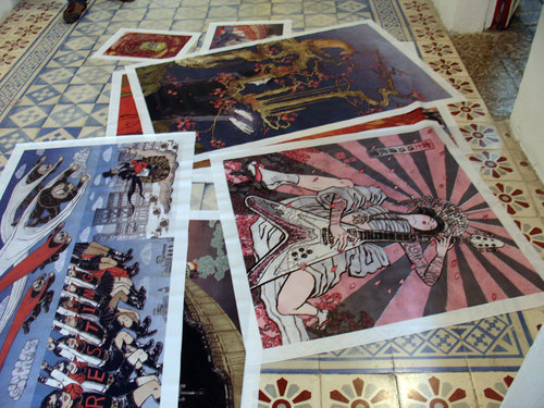
Amarillo space getting ready for the show. I get to see this space tomorrow. Beautiful tile work!

Yes, Spectrum!!!

Spectrum: Donato Giancola
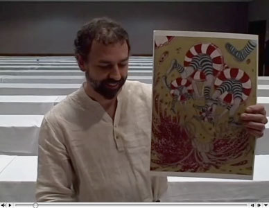
Donato Giancola announcing the award. You can watch the video on Spectrum site.I just found out I have received a silver medal from SPECTRUM 16. Yes, that SPECTRUM, where sci-fi and fantasy artists are awarded. Yeah! Is it for real????????

When you see my work, you probably don’t think about this genre, I know. But, I have to comfess, I was a huge sci-fi fantasy geek in middle school drooling over Frazetta, Boris and Jeffrey Jones, reading Moorcock and C.L. Moore. This is something I wish I can go back in time and tell the 14 year old me! Thank you thank you thank you judges.

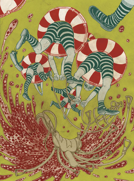
Spectrum: Image 4
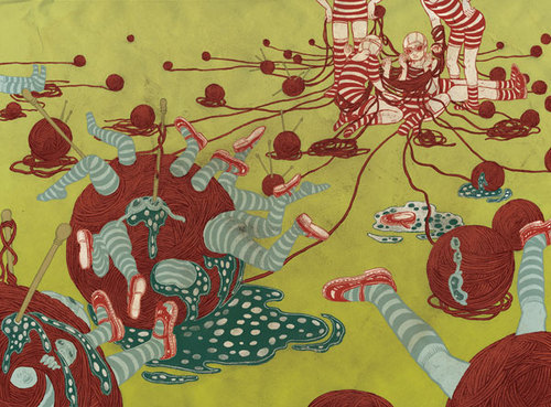
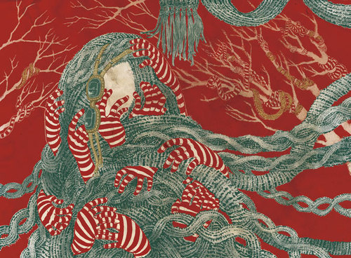
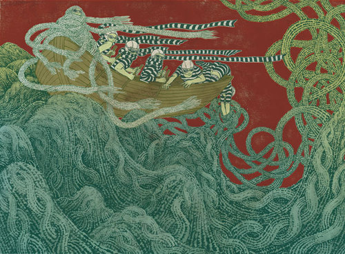
This job was done about a year ago for Microsoft’s website UltimatePC (site is now gone). Microsoft hired multiple artists; photographers, illustrators and animators to create work using PC (instead of MAC which we are more used to) to promote the high graphic performance of PC.
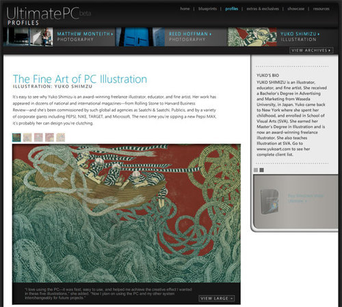
Spectrum: Ultimate PC
This is the site UltimatePC, which unfortunately is not around anymore. This site had some fun works by Photographers and animators as well.
Spectrum: PC
I was given the top of the line machine Falcon custom colored to my taste (red of course) with all the software pre-installed. Their request was to create a series of five images or more. I asked them what they were looking for. They said “your personal work”. They didn’t even bother to look at my sketches. Well, I sent some to them anyway, and all they said was “they look great”.

Under current economic crisis, this sounds unreal, like a voice from heaven. Yes, I did it myself, but it still doesn’t sound real to me. Probably one of the best jobs I have ever given. I guess, we do our best work when we are trusted and given total freedom.

Spectrum: Concept Sketch
These are the sketches I sent to my client. Now I look at them, one of them I didn’t even create at the end, and the award winning piece doesn’t even have sketches…
Spectrum: Jump (B&W)
This is the drawing before I colored it. Matt Rota helped me a lot with this process. He colored the base for the finished images as I was still working on other images.
Spectrum: Image 1
Spectrum: Image 2
Spectrum: Image 3
Spectrum: Image 5
These are other images in this series.Thank you Microsoft for this awesome project, Pamela Esposito for getting me this gig, Matt Rota for helping me with complicated coloring process.