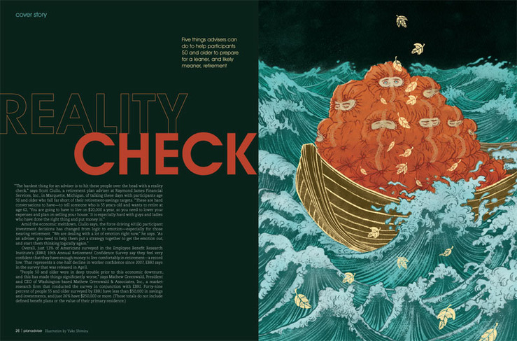
“Reality check: things are not looking so great when you wake up.”This was the line I received from AD SooJin Buzelli to come up with this illustration for PLANADVISER Magazine.
What I love about working with SooJin (as all the fellow Drawgers know) is that she knows the illustrators do our best job when we have the biggest freedom.
Well, to be honest, I thought maybe this idea was a bit too out-there, but she didn’t seem to mind it!
By the way, side track… I am still learning how to be a better blogger… I have only posted one (ONE!) post last month.. I am trying to be better at posting from now on…
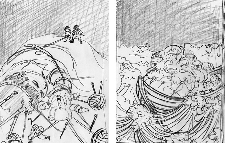
Two sketches submitted. I really didn’t mind working on either one. The other one may have been fun too.
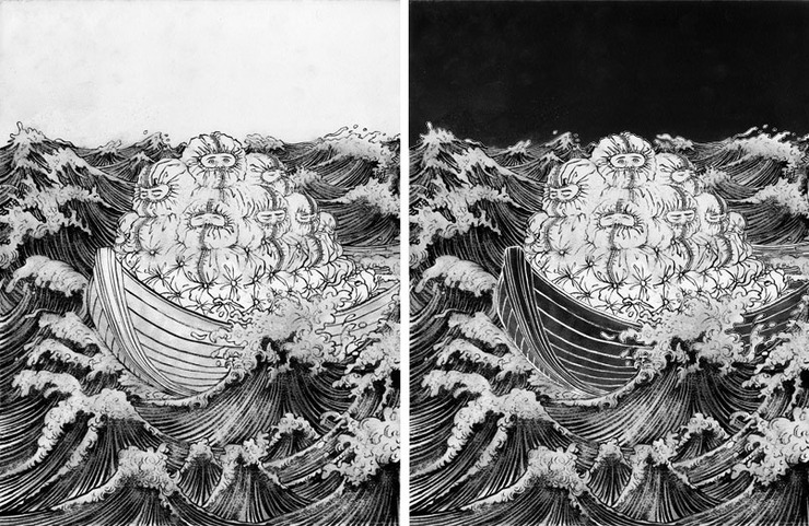
Next is the drawing stage. India ink with Japanese calligraphy brush on watercolor paper. Original image size is about 17″ x 22″. Yes, I draw quite large… The left is the original drawing as it was scanned in. The right is after the basic Photoshop value tweak before proceeding to the actual coloring stage, which is a time consuming process, but necessary to make the colors work well in the final.
SooJin only asks revisions if it is absolutely necessary. The very small, but very effective revision she wanted was to drop the blue color of the ocean into the kid’s eyes, so they pop more. Totally worked. Thank you SooJin.
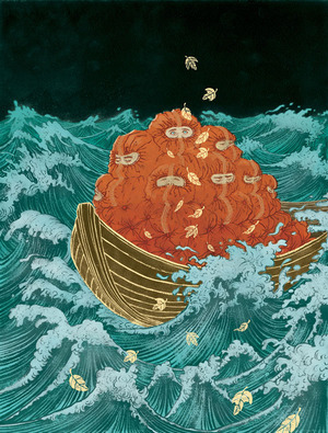
Final illustration. I added the golden leaves for compositional purposes, and also to enhance the concept.
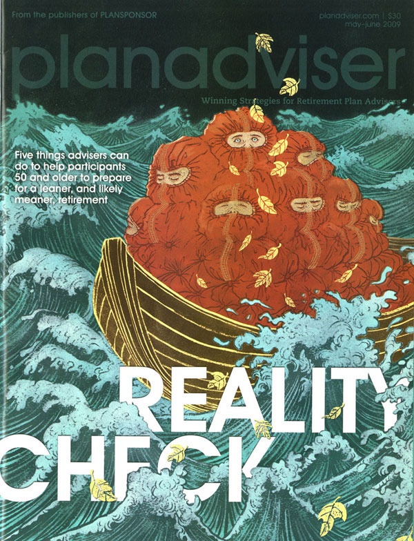
Final cover. I love how the type is doing hide-and-seek in between the waves.
Interior spread layout.


