I have to confess. I LOVE drawing small details.Like every single lines in the waves, and those textures in sweaters. And oh, drawing polka dots for hours and hours is just pure meditation I can do non stop forever.
But, it is also true that I tend to get commissioned for complicated images because of this obsession.
In reality, I am a huge graphic design fan, simple and bold posters are my favorite. But I seldom ever asked to do anything simple.
So, when Alissa Levin of Point 5 Design called me for Columbia Journalism Review cover and said “we want something very simple, bold and graphic”, I was like “YESSSSS!”
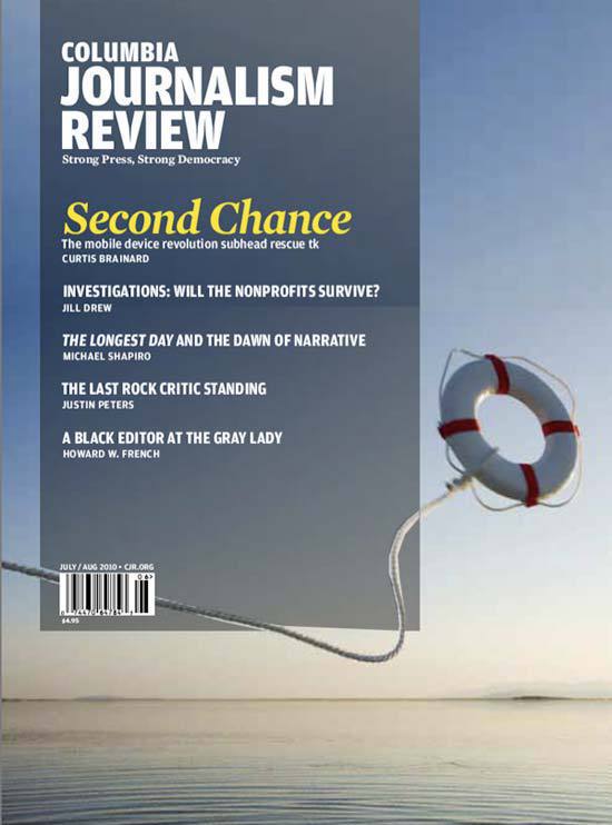
Dummy layout came from the client as a brief for this projectSome jobs come with no brief, and some comes with very detailed one. This project was the latter. The editorial and design teams had gone through long meetings to decide what they wanted to be the cover, so this job came with a detailed mock up dummy.
Type of briefs are definitely case by case, and it is not that one is better than the other. All it matters is that there is trust and good team work between the designers and illustrators.
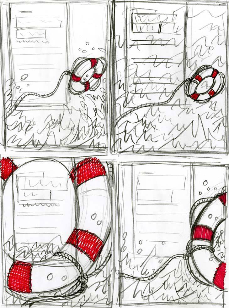
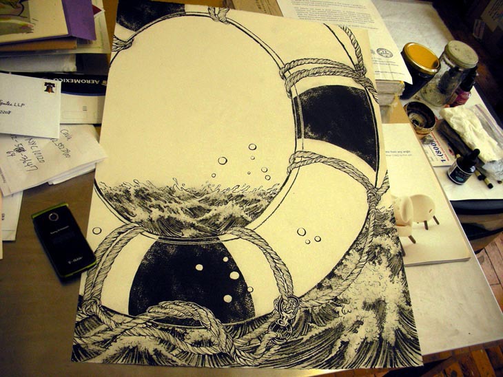
Woops, busted! No, I don’t have an iPhone or a blackberry :-b Phone is something I can make and receive calls, at least for now that’s enough…Drawing in black and white stage. About 22″ high. India ink on watercolor paper. When an image is graphic, I try and include an area where things are extremely dense, to balance out. In this case, the waves.
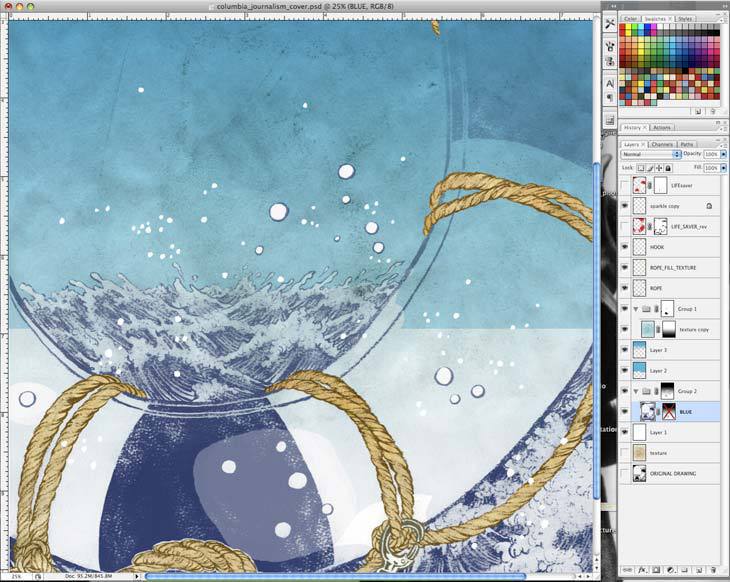
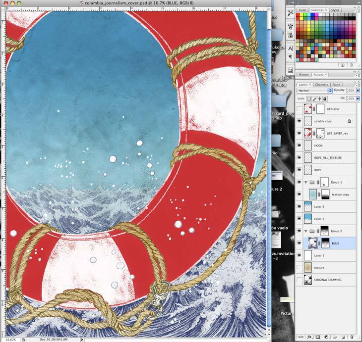
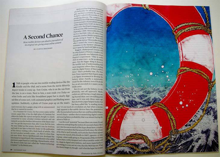
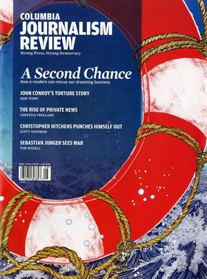
Done!! Although there are many layers on my Photoshop, this one is considered simple, because of the graphic nature of the image. Some of my illustrations have like 50 layers…I like how images feel a lot different between the cover and inside spread.
July/August issue of Columbia Journalism Review is in newsstands now.

