One of the best things about illustrating for magazines is that I learn new things every day by reading articles I illustrate.
I guess I can say I am climate-change-conscious, seeing my home country of Japan having gone through dramatic temperature change since the mid-late 1980s. (I am not a specialist, but my guess is because it is an island country with many warm and cold sea currents meeting there, the country is especially prone to climate changes. You can ask me about it next time I see you if you are interested in discussing about this more. ) Also recent Sandy hitting NY, my current city of residence, really hard.
But still, reading an extensive article about the next generation of city planning through Green Source Magazine was an eye opening moment.
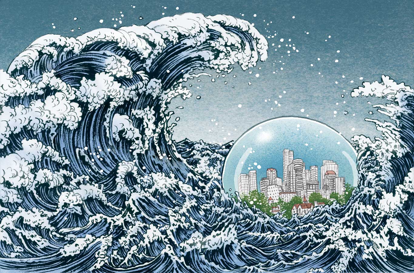
And, drawing a dynamic opener spread for this was such a fun assignment. Especially that I love drawing sea and waves (I have in past mentioned that I have severe hydrophobia), it was so much fun.
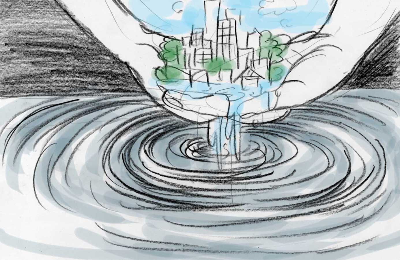
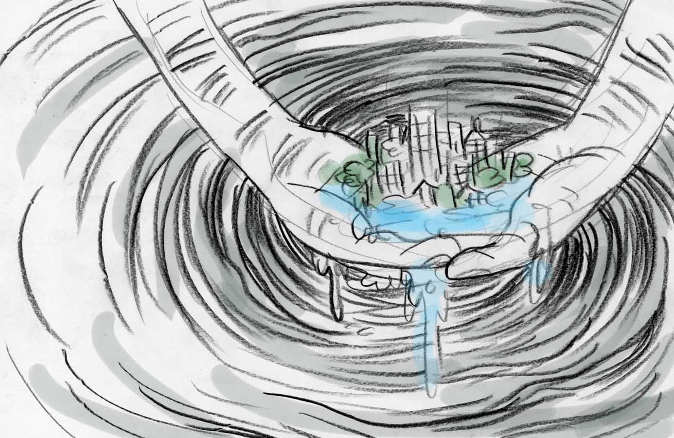
These are three ideas I initially submitted. Honestly, I could have gone with any one of them. Different types of water I can get absolved into drawing…
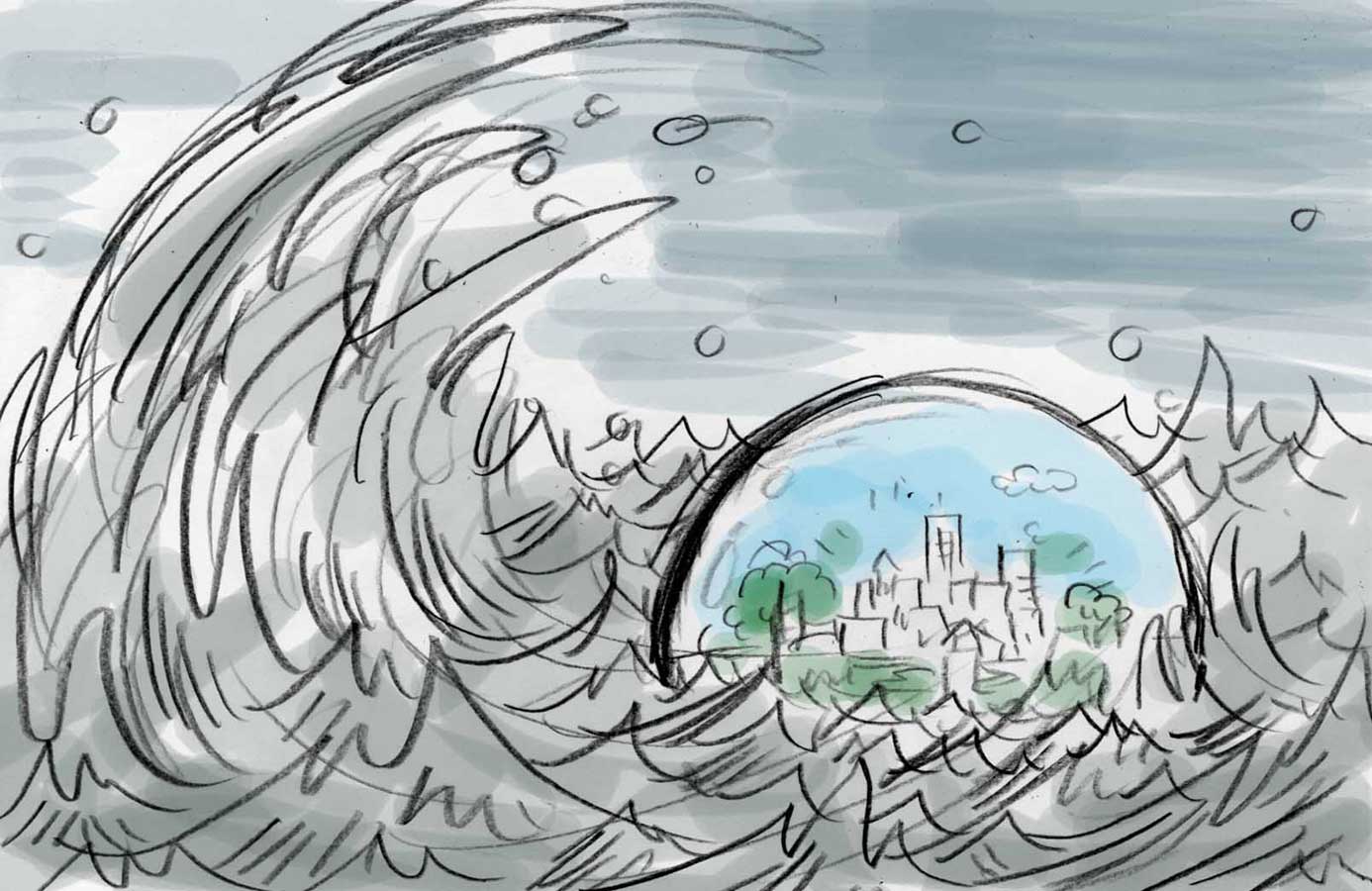
Then, AD Heather Haggerty and I went into minor details to change, based on the rough layout she made. Make sure the orb is not touching the gutter, so make it a lot smaller. waves can be bigger as long as it won’t cover the general type area… I like when ADs are upfront about their needs.
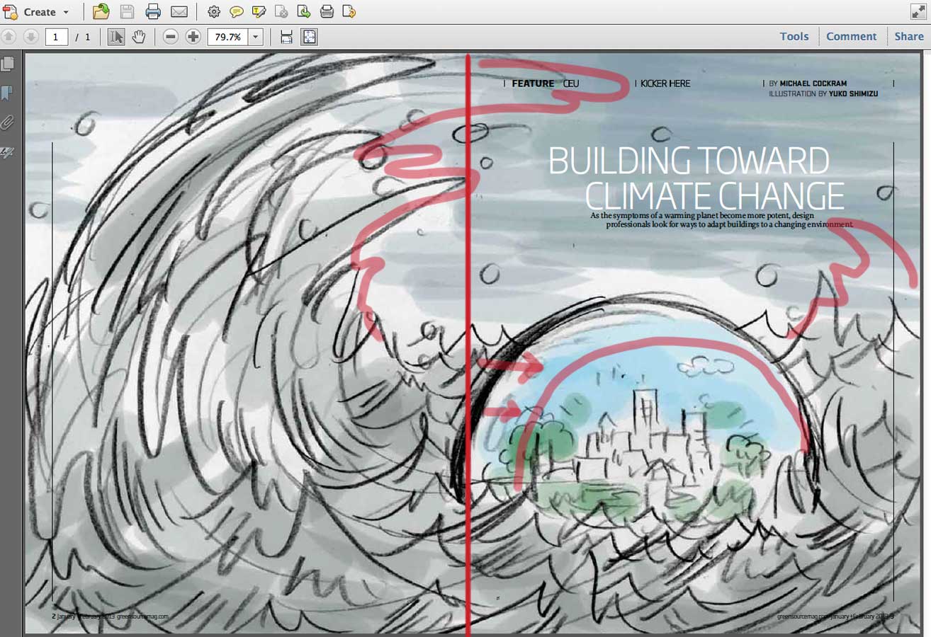
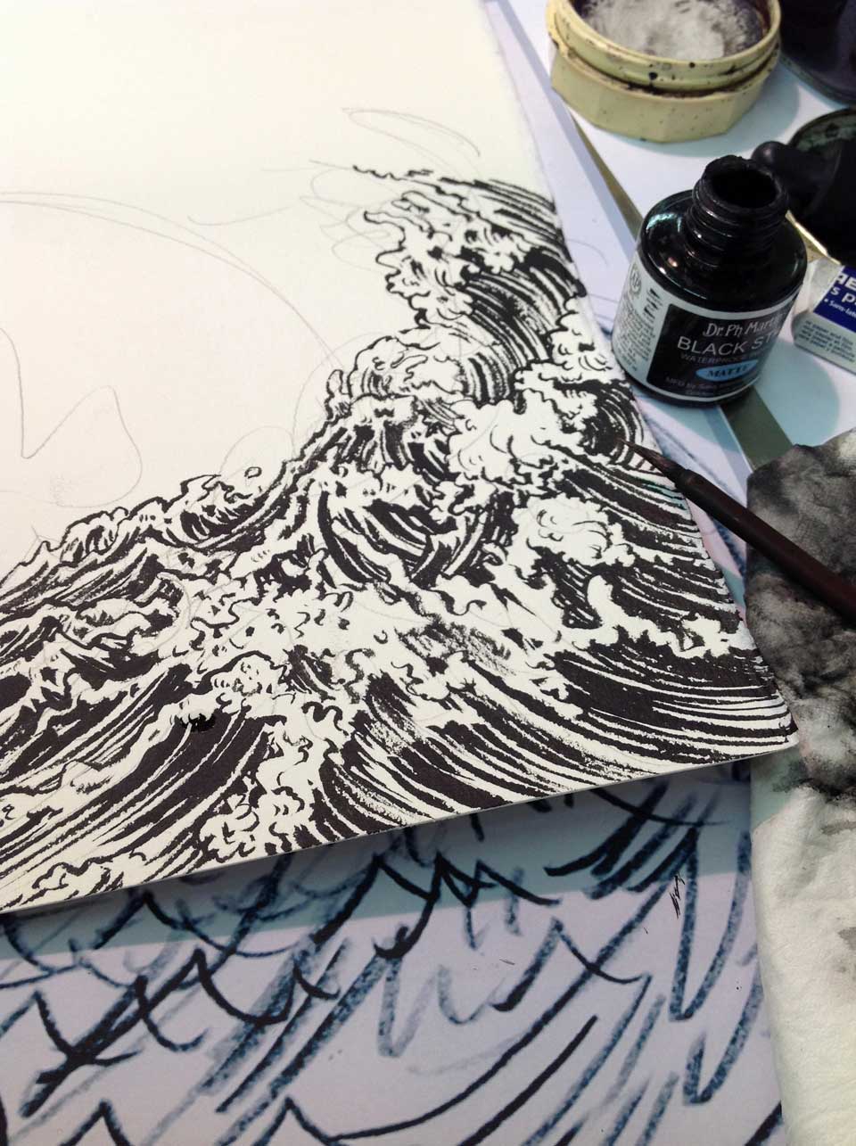
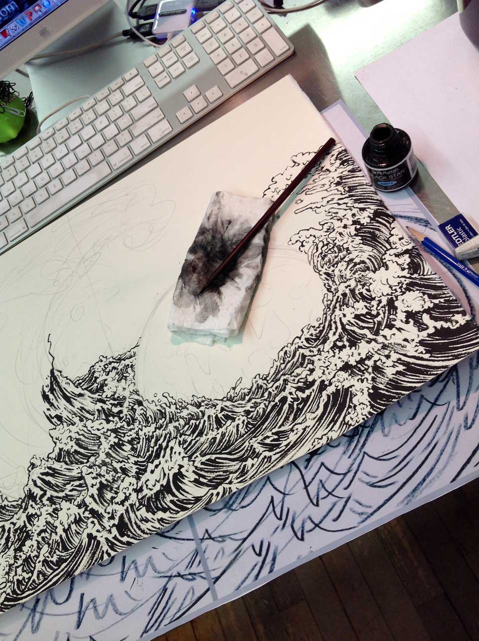
Then, going into drawing…. I have decided this illustration should be about drawing of menacing waves, so most of my time should be spent on actual drawing, with relatively simple coloring process on Photoshop. In the second photo, you can see I marked the gutter area with pencil, so I make sure nothing important sits around that area in final drawing.
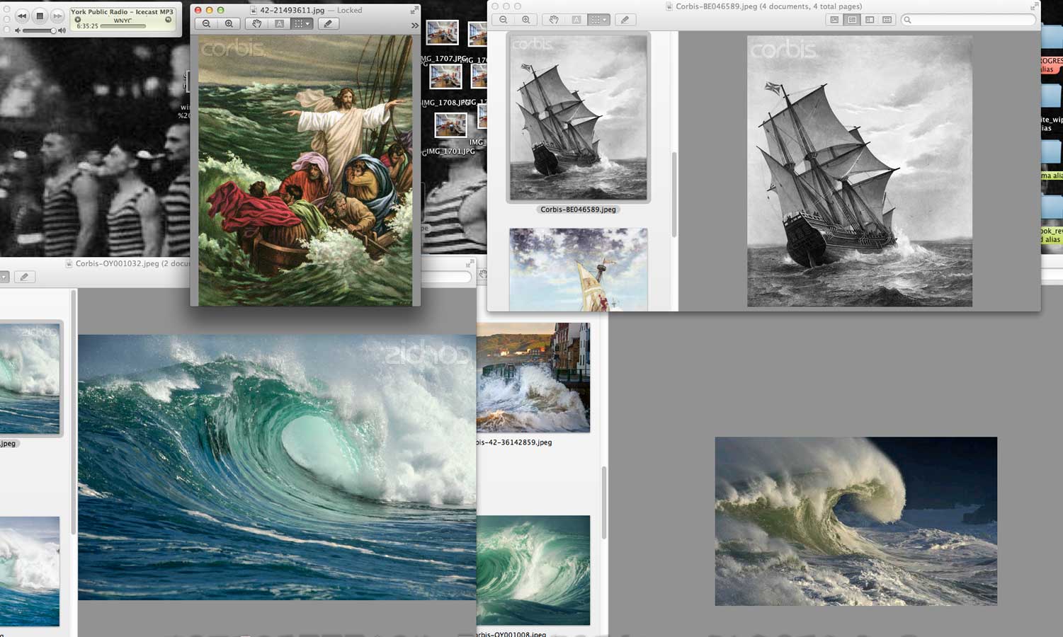
This is a screen shot of some of the reference materials I picked up here and there from different sites. It is not about copying one photo, or two photos. It is all about understand the structures and forms of the subject I am illustrating. So I usually try to look at as many different materials as possible.
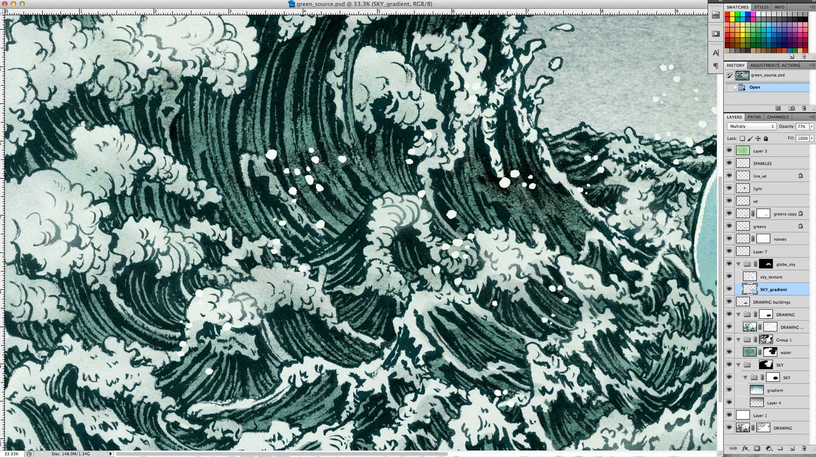
Photoshop coloring process was realatively simple for this project. (I normally have gozillion layers. All the layers fit in this screen shot, so that explains how simple this was. )
On average time divided between drawing and photoshop is 50:50. In this specific project, it was more like 70:30. When drawing is more detailed, I keep coloring simple. When drawing is simple, I end up spending more time coloring. I personally prefer spending more time on drawing than coloring. Drawing is all the fun of my process, coloring is just work. It varies from an artist to artist. Some of my peers enjoy being on the computer much more than going through traditional process. There is no right or wrong, whatever works works.
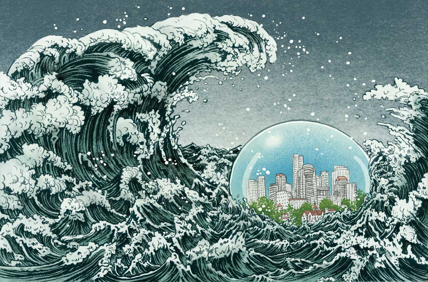
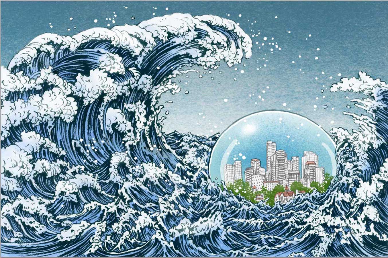
One of the things that happened with this specific job was to color adjust according to the paper it get printed on. The original finish, which I liked, was too dull to be printed on a recycled paper. So, two stages of minor color adjustments were made. The last one is the final printed image, but in actuality, because of how ink sinks into the paper, the middle one is how it looks on the page. This is something I have to learn and adjust according to each surface. On a slick and glossy paper, the last one may be too bright.

This is the final layout.
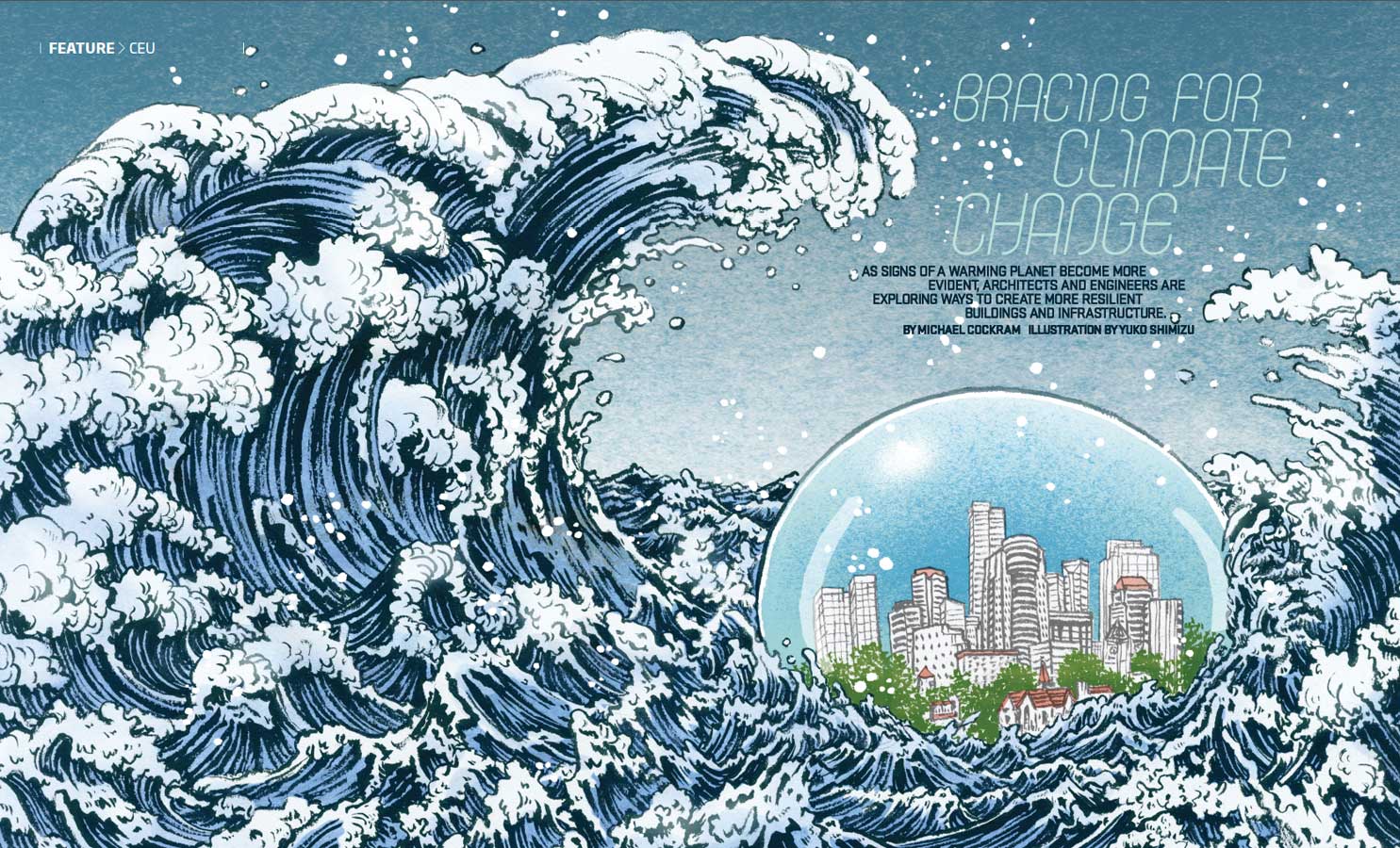
… and in the magazine context. Really good magazine. Cool cover too.
Thank you Francesca Messina and Heather Haggerty for this project.


