Yuko Shimazu Yuko Shimazu Yuko Shimizu

Award winning Japanese illustrator based in New York City and instructor at School of Visual Arts.

(on accidentally discovering) Google Map as a virtual location drawing tool

I use Google Maps all the time. You do too, right? I just used it yesterday to find out where exactly was the West Village restaurant I was going. And, oh,  the closest subway stop. But it never occurred to me that I can use this to illustrate.

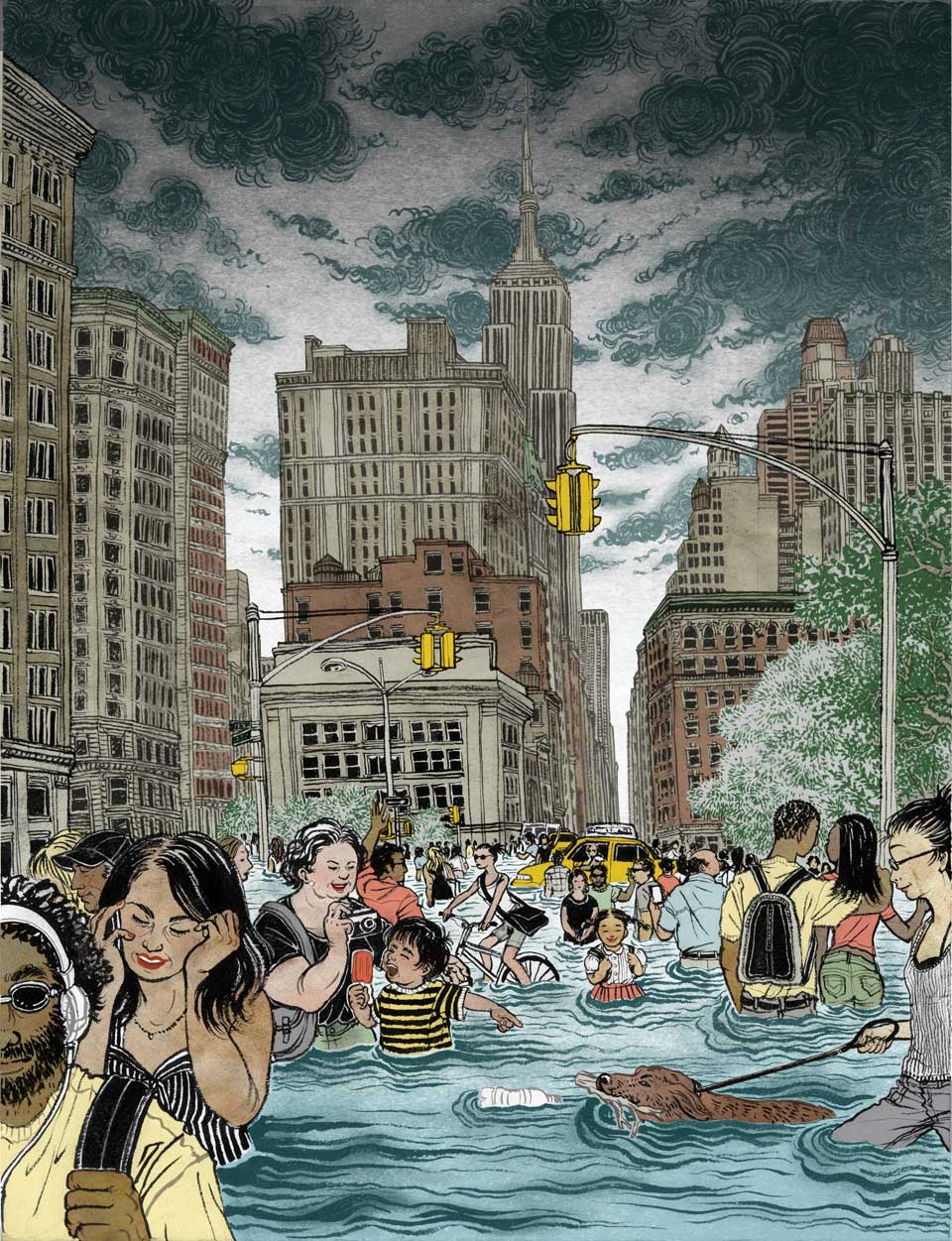
This illustration is for the current Mother Jones magazine (July and August 2013). Story is about how we are pretending the next super storm won’t arrive and believe our cities are going to be fine.

They asked for an image of New York City in flood where people carrying on their everyday lives like they don’t care.
The key was to pick a location that looks undeniably New York City, with enough open space to fill with crowd. Times Square was being suggested for obvious reasons. But then again,  if you are a New Yorker, you know Times Square is for the tourists. You don’t go there unless you need to.

I ended up choosing 23rd Street where Broadway and 5th Avenue meet, right next to Madison Square Park. This is where you have a great view of Empire State Building, with two avenues going diagonally up north with lots of interesting looking buildings, a park to your right, and a big open space to draw bunch of people and some cars in.
This is also where I have been getting off the subway to go to School of Visual Arts (SVA) for last 14 years, first as a student, then as an instructor after I finished my MFA. It was a natural choice.  (And may I mention my favorite restaurant in town, La Mar, is situated right near by?)

I initially downloaded bunch of photos online. Then realized, you can’t really get all the details from the online photo references.
I don’t know how I  ended up going to Google Map street view. But I did.
Why didn’t I do this before? You can virtually walk up and down the avenues, to see the details of some buildings you cannot see in the reference photos. You can look up, then look right and left. This is PERFECT.

It saved me from going out in the miserable weather to sit on a street corner for hours and hours and possibly harassed by passers by, even laughed at for my wobbly drawing skill.
More New York city scape assignments? Bring them on.
"yuko shimizu" "new york' "flood" "mother jones"


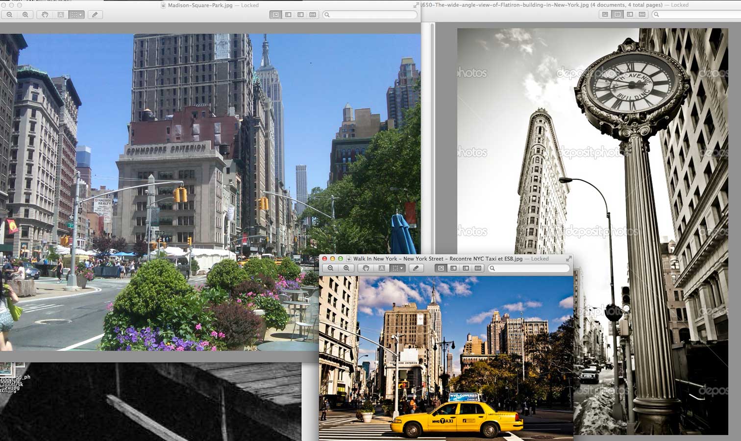
Initially I downloaded these photos of the location from various websites. I had noticed that though they are good photos, I cannot see enough of cityscape details to draw from.
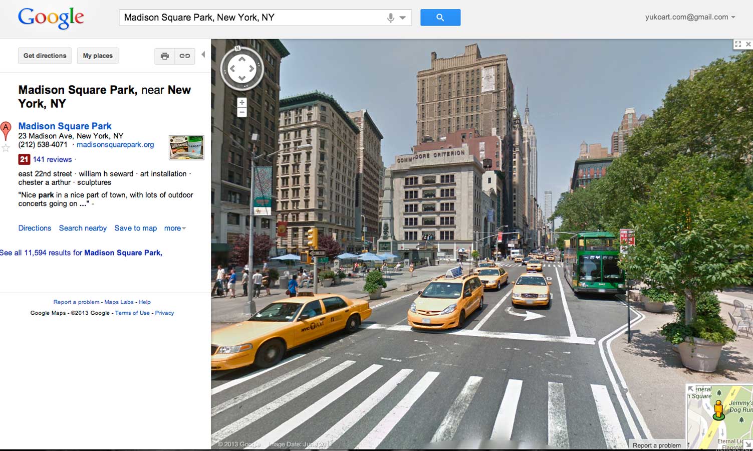
Then, here is Google Map Street View. I can walk up and down the avenues virtually.
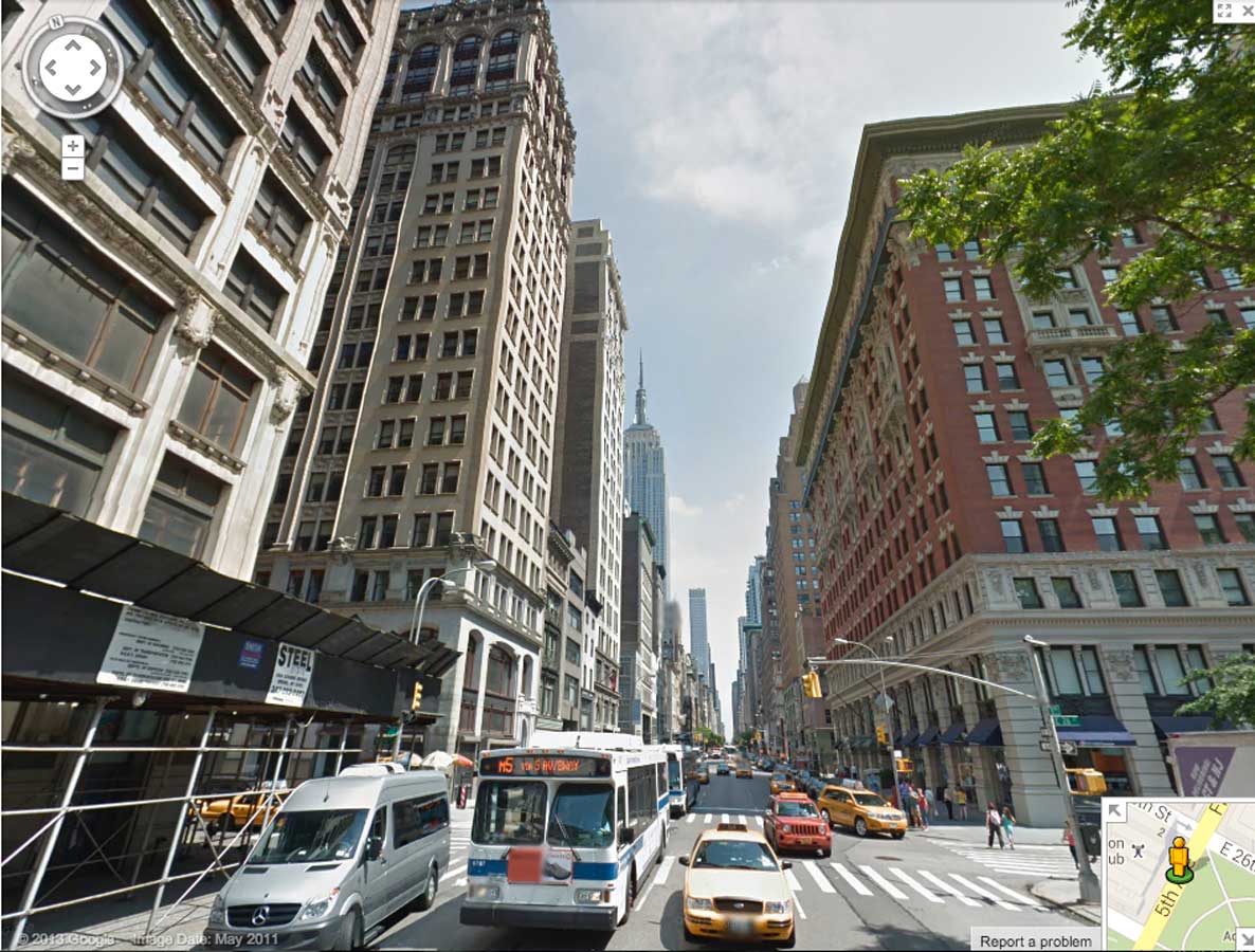
 I really liked this pink building on the right, so I walked around it virtually to get the details and understand the structure.
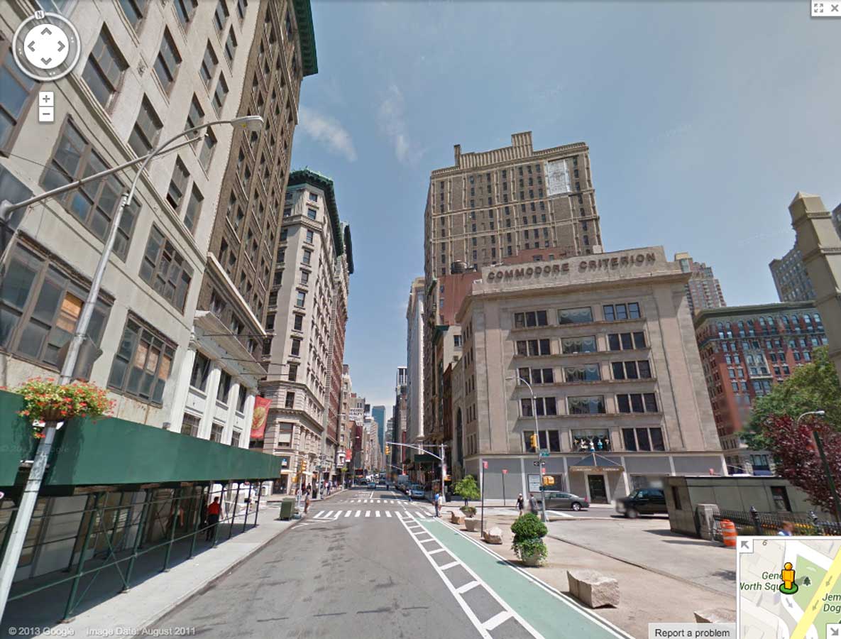

This is a rare cross streets where two avenues and a street meet all at once. So, I walk up and down the other avenue to understand the buildings surrounding it.


Having all the windows open on my screen, I get to work. I virtually walk around as I draw, according to which part I am drawing.
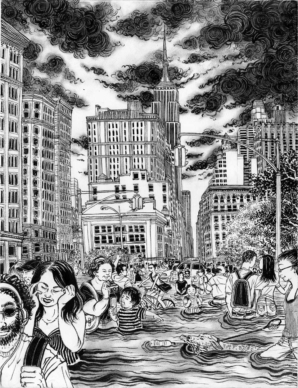

I didn’t mention about the characters in the image, but that was another fun part of this project.
Williamsburg hipster dude listening music on his big headphone, hot girl (but a realistic one and not a movie star kind) talking on her phone, teenage couple, George from Seinfeld look alike… A girl with the dog is based on one of my students who had to give away her dog to the neighbor and feeling sad, so I decided to draw her with a dog happily taking a walk.
And oh, the small girl in the center with backpack is me as a child.
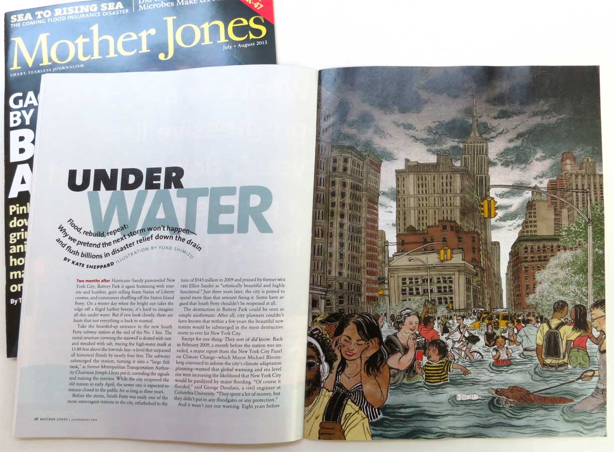
Last but not least, thank you AD Carolyn Perot for this fun project. Mother Jones July/August issue is in newsstands now.

Climate Change and the City

One of the best things about illustrating for magazines is that I learn new things every day by reading articles I illustrate.
I guess I can say I am climate-change-conscious,  seeing my home country of Japan having gone through dramatic temperature change since the mid-late 1980s. (I am not a specialist, but my guess is because it is an island country with many warm and cold sea currents meeting there, the country is especially prone to climate changes. You can ask me about it next time I see you if you are interested in discussing about this more. ) Also recent Sandy hitting NY, my current city of residence, really hard.
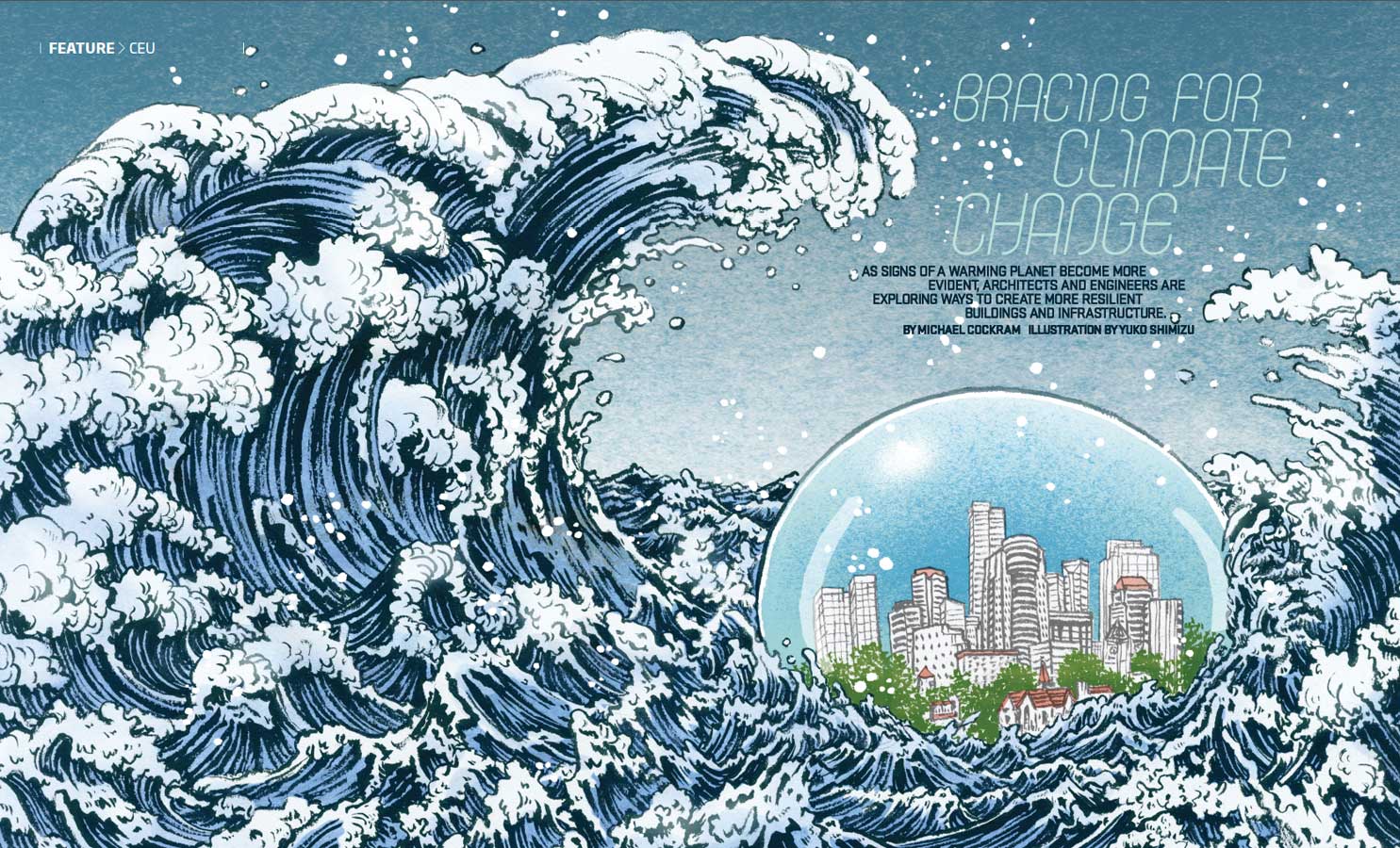
But still, reading an extensive article about the next generation of city planning through Green Source Magazine was an eye opening moment.
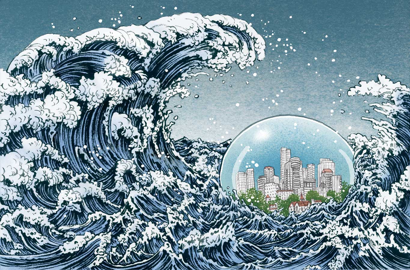
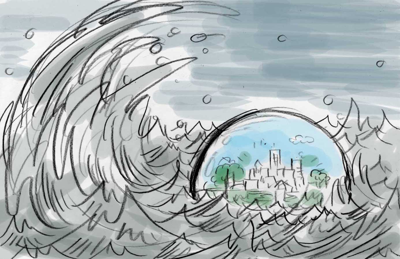
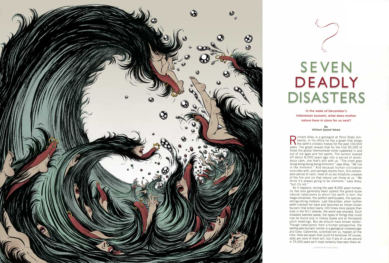
And, drawing a dynamic opener spread for this was such a fun assignment. Especially that I love drawing sea and waves (I have in past mentioned that I have severe hydrophobia), it was so much fun.

"green source" "climate change" "global warming" "Yuko Shimizu"

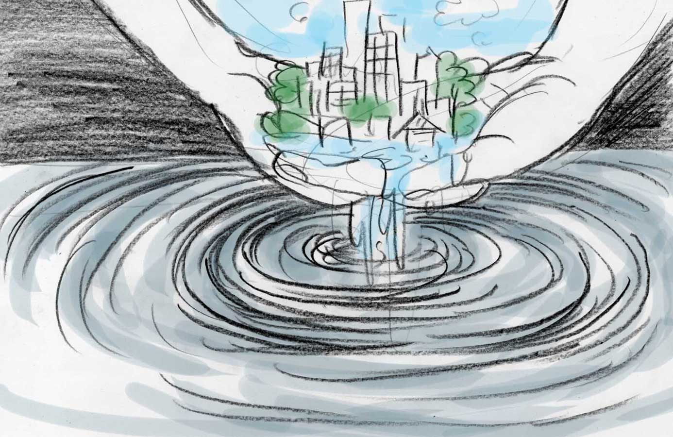
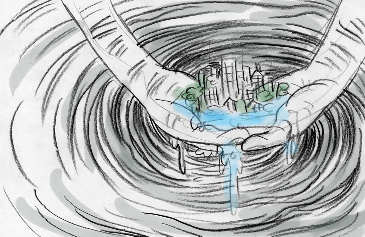
These are three ideas I initially submitted. Honestly, I could have gone with any one of them. Different types of water I can get absolved into drawing…

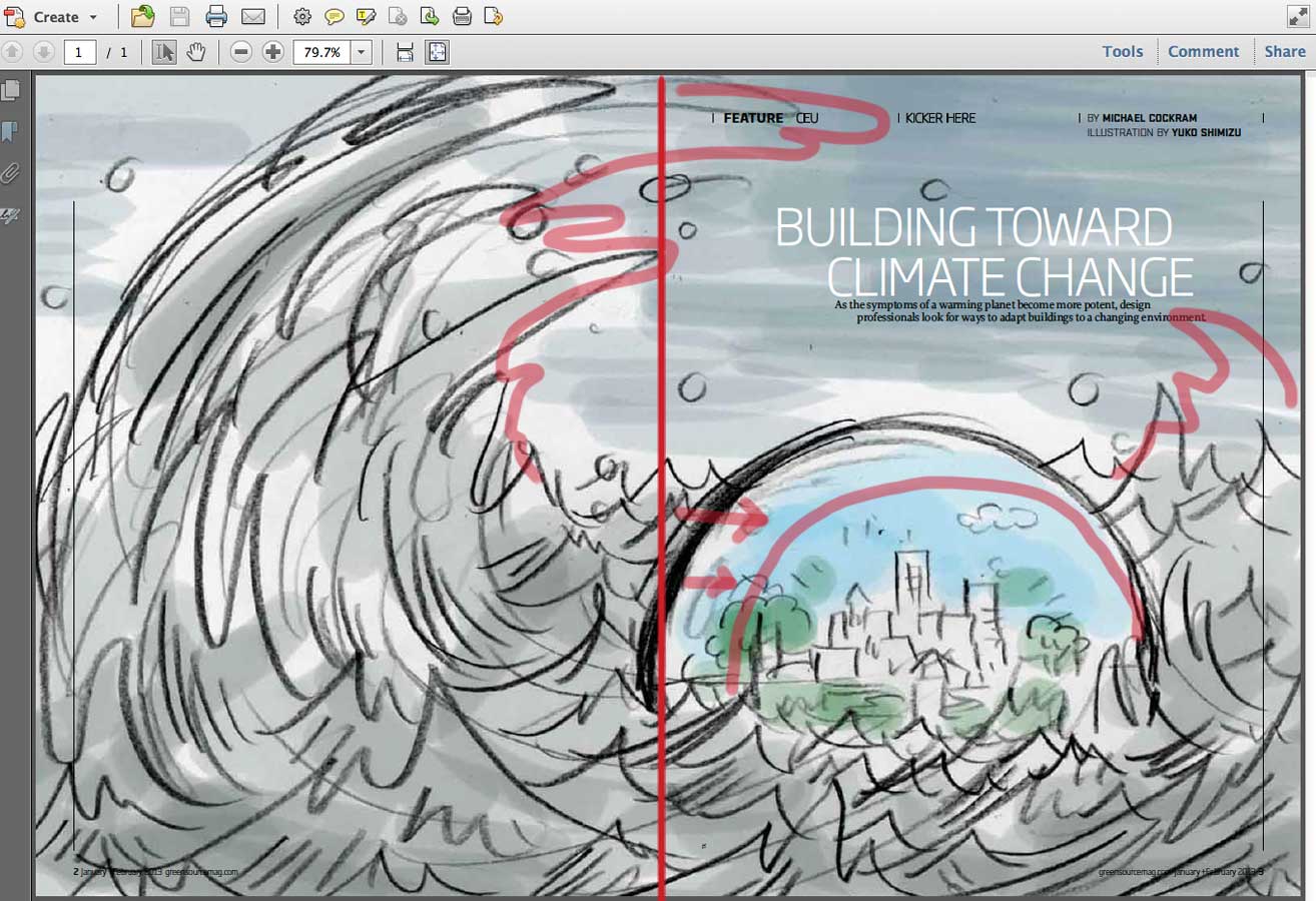
Then, AD Heather Haggerty and I went into minor details to change, based on the rough layout she made. Make sure the orb is not touching the gutter, so make it a lot smaller. waves can be bigger as long as it won’t cover the general type area… I like when ADs are upfront about their needs.

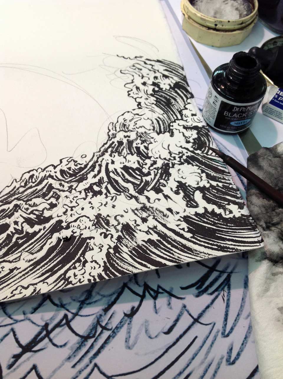
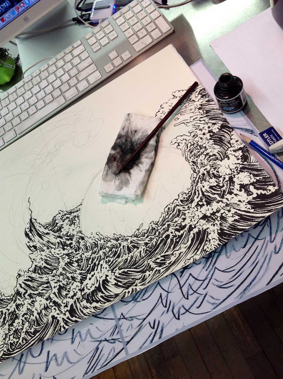
Then, going into drawing…. I have  decided this illustration should be about drawing of menacing waves, so most of my time should be spent on actual drawing, with relatively simple coloring process on Photoshop. In the second photo, you can see I marked the gutter area with pencil, so I make sure nothing important sits around that area in final drawing.

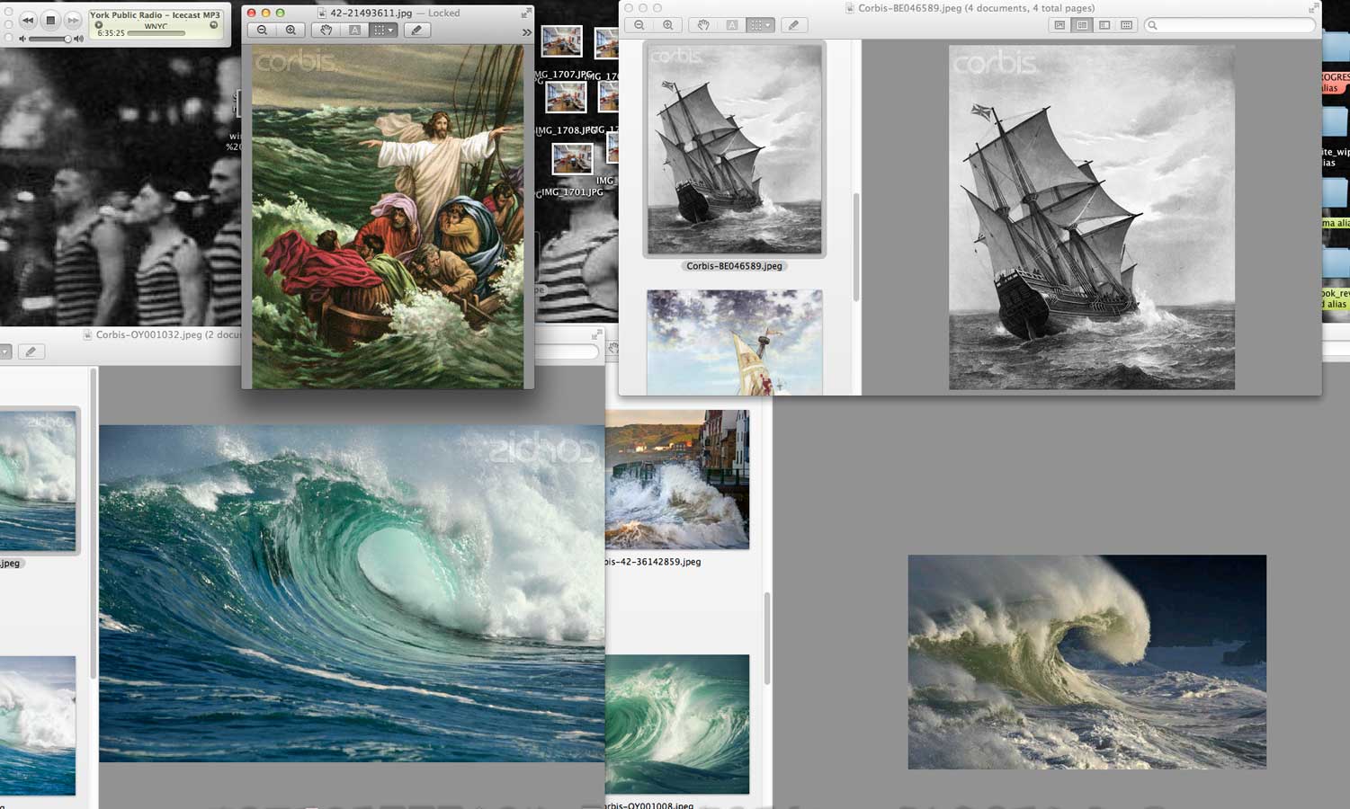
This is a screen shot of some of the reference materials I picked up here and there from different sites. It is not about copying one photo, or two photos. It is all about understand the structures and  forms of the subject I am illustrating. So I usually try to look at as many different materials as possible.

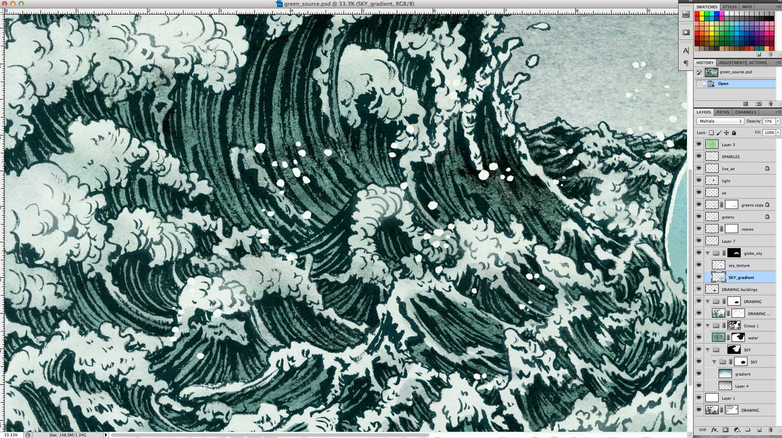
Photoshop coloring process was realatively simple for this project. (I normally have gozillion layers. All the layers fit in this screen shot, so that explains how simple this was. )
On average time divided between drawing and photoshop is 50:50. In this specific project, it was more like  70:30. When drawing is more detailed, I keep coloring simple. When drawing is simple, I end up spending more time coloring. I personally prefer spending more time on drawing than coloring. Drawing is all the fun of my process, coloring is just work. It varies from an artist to artist. Some of my peers enjoy being on the computer much more than going through traditional process. There is no right or wrong, whatever works works.

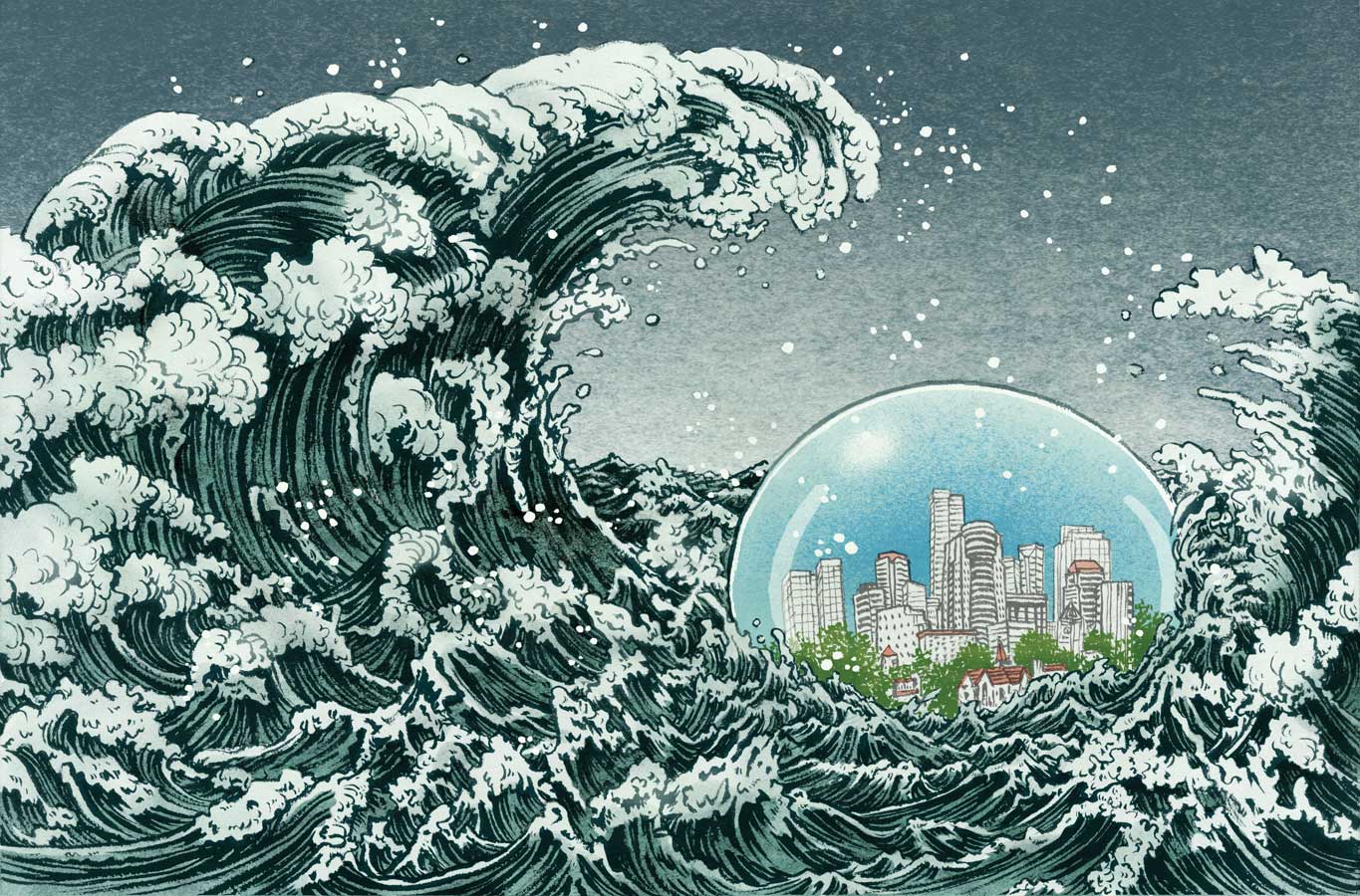
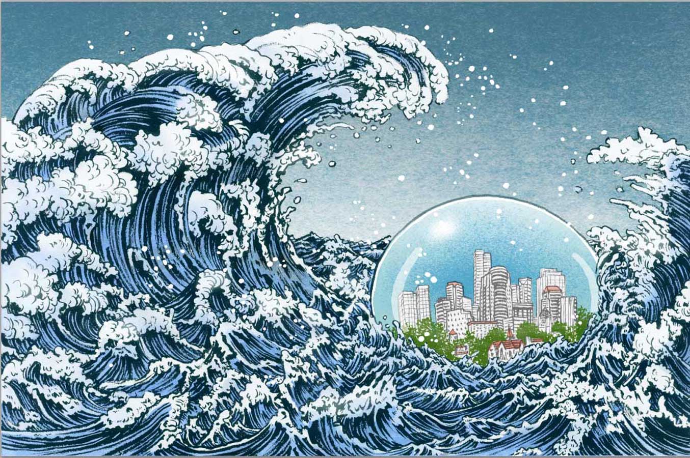
One of the things that happened with this specific job was to color adjust according to the paper it get printed on. The original finish, which I liked, was too dull to be printed on a recycled paper. So, two stages of minor color adjustments were made. The last one is the final printed image, but in actuality, because of how ink sinks into the paper, the middle one is how it looks on the page. This is something I have to learn and adjust according to each surface. On a slick and glossy paper, the last one may be too bright.

"green source" "climate change" "global warming" "Yuko Shimizu"

This is the final layout.

… and in the magazine context. Really good magazine. Cool cover too.
Thank you Francesca Messina and Heather Haggerty for this project.

Sketchtravel poster creative process step by step.

You may, or may not know about Sketchtravel. But, let me tell you that this is quite an amazing project that started relatively small, as something fun, and ended up becoming something of a monster-size charity project.

In 2006, project was conceived and organized by Dice Tsutsumi and Gerald Guelai as a fun small project, let’s pass a sketch book around from illustrators to illustratos, around the world and fill the book cover to cover. It took 4 and half years till the book was complete, contributing artists including: Hayao MiyazakiJames Jean, Peter DeSève, Taiyo MatsumotoTomer HanukaMike MignolaKatsuya TeradaNatalie Ascencios to name a few.  Resulting in publishing of the book in multiple language editions and becoming a bestseller in France and Japan, traveling exhibitions, and most importantly, auctioning off the original book  and raised 70,000Euros to fund Room To Read to build libraries in five countries so far

Traveling exhibition is arriving to Kyoto International Manga Museum in Kyoto, Japan in March.
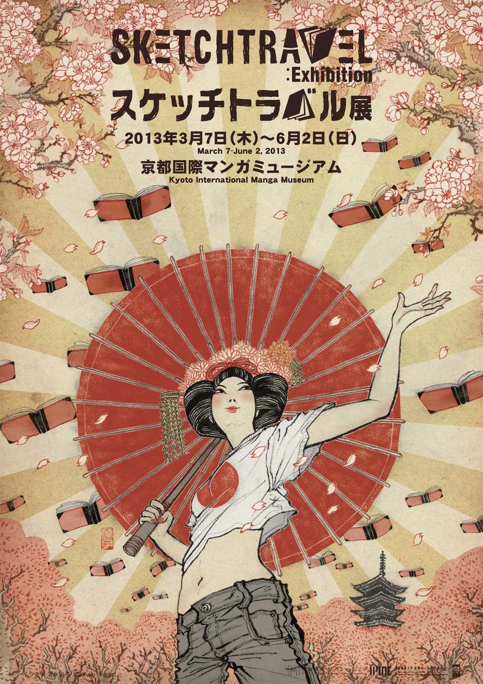
As a contributor to Sketchtravel, I was honored to be asked to create poster for Kyoto exhibit. I took detailed record of creative process, so I am sharing them with you today. I often get asked about drawing medium and surface. For details of medium, please visit FAQ section.

"yuko Shimizu" "sketch travel" "poster"this is the finished poster. Let’s look at the creative process from the beginning….
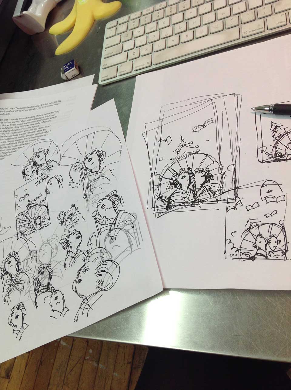
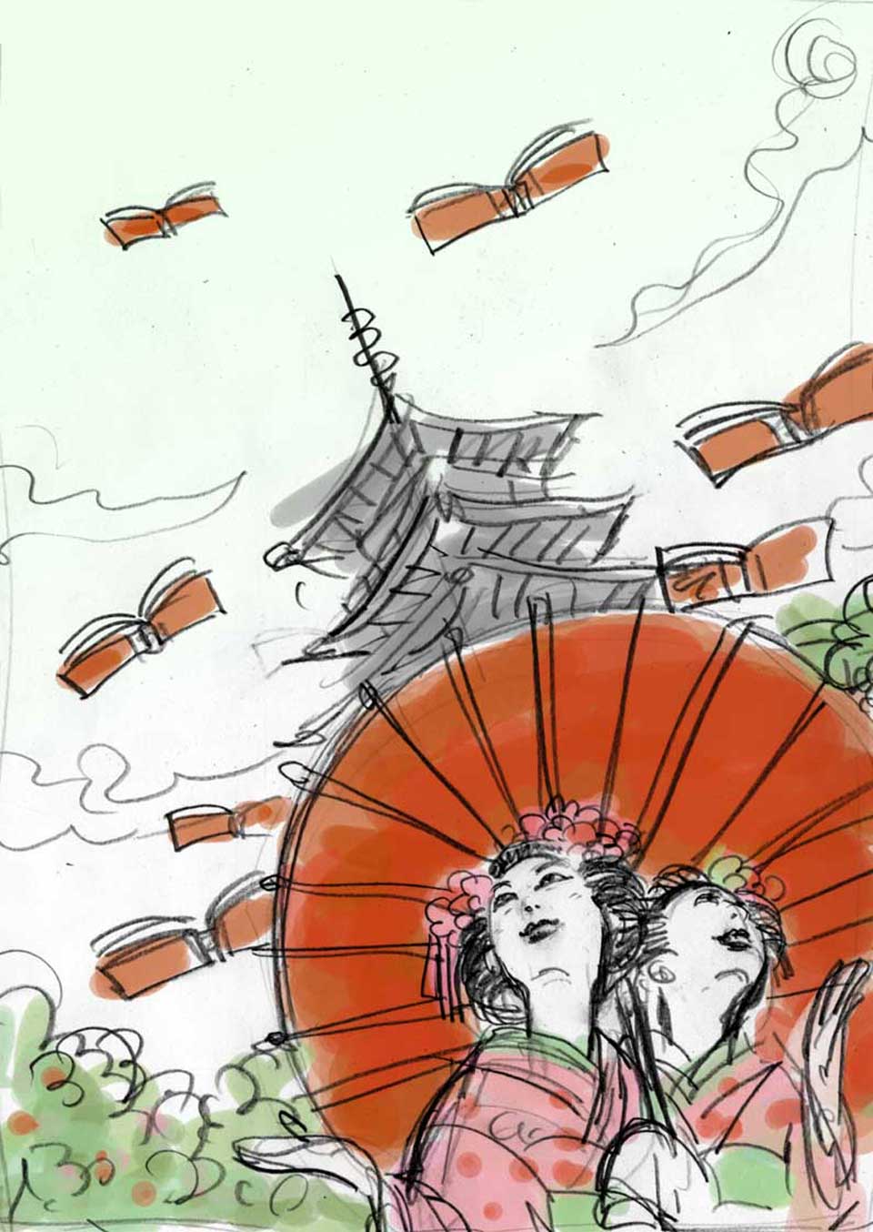
"yuko shimizu" "sketchtravel"
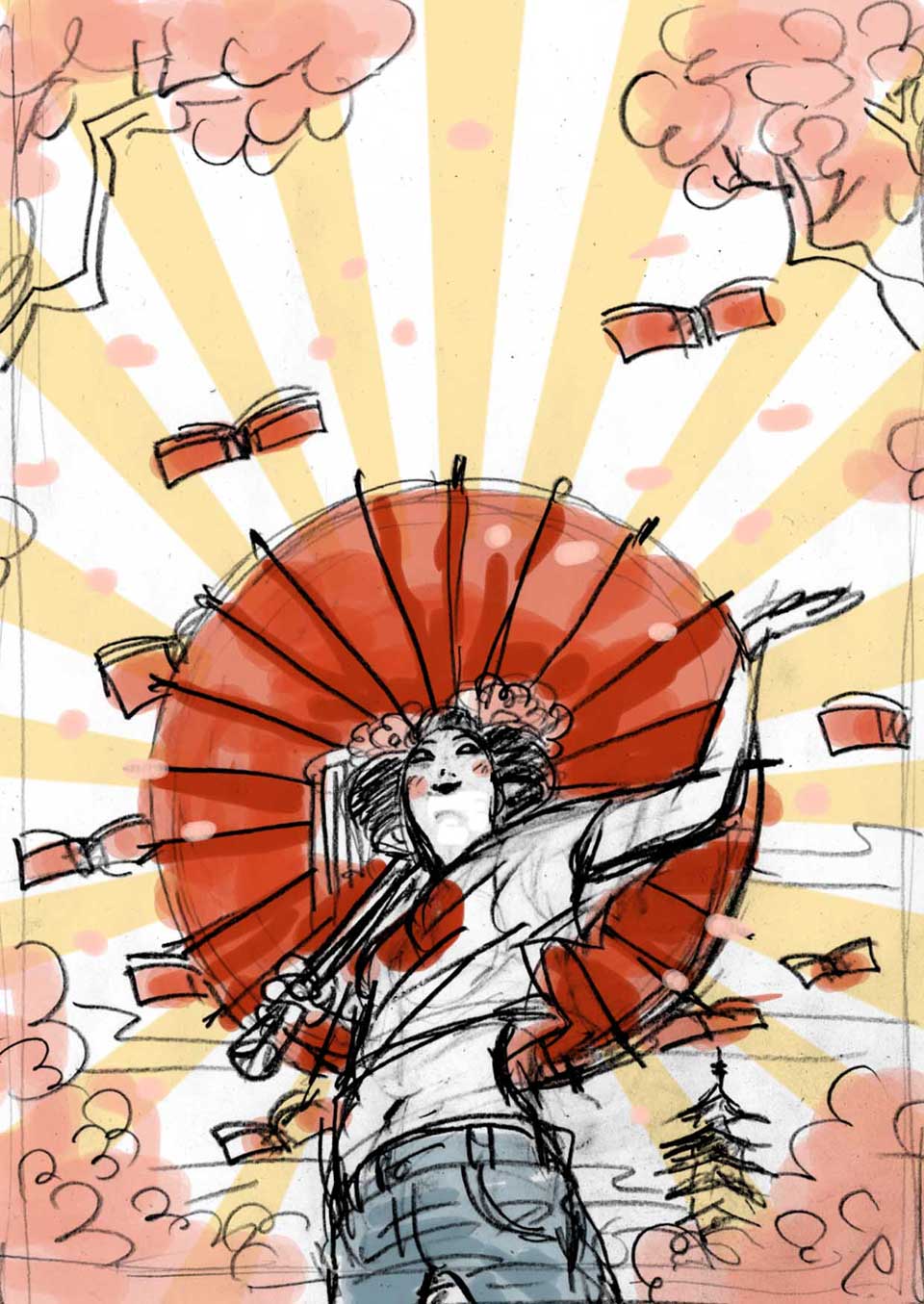
everything starts kind of like this…. lots of doodles and thumbnails.
Concept started off as drawing a “Maiko” or two. Maiko is a younger version of Geiko (what westerners know as geisha). Both Maikos and Geikos are close to extinct in this 21st century Japan, but in old capital of Kyoto, the culture still exist.


So, this was my initial idea. Dice and I discussed and decided to go with a more contemporary take on Maiko culture. He said he wanted to see more of my “edge”. I was a bit weary at first… but said OK, I will do it.


Second idea. More with edge and tradition mixed with contemporary.  Japanese umbrella she is holding makes the shape of Japanese flag: red dot. Cherry flowers, of course, are the symbol of spring. Luckily, the show starts in spring, right around the famous Japanese Cherry Flower season.
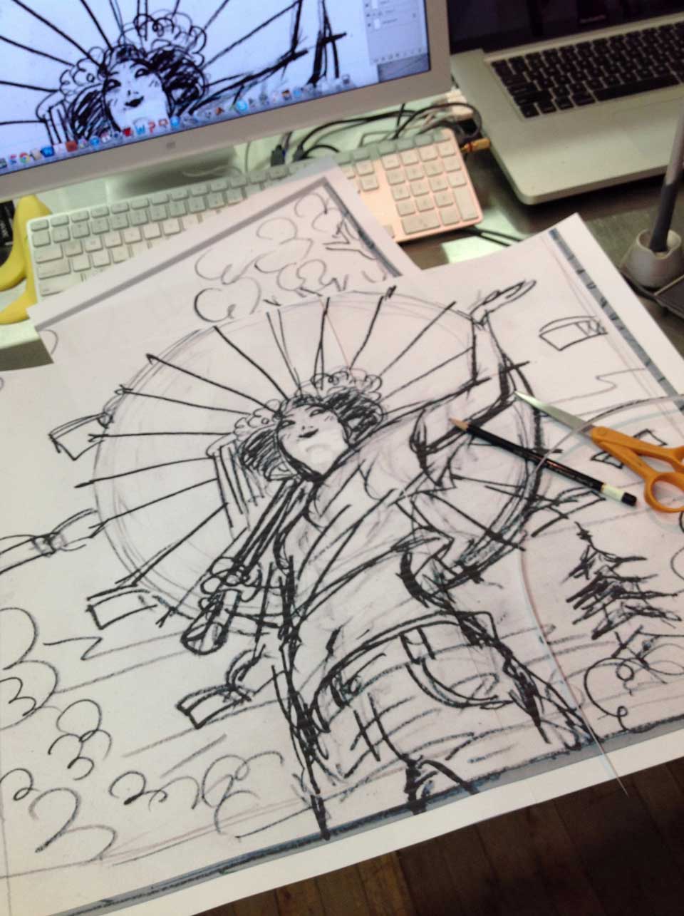
This is a typical preparatin stage before moving onto actual inking stage. Add gutter space (in grey) and blow up the sketch to the size I am drawing. For a poster use, I usually go 22″ x 30″. Obviously, it takes multiple print outs from my Epson printer and lots of cutting and taping…
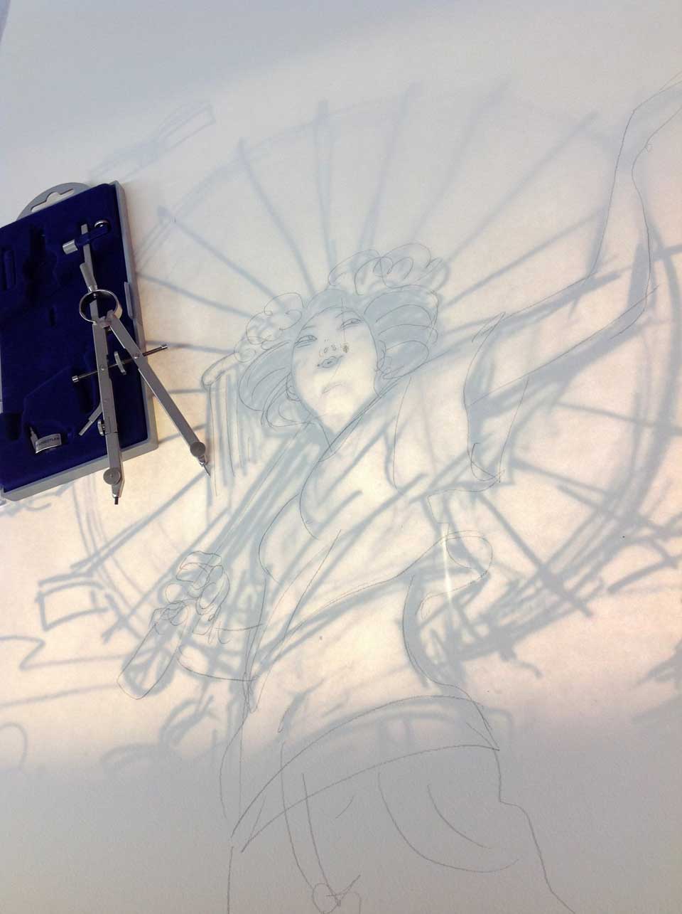
Lightbox saves your time (therefore your life). You can see the traced pencil linse on watercolor paper. this is about the tightest I normally trace. No tracing takes longer than a few minutes. It is more about transferring the sketch composition onto the paper. No more no less. It is my trick to ink fresh lines and not making it look like traced.
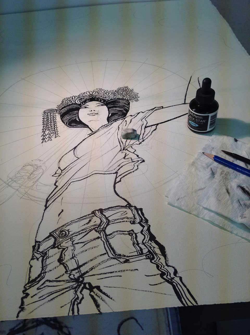
Some things cannot use shortcuts. So, I take good old compass to draw out the perfect circle for the umbrella.

Finish figure first, then the rest follows. Face ended up changing a lot from the sketch, but that’s part of the process. Only time I do tight face sketch is when I am doing a portrait.
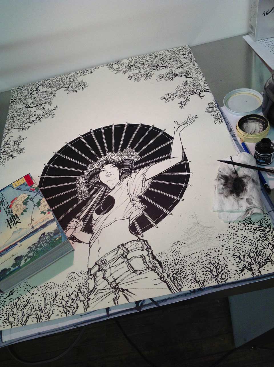
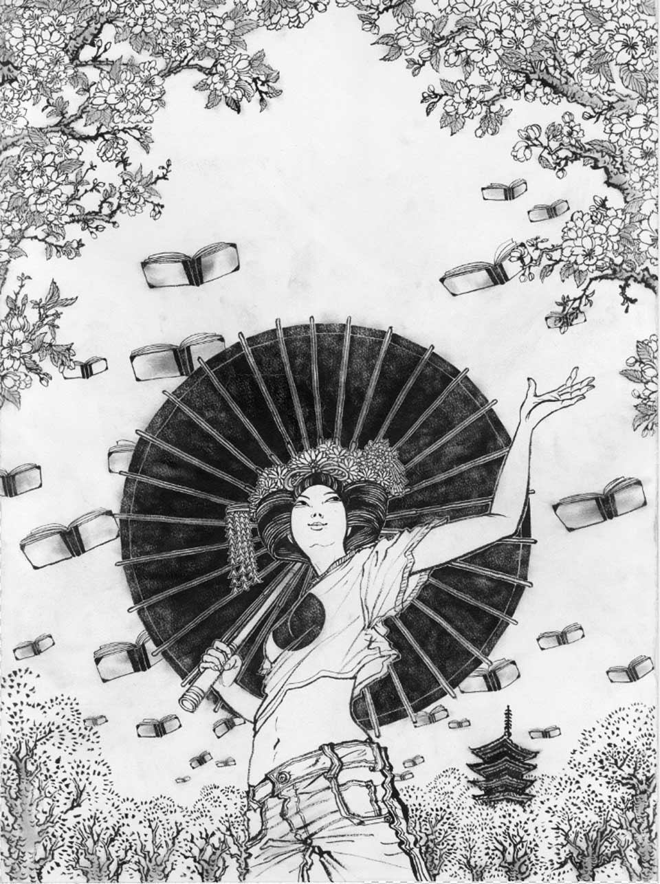
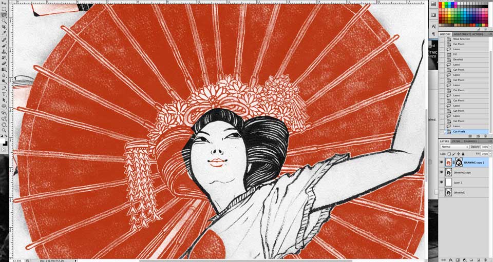
I initially thought I would finish the drawing much faster, then ended up taking longer, because of large scale, and because of detailed cherry flower drawings.


Yaaay, getting very close to finishing up the drawing.  The book on the side was the book I referred to to draw various different types of cherries. Top was very close up, bottom was far away, and petals were drawn on separate paper.
Also, bunch of photos of real Maikos from kyoto, their hair style and accessories were downloaded from the web, as well as the famous five story pagoda, a symbol of Kyoto.


FINITO! (there is a bit of time-consuming process of getting the texture and tone on the finished drawing, which I ask to keep it as ‘secret ingredient’) This gets scanned in tediously in parts.  Yes, I do have a large format scanner (Epson Expression 10000XL), but it still takes at least four scans to get everything onto the computer. At least, Photoshop Auto-merge feature works like a dream and saves a lot of time.


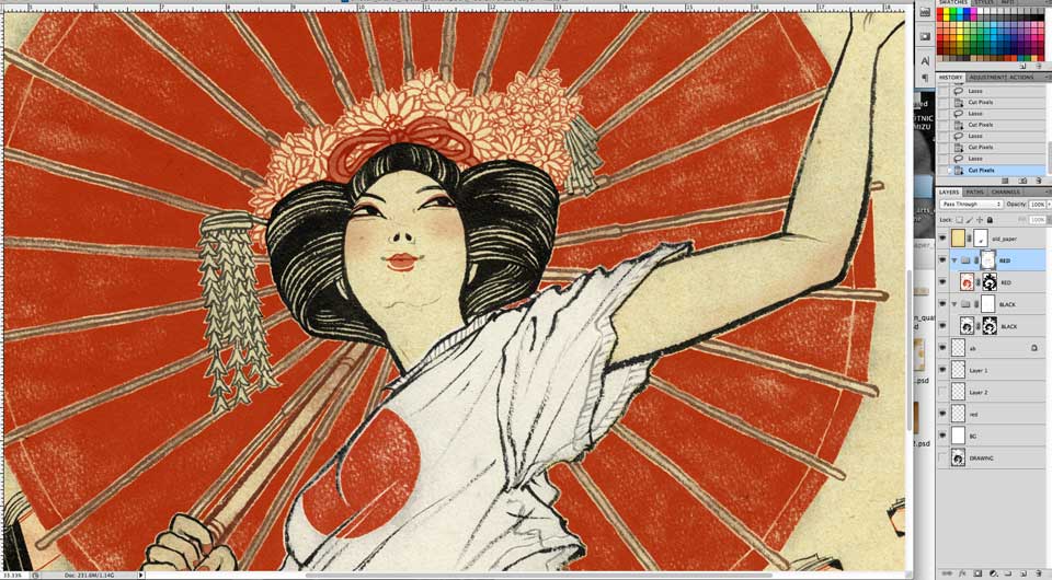
Adobe Photoshop CS5.5. I should switch to Ps6…. Wacom Intuos 3 tablet (which died since, and now I am on super shiny Intuos 5).  Every coloring process is different, and this is one of the reasons why it is very hard for me to hire a coloring assistant. But most of the coloring starts something like this…


Getting there, but still not many layers. I know, I am a huge fan of masks. It is all about masking and masking and masking stuff….


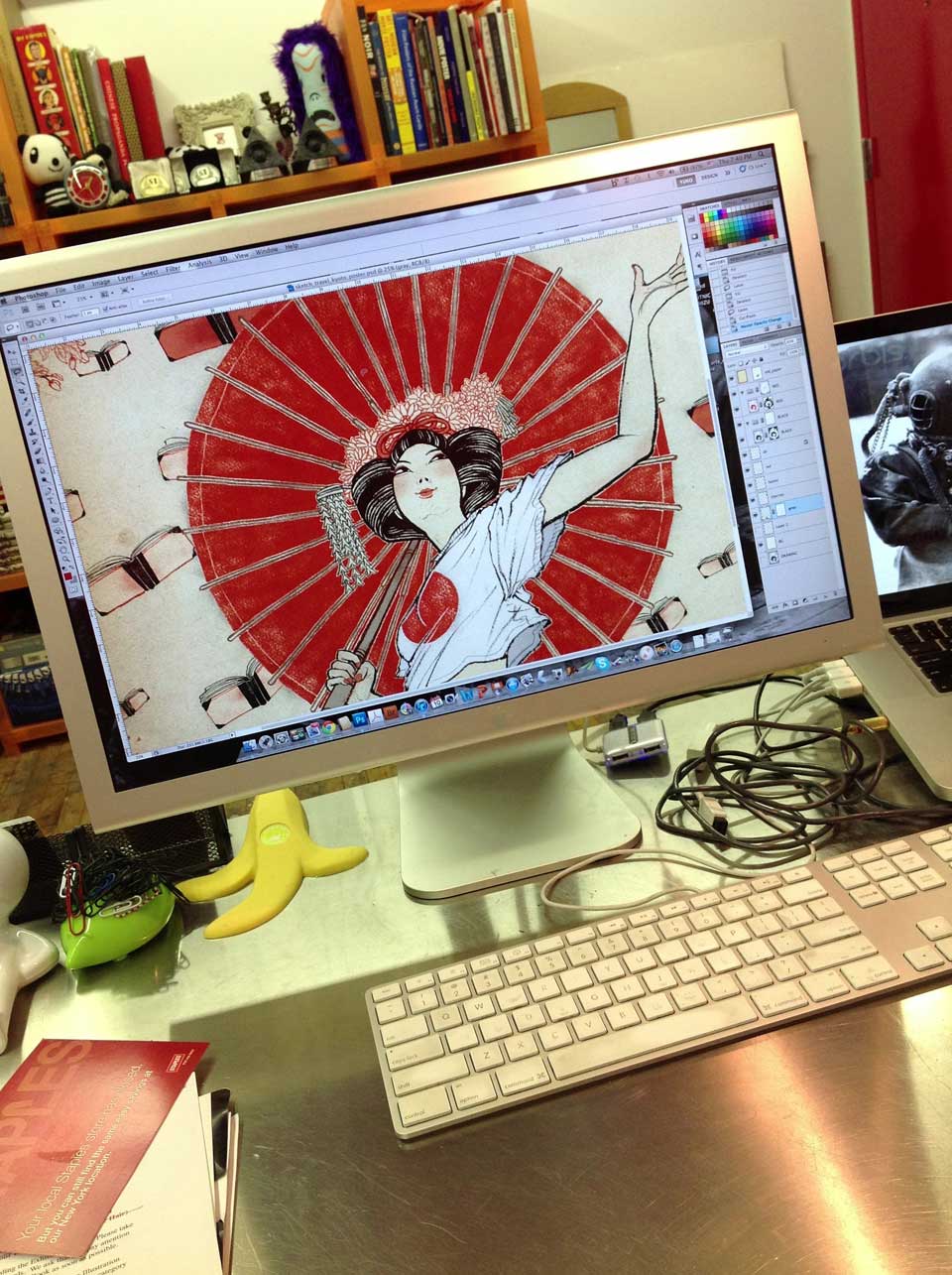
This is my workspace… I have a large Apple Cinema Display (old one, died once and paid a lot of money to fix) next to the laptop. I don’t own a desktop computer and I never will. (and that keyboard died since then. Now I have a cute code-less.)


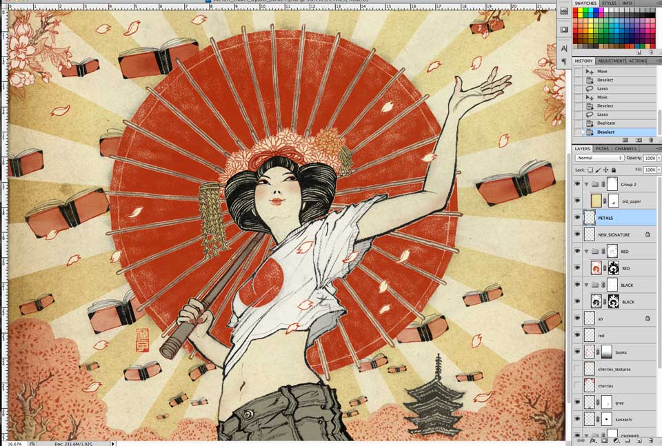
Cherry petals are inserted, and the number of layers are doubled. I think I call it done!

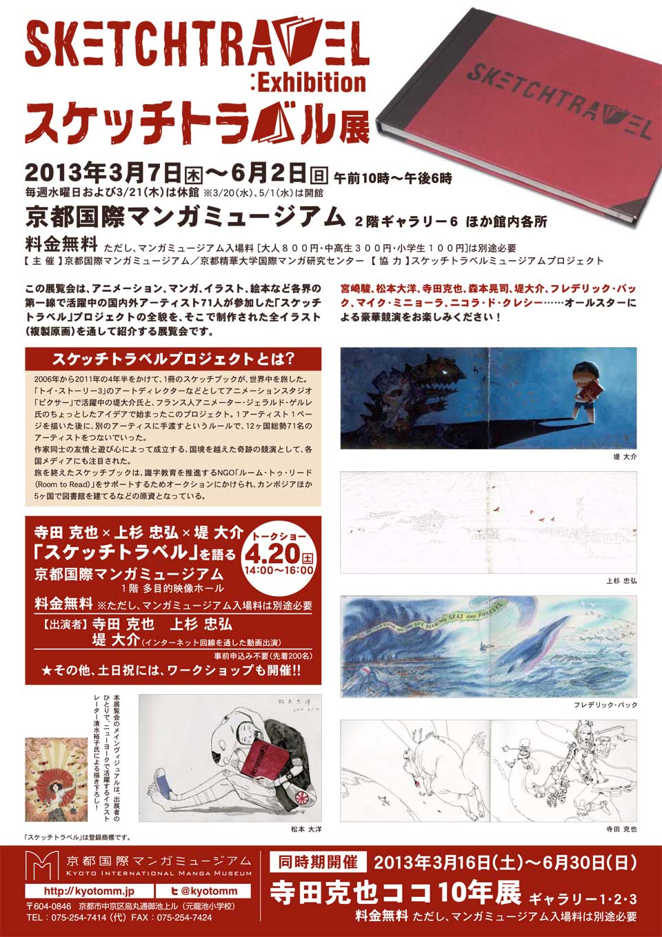
Once again, below is the final result, and there is a copy of the backside of the flyer on the bottom, for those of you who are in Japan who are interested in going to the exhibition.
I won’t be able to make it to the show, but I am sure it will be super, so enjoy!
"yuko Shimizu" "sketch travel" "poster"

illustration and fear of water

I believe many of you who are reading my blog are aspiring illustrators. If you are, here is something you may want to remember, or to work on, if your art school instructors haven’t taught you already: we have to be remembered by something we are good at, so when a prospect client see a topic that need to be illustrated they know who to call.

Most obvious ones prospect clients think of my work are Japanese and/or Chinese themes. I am a Japanese, but I had also studied Cantonese for three years and I have strong interest toward Chinese culture. And people somehow see that in my work. There are other themes like sexy girls, action and sports, comic book look, snow….
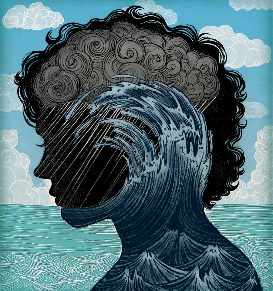
And odd one is, which is today’s topic, water and underwater theme.

"yuko shimizu" "swimming" "water" "scrubs"

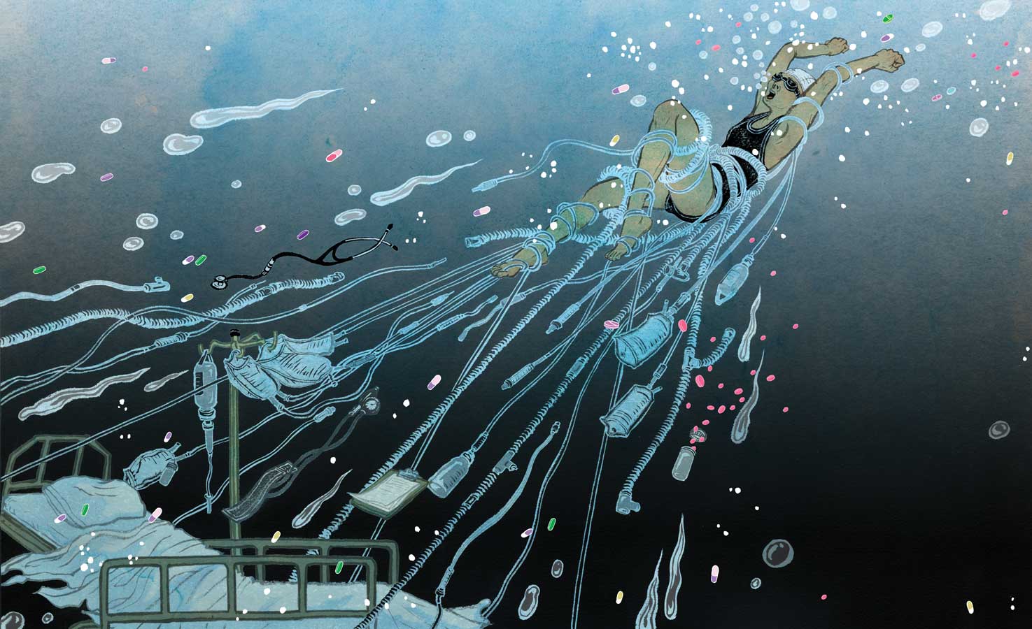
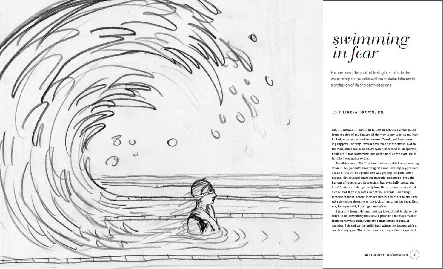
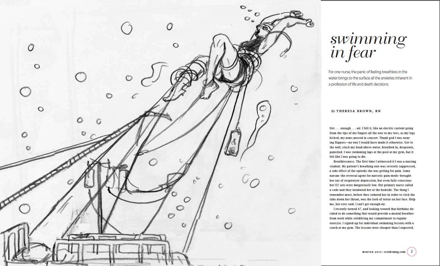
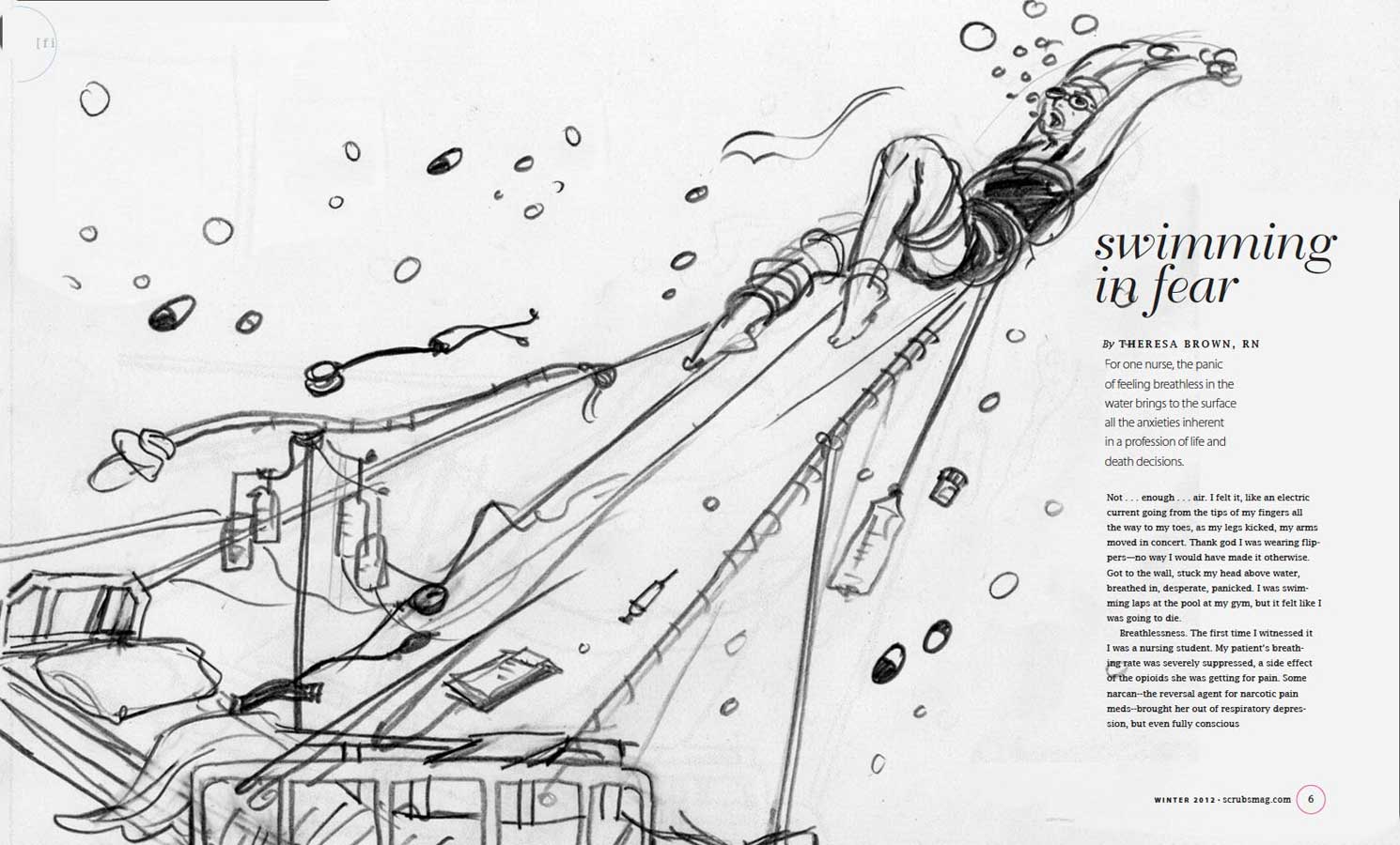
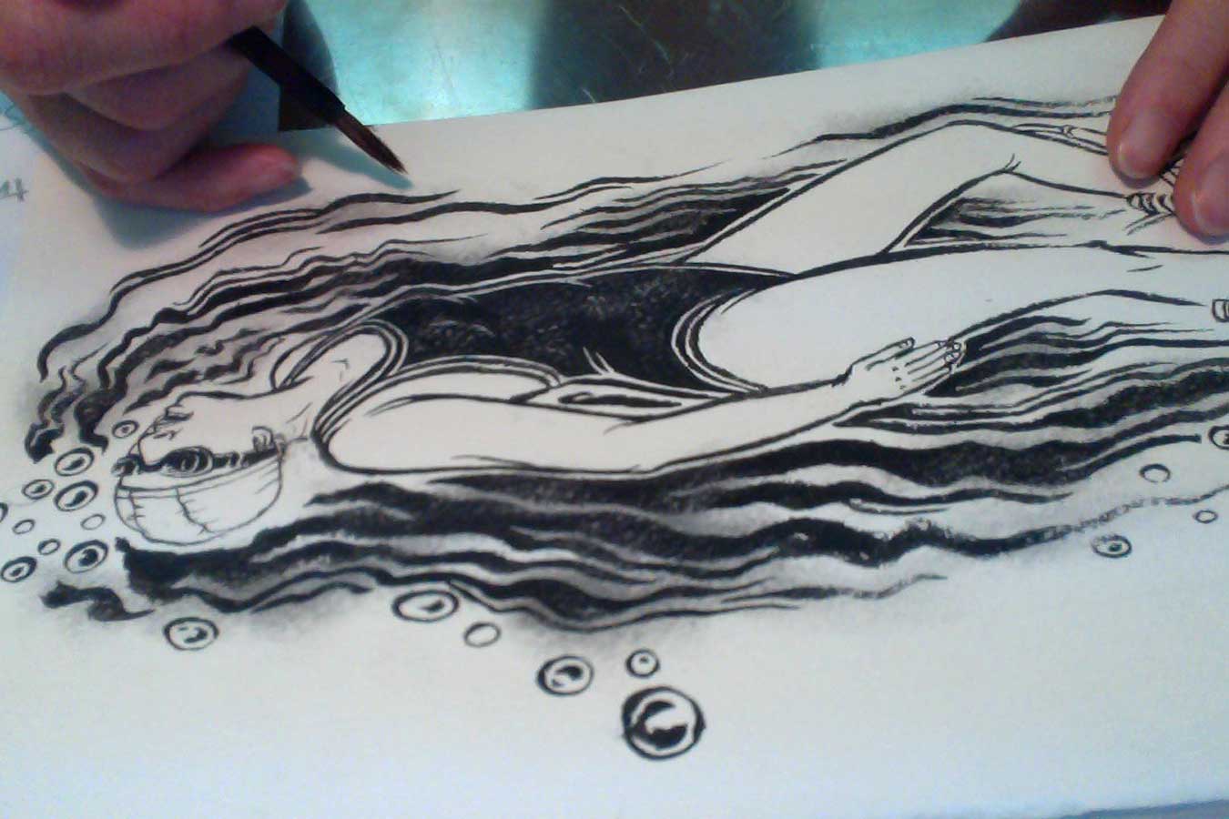
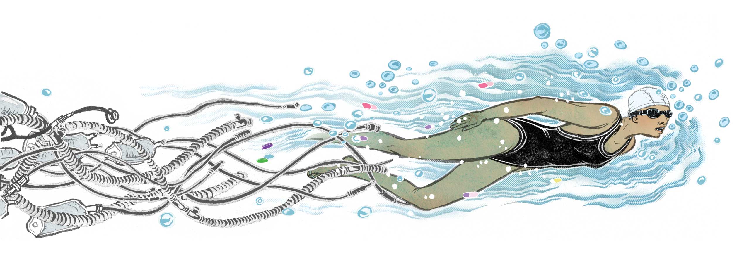
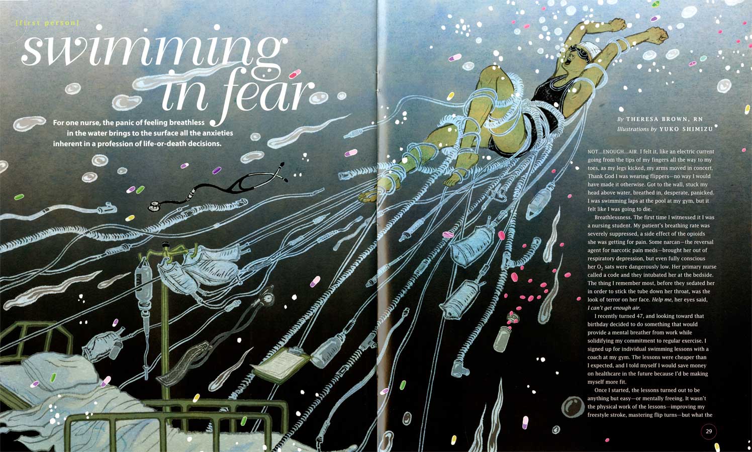
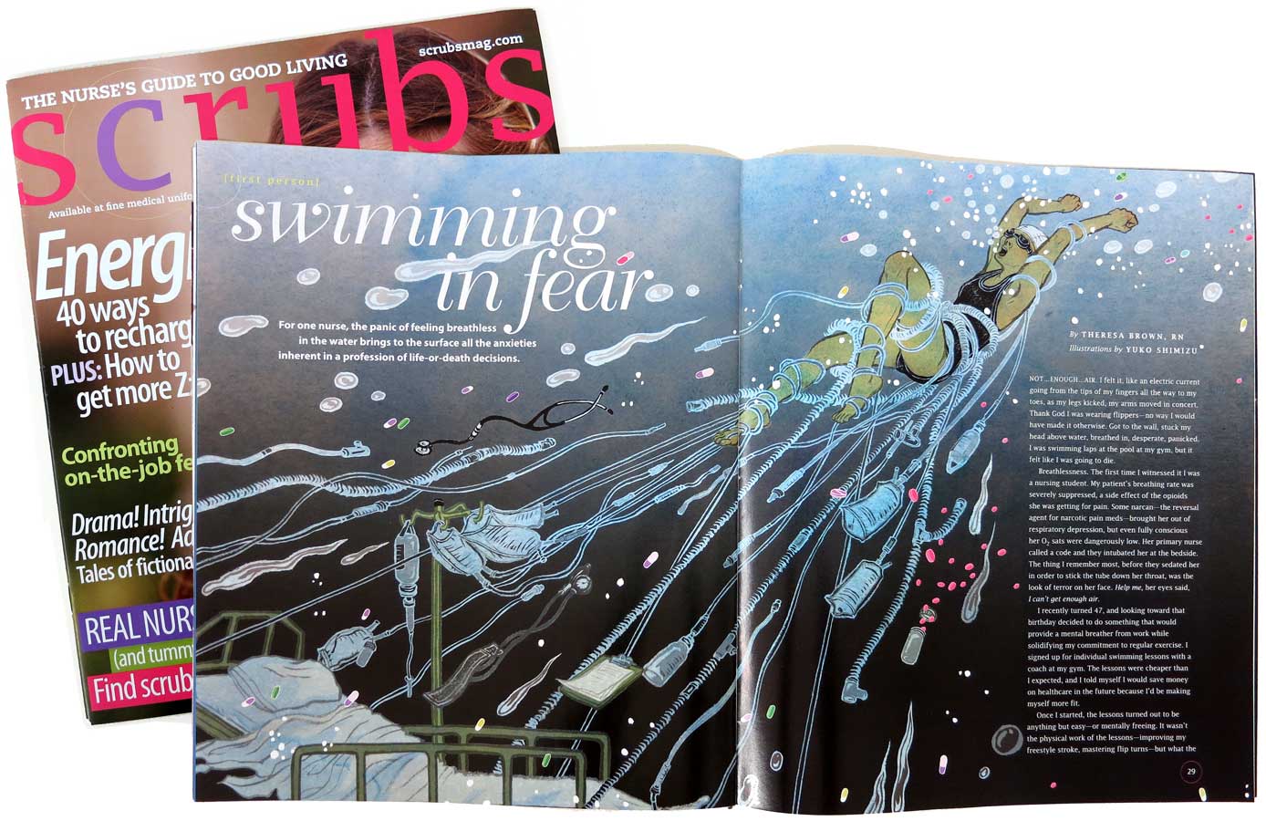
The illustration here is a project published recently in Scrubs, a magazine for nurses. The article was called Swimming in Fear, about a nurse’s fear of breathlessness in water compared to the pressure of being a nurse. When AD Maxine Davidowitz called me she said it was a perfect assignment for me. Indeed.

Why do I draw a lot of water in my work? The big secret (or not?) is: I have a severe hydrophobia. I can’t swim, and I know I will never learn how to swim.
Water theme that keeps coming back to my works are almost my secret fantasy. One of my favorite movies of all time is The Big Blue. It is my ultimate dream to  swim like a fish. (I also have fear of fish, by the way!)

Some process pics here…

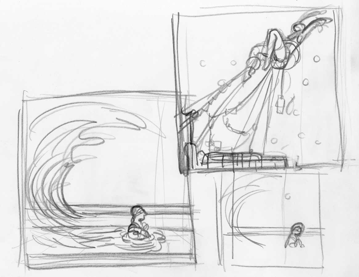
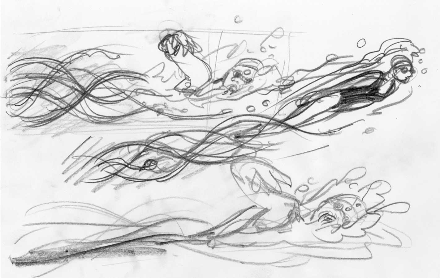
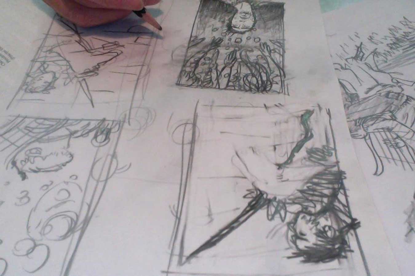
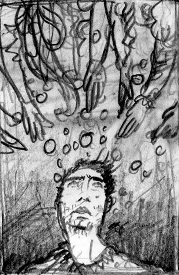
1) starting out with lots of idea thumbnails…

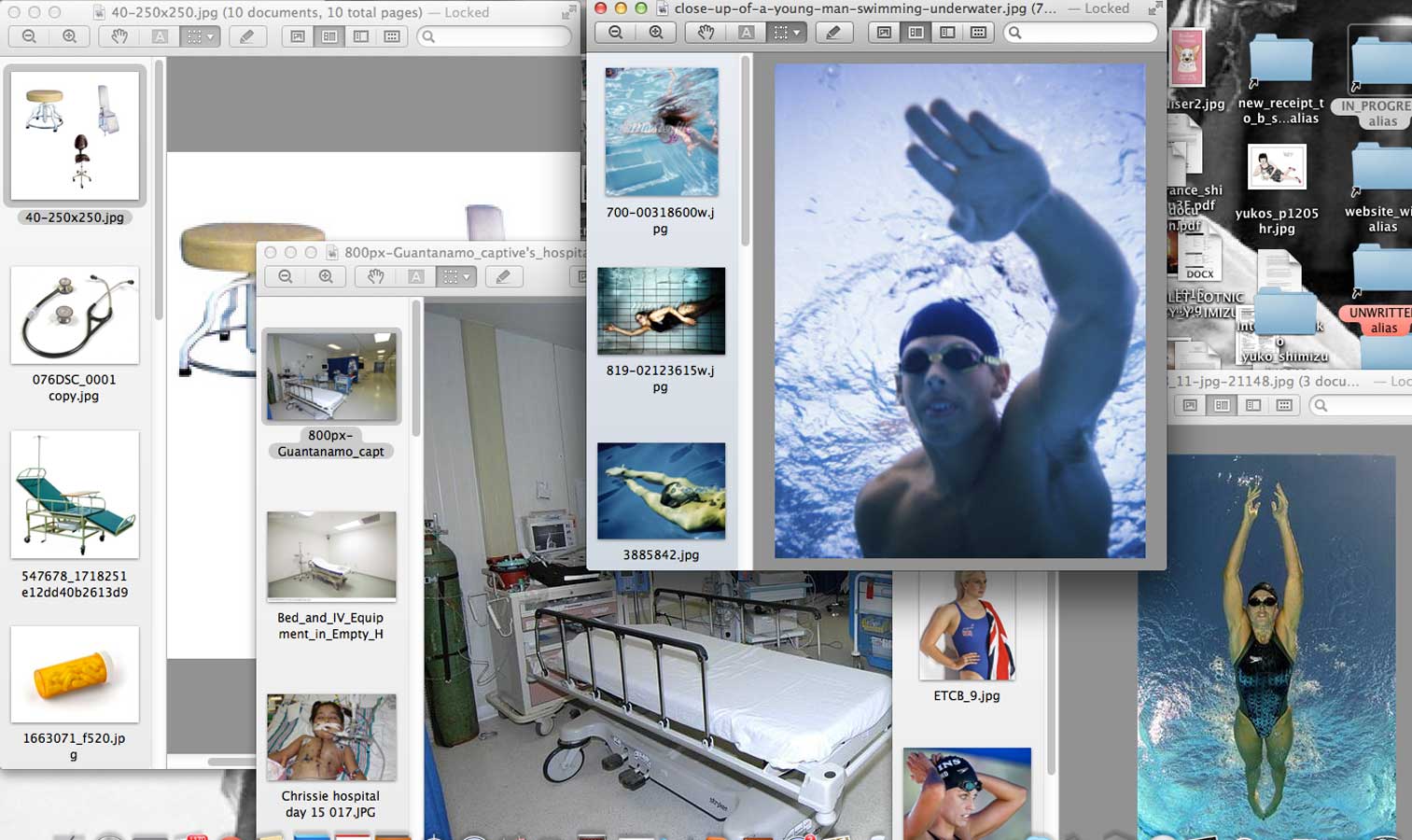
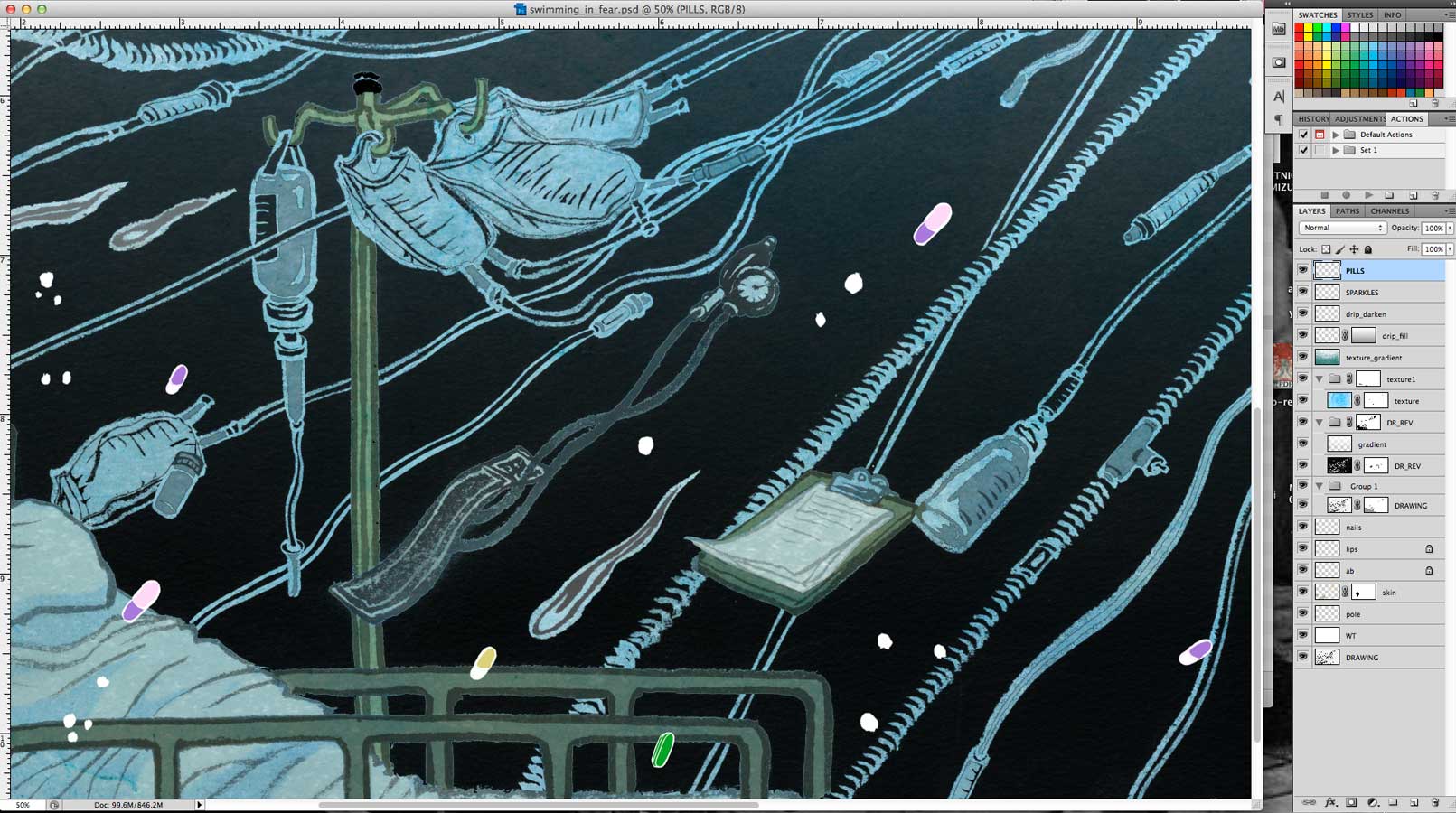
2) reference materials…

3) sketches

4) discussion with the AD, and minor adjustment to the sketch

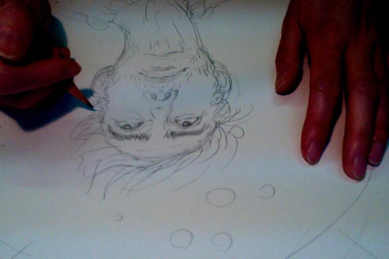
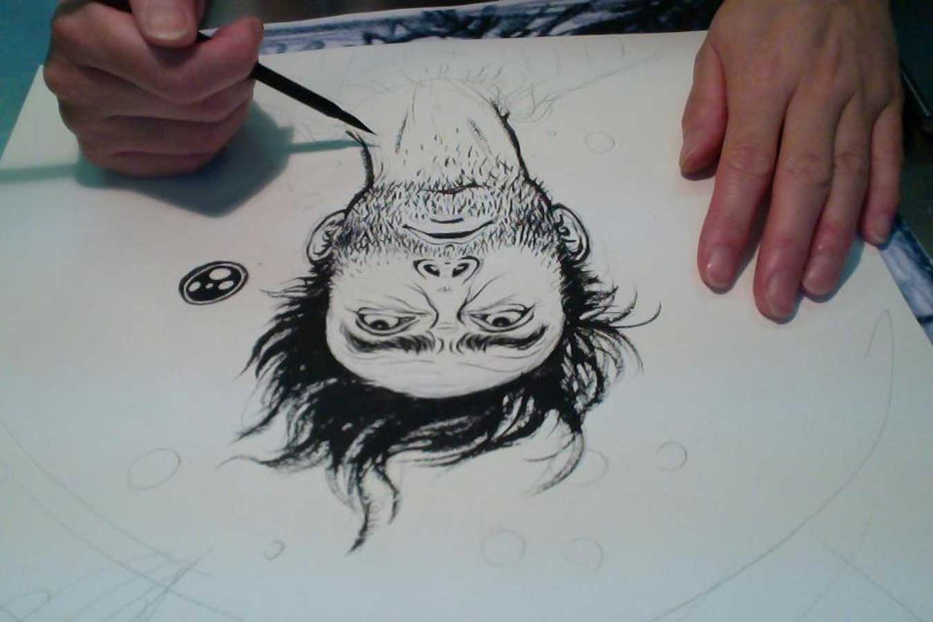
5) let’s draw! 

6) go through Photoshop coloring process, and then…. finish! (as you can see, not as many layers for this particular illustration, but lots of layer masks!)
"yuko shimizu" "swimming" "water" "scrubs"

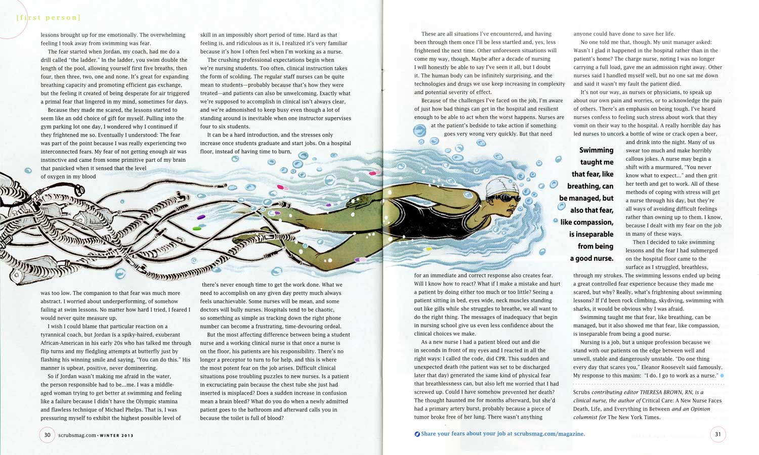
7) how they look on the pages


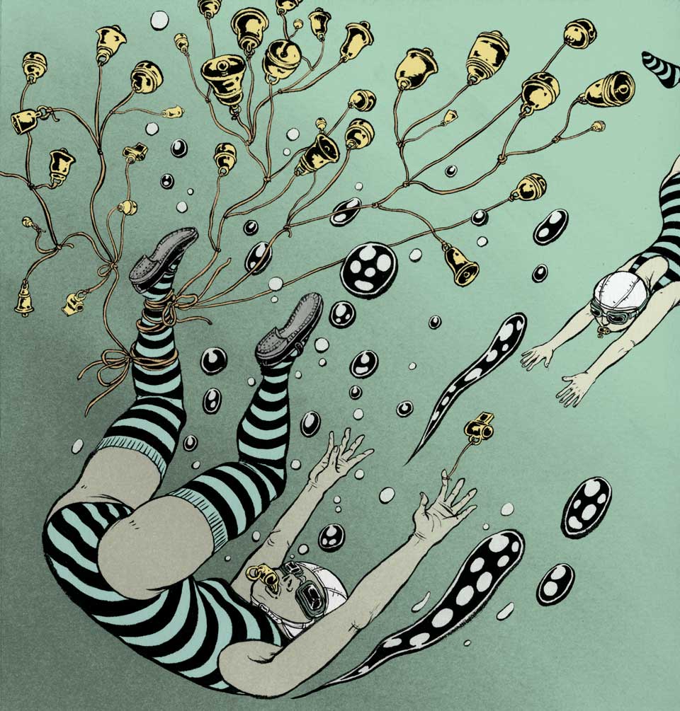
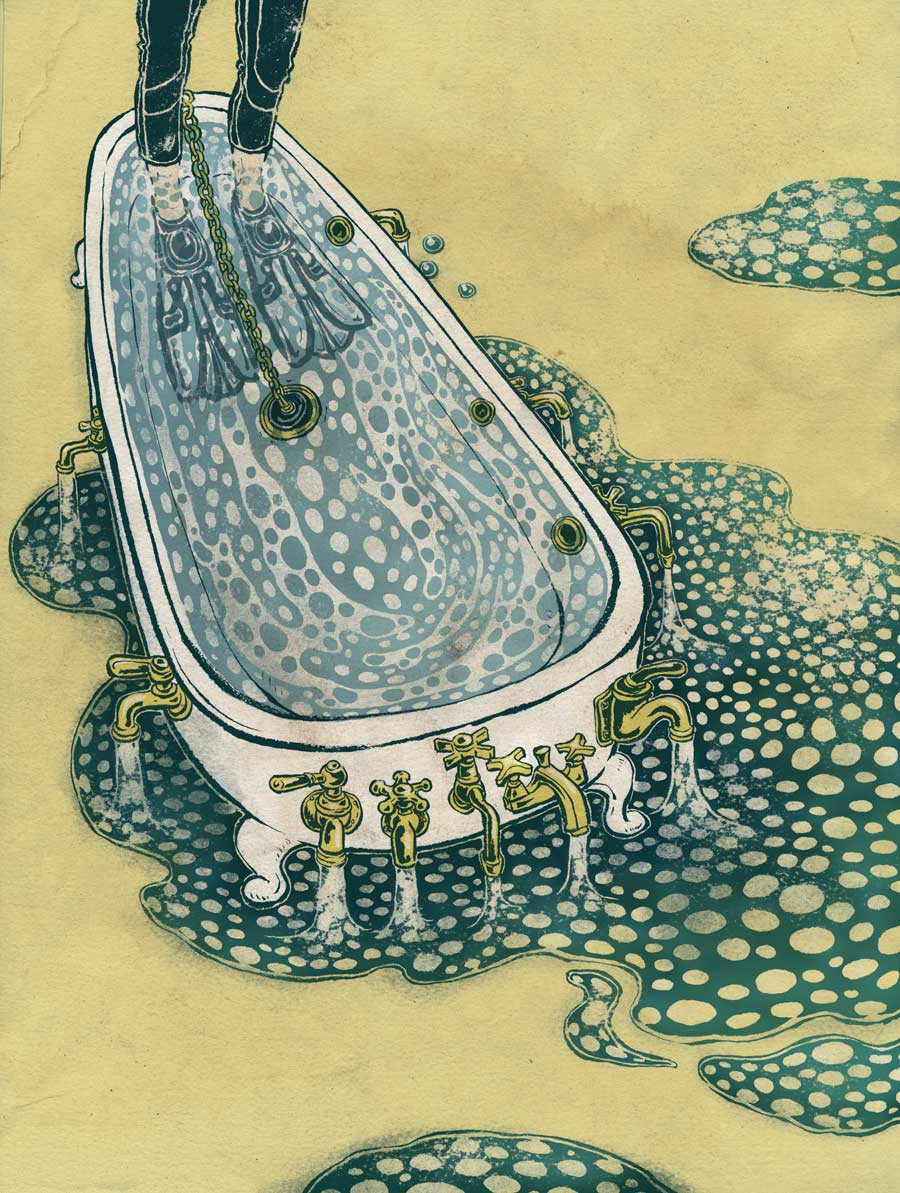
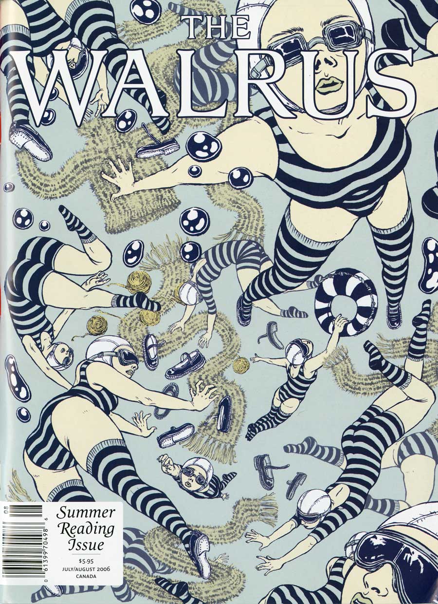
And…. here are just some examples of how water has been dominating my work (and life!).
PLansponsor: Bells and WhistlesPLANSPONSOR Magazine

Storage magazine Data Security
STORAGE Magazine

The Walrus coverTHE WALRUS Magazine cover

"yuko shimizu" "playboy"PLAYBOY Magazine

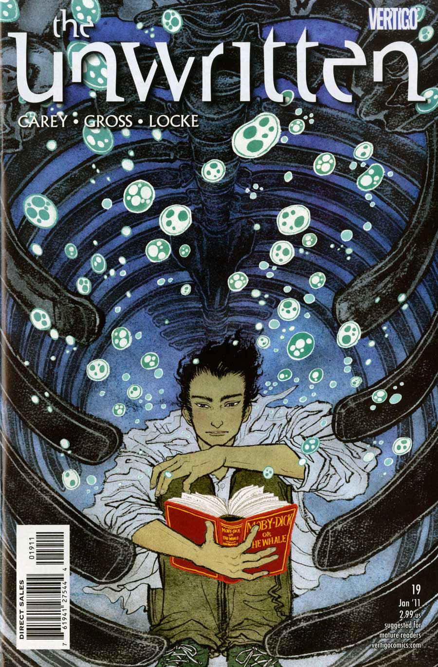
The Unwritten #19THE UNWRITTEN issue #19 cover

GQ Japan
GQ

Money Magazine money and fearMONEY Magazine

It’s here! It’s here! (it feels like Christmas already)

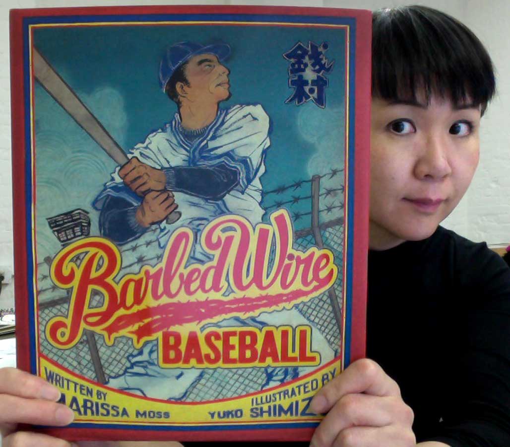
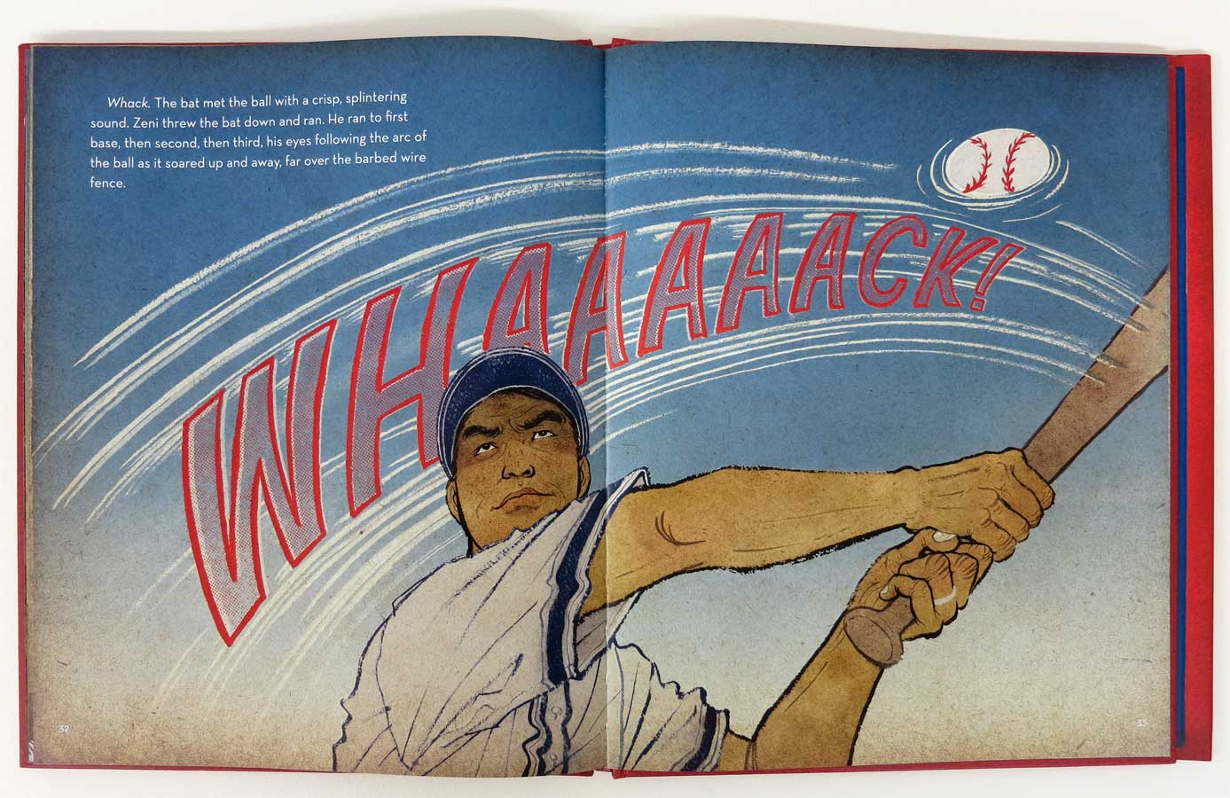
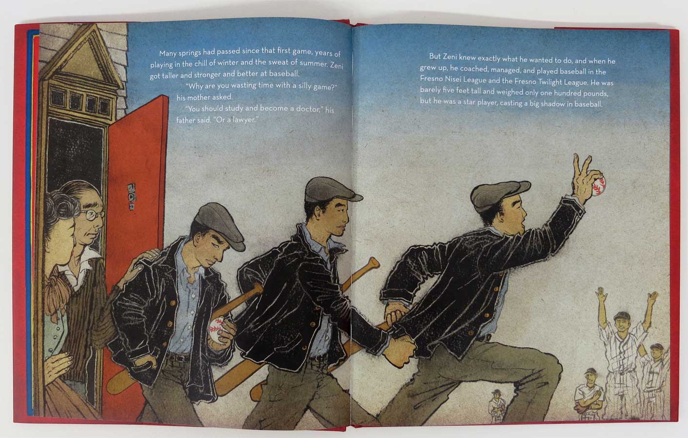
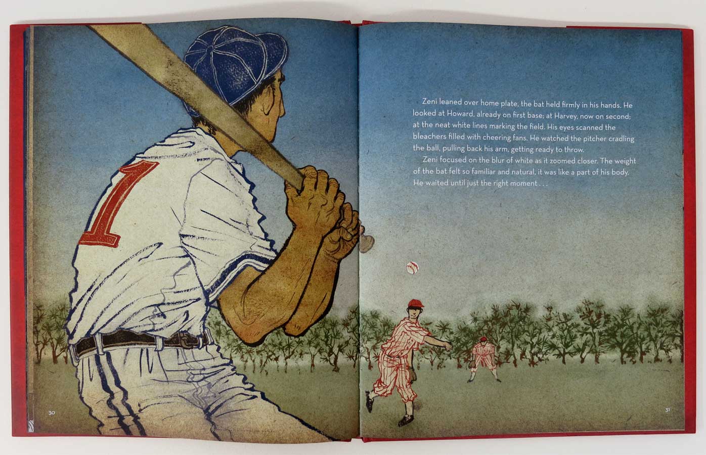
It feels like Christmas already! This came to my door yesterday. The first bound sample copy of my kids book Barbed Wire Baseball (written by Marissa Moss, published by Abrams, scheduled to publish spring 2013).

I have heard from peers who have already done it  that working on a kids book is a lot of blood, sweat and tears. OK, maybe not blood, but definitely the latter two were true. Actually to be precise, last fall when I was in midst of working on the interior pages, I lost hearing in one of my ears, probably from fatigue and stress. I had to run to an ER, then thoroughly get my hearing tested at a hospital.  So, blood part was not that far off either. (Thank you my BFF Gary Taxali for giving me a call to ease me when I was in pain)

But, finally finally finally, I am holding the book in my hand. And it is beautiful! Thank you AD Chad Beckerman for paying such great care even down to very small details in design. Thank you Dadu Shin and Victo Ngai for helping me with coloring process. And thank you American Illustration for including four spreads into their recent annual.
Book is ready for pre-order now.

"yuko shimizu" "barbed wire baseball"me, happy with the newly received book

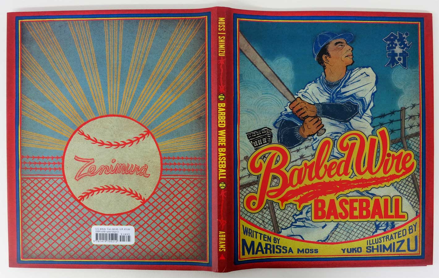
dust covers were inspired by old baseball covers. John Gall‘s Sayonara Home Run! was referenced heavily, and now John works for Abrams. Nice coincidence.
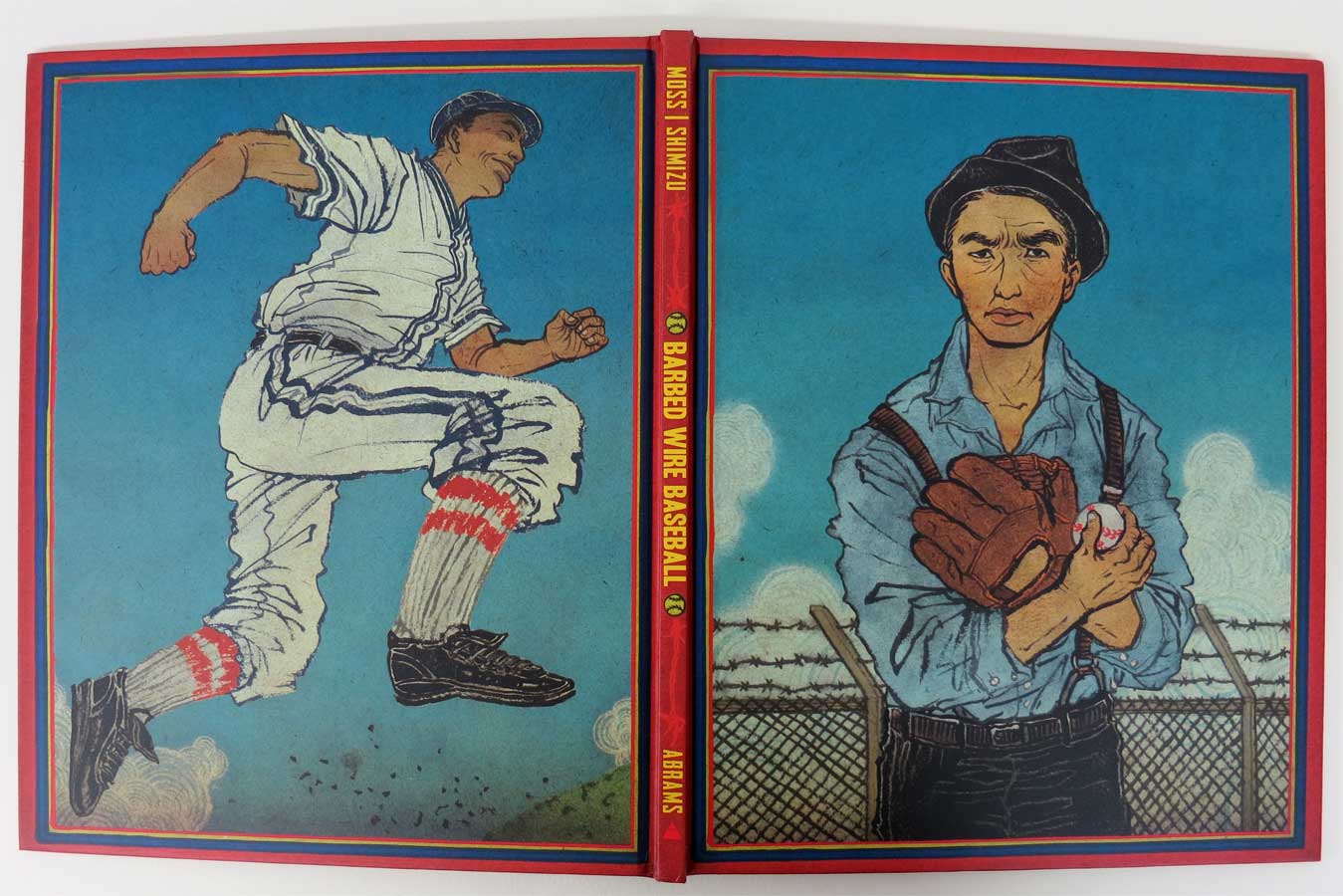
when the dust cover is off, a different cover design appears
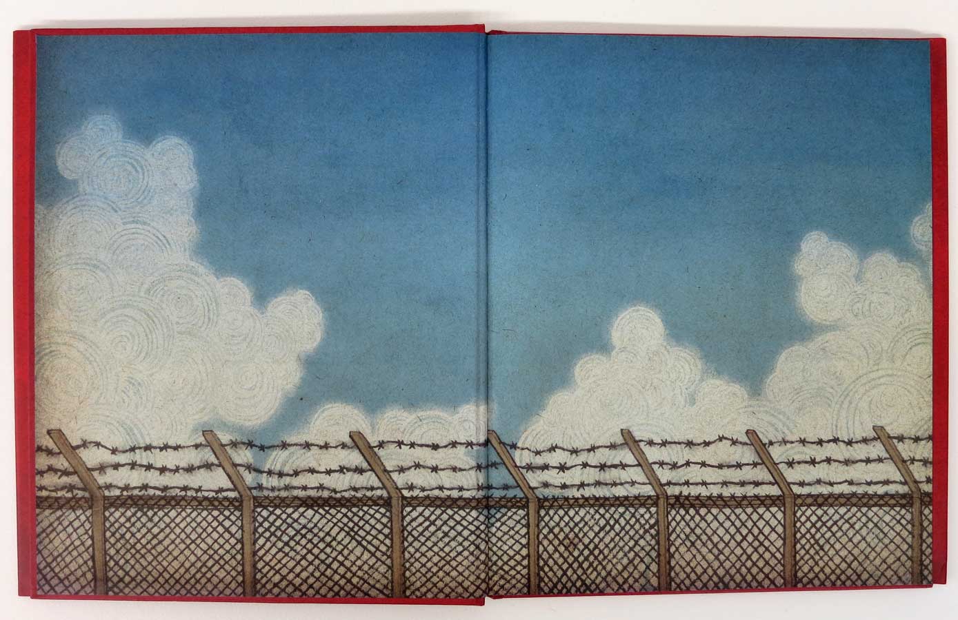
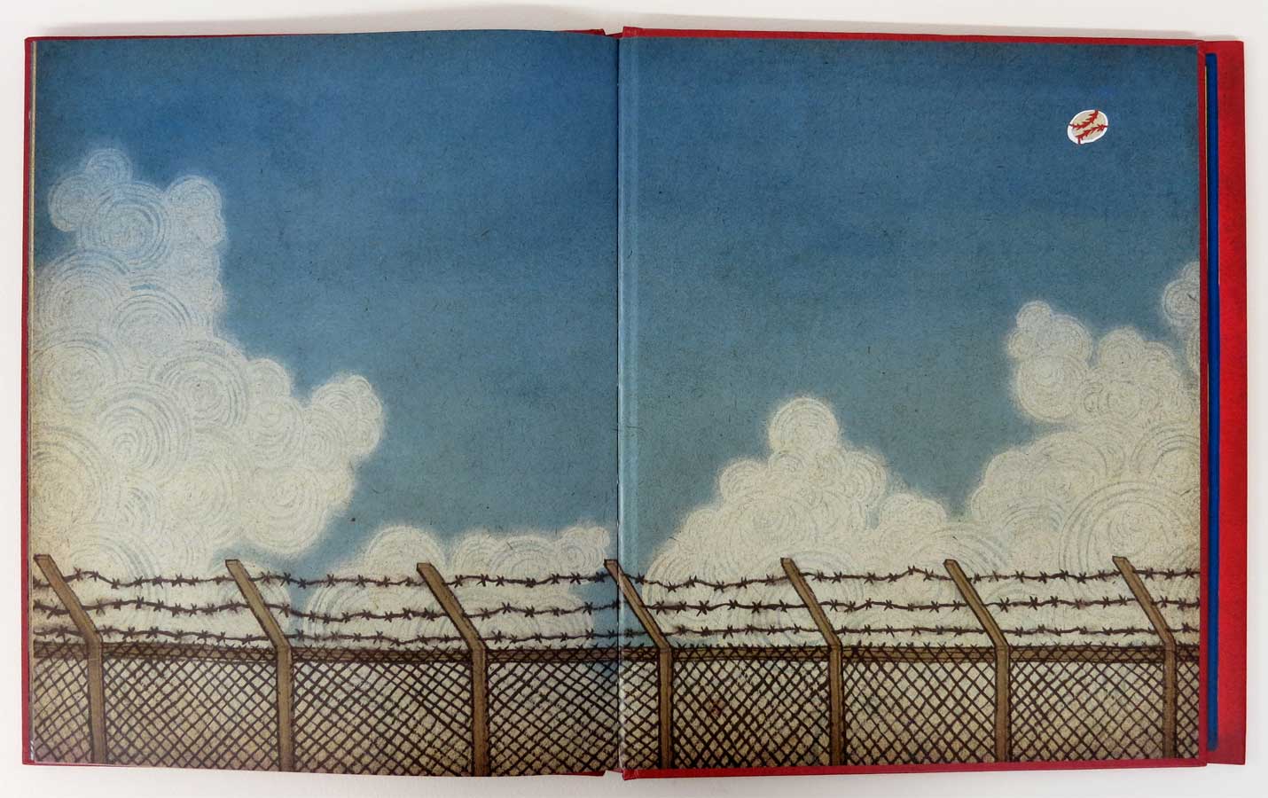
the front end paper is just sky and fence, but the back end paper has one more element, to go along with the story. you will see the other one at the end.
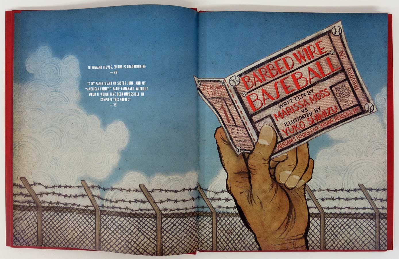
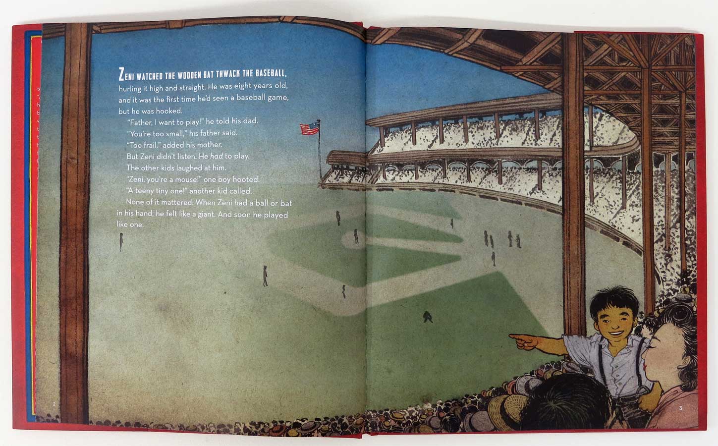
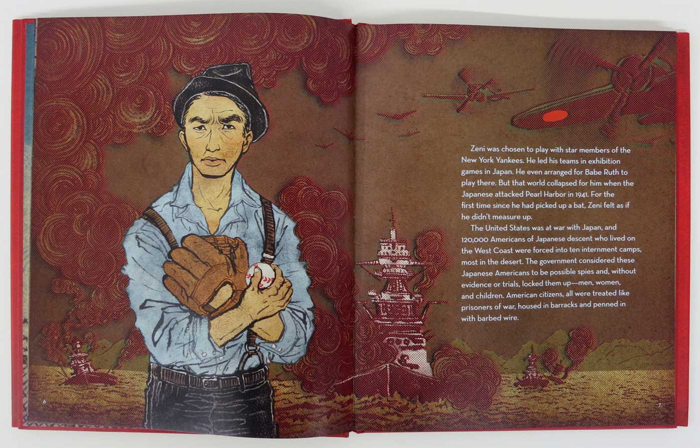
this spread was a bxxch to work on. I cannot thank Victo enough for helping me separate colors on this cray spread.
so, here is the other end paper. See the difference?
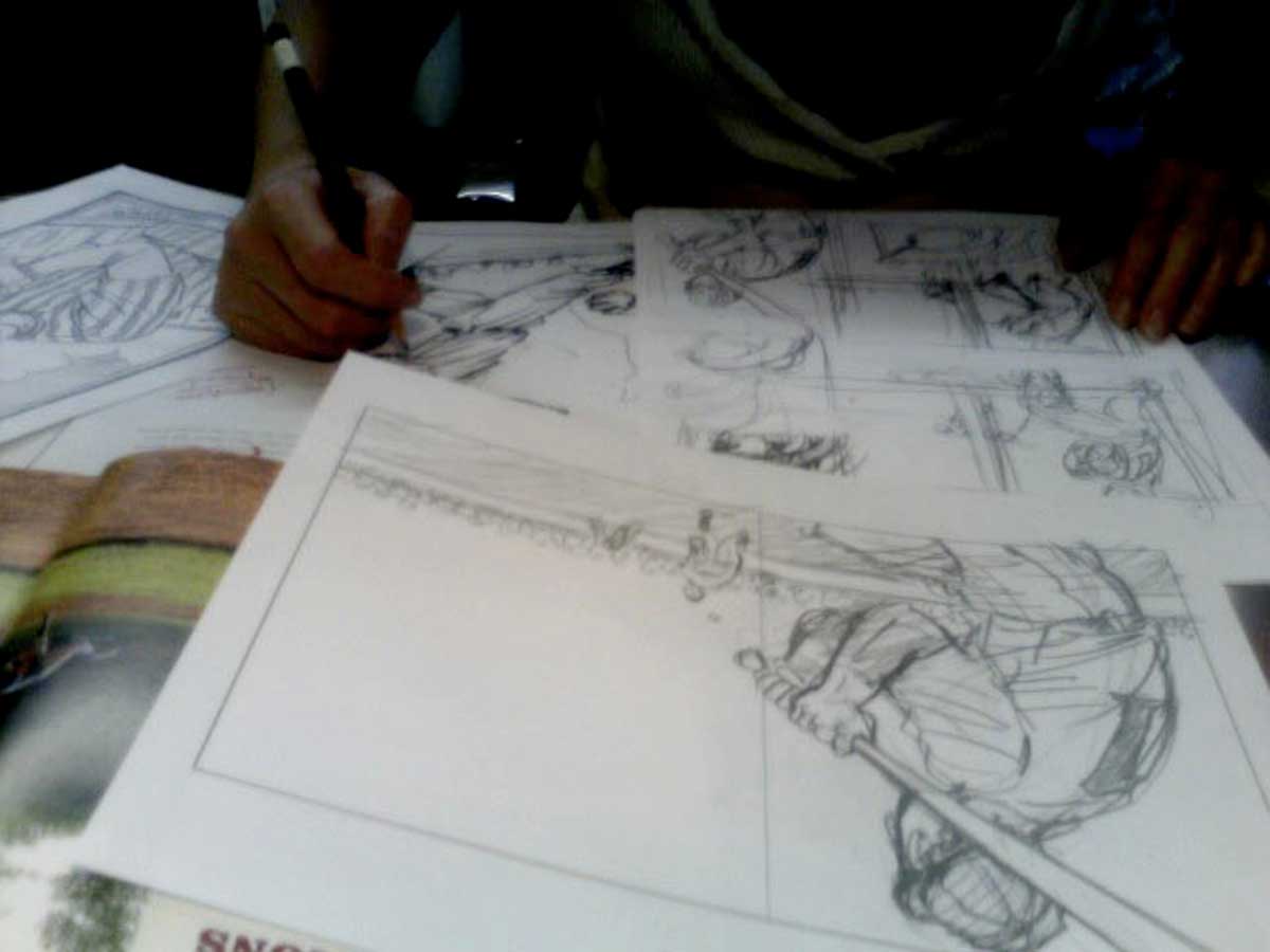
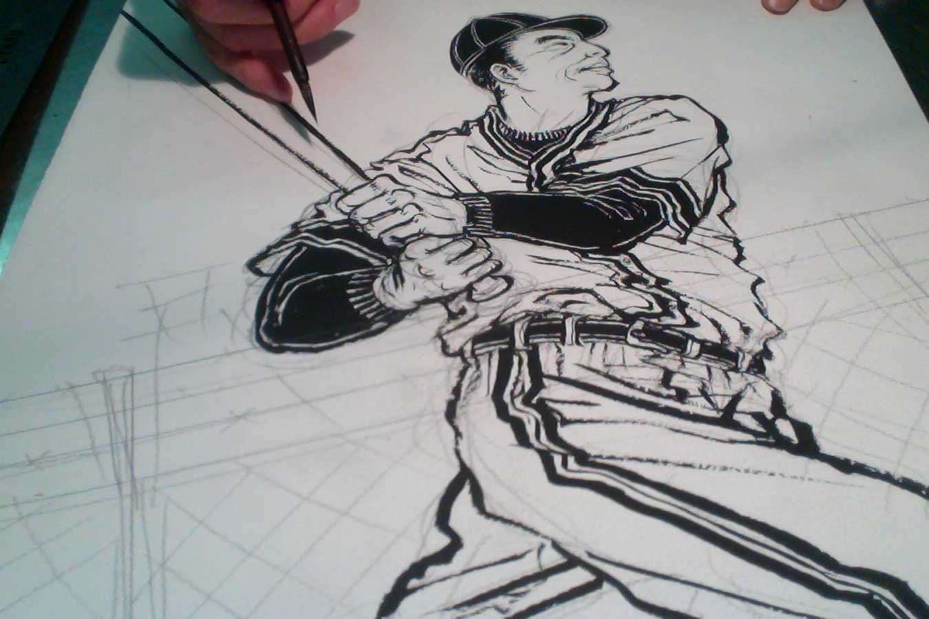
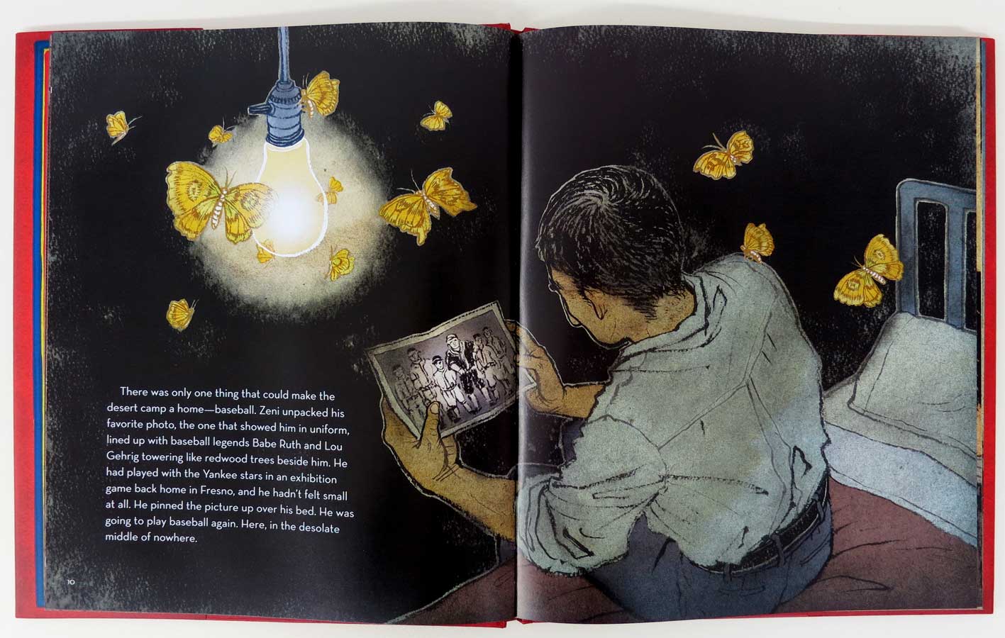
And, here are some process photos I took over the course of the project (photos sans blood, sweat or tears.)

how the hell I finished the most complicated illustration ever.

FastCompany is one of my favorite magazines. Once I said that to an illustrator friend, he looked very surprised and asked me why I like reading a business magazine.
Maybe it has something to do with my corporate background (I was in corporate PR for 11 years before I went back to art school). Maybe it is something to do with that I constantly think of myself, a freelance illustrator, as a small business, not more so, but as well as being an ‘artist’.

When FastCompany called me for a double page opener, I got really excited. Then I took subway down to their beautiful office in World Trade Center overlooking WTC Memorial for a meeting, and soon realized what I got myself into! It turned out to be, as far as I can remember every editorial job I have done in past ten years, the most complicated piece I would ever end up working on.
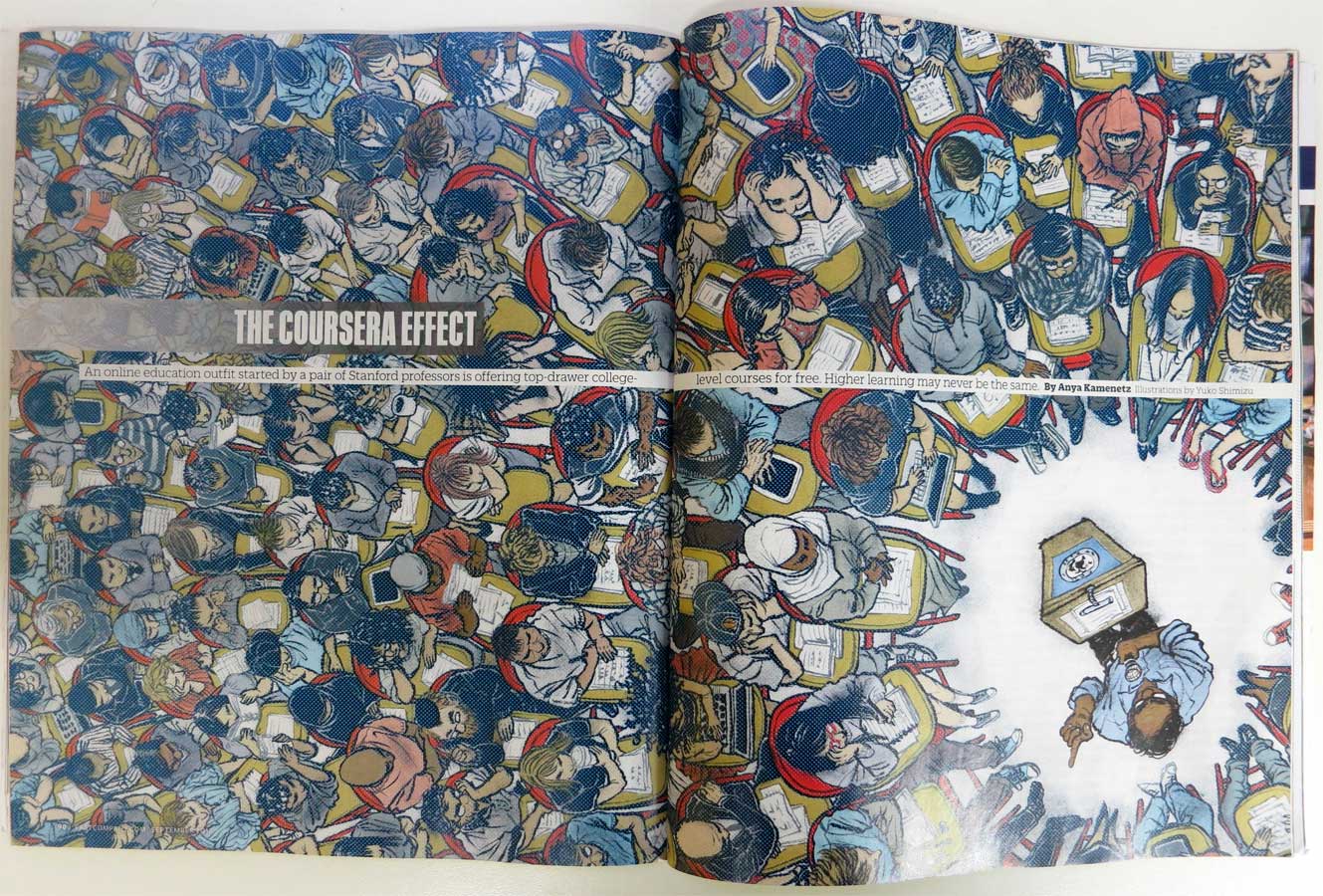
I will show you the result first.

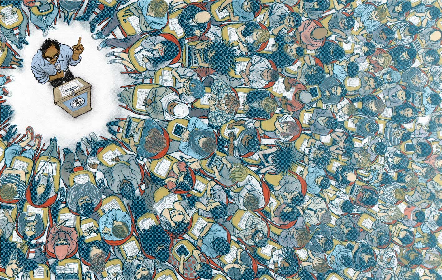
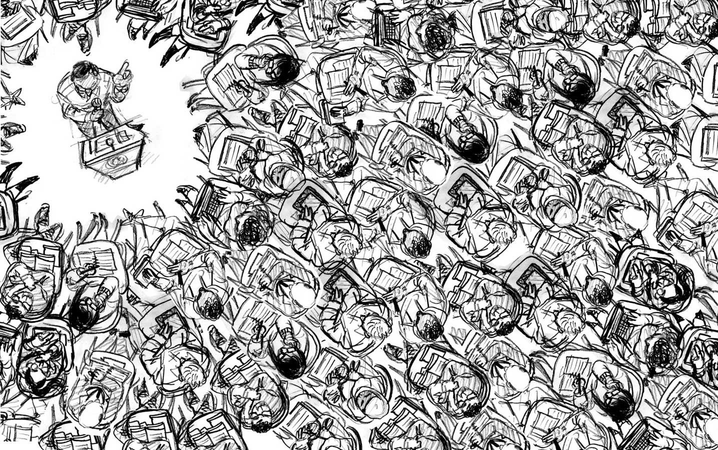
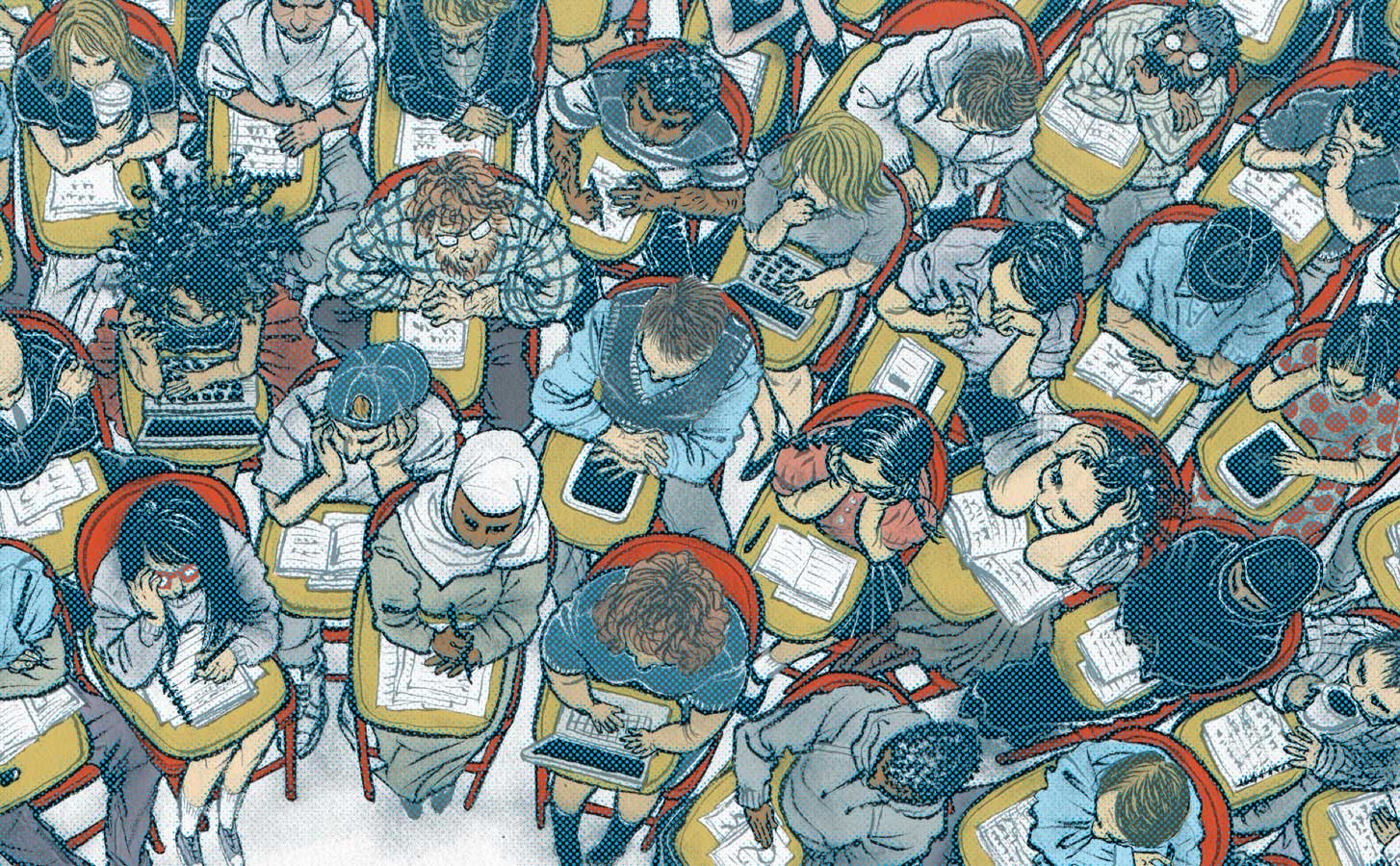
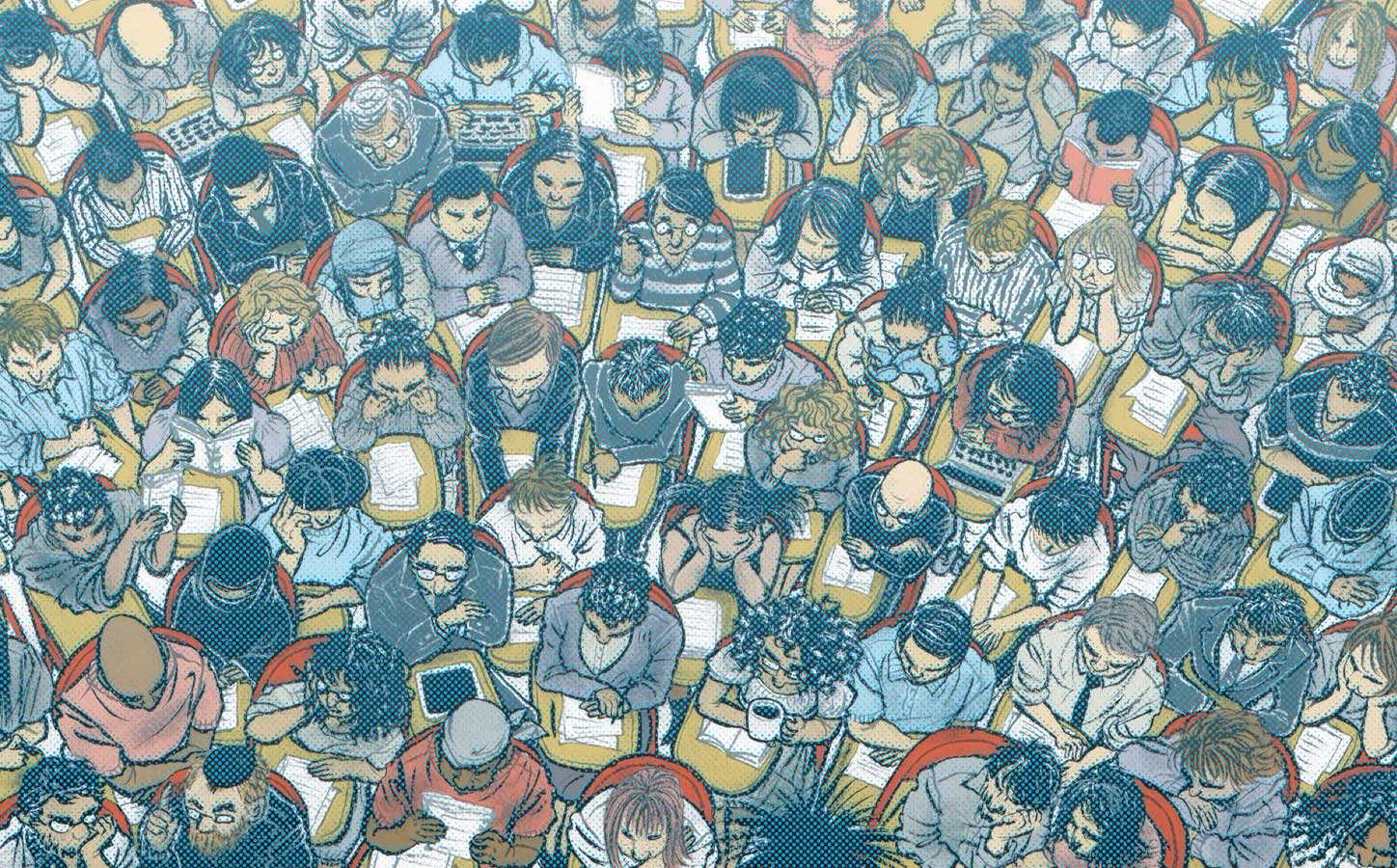
The story was about Coursera, an innovative online higher learning which may change the way we think of college education. They wanted a space filled with different students from all over the world listening to a professor talk. Oh boy, what did I get myself into??? But for my favorite magazine, I should just try to do the impossible!

Initial sketch after the meeting. ‘it’s good, but we want more people fitting into the spread’. Oh boy.

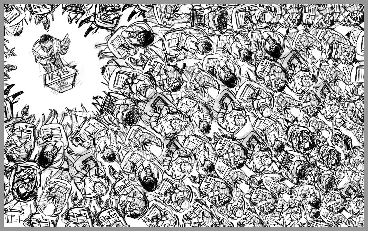
So, here is the revised sketch. We decided to slightly distort the perspective, so students are smaller as they go farther away from the professor.
Sketch get approved! Now what? Non stop drawing for days and days.

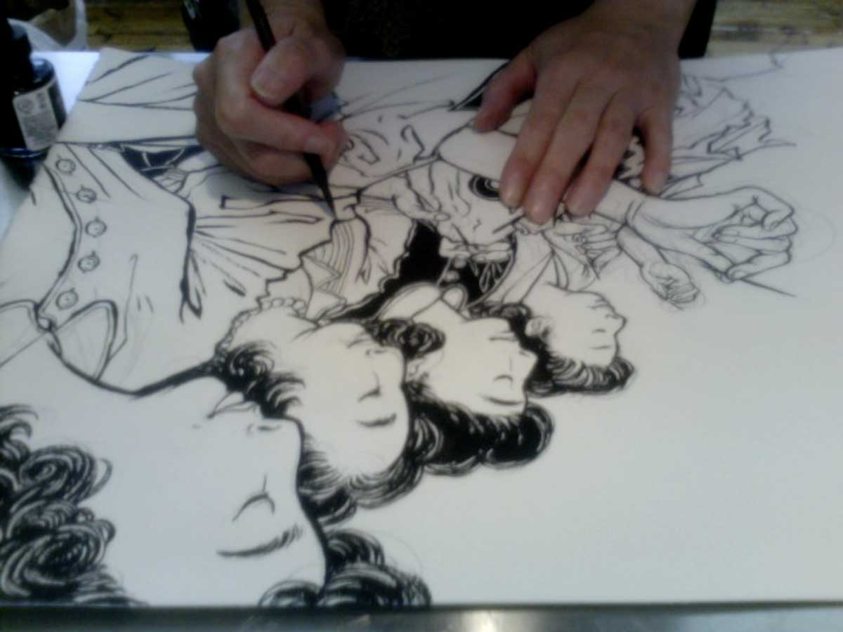
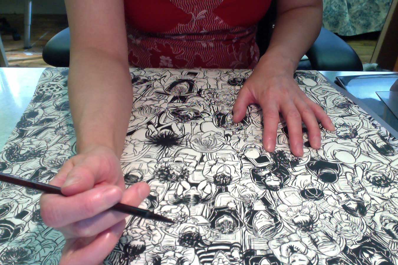
Here is me drawing. Non stop for days. I have downloaded some college student photos, but I soon ran out of characters, and started filling this out thinking of some of my personality-filled friends and acquaintances.

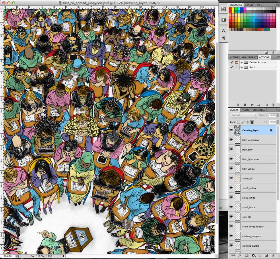
I cannot thank my studio-neighbor Jungyeon Roh enough. I finished the drawing on Friday, then I had to take off to speak at Illustration Conference ICON7 in Rhode Island. While I was traveling, she helped me as coloring assistant. This was what I asked Jungyeon to do. fill in the basic colors, so I can tweak and fix when I came back on Monday morning.

Here are some details of finish. Every single student here is different. Because I ran out of ideas, I sneak in some people I know, like the red-head beard guy is my current studio-mate Jacob Thomas, and I am the one on the right hand corner with bangs with red polka-dot dress…

And some Jewish men from neighborhood, as well as my friend Sara Varon’s former Olympian boxer husband in du-rag, aged Harry Potter, single mom and maybe even Stefan Bucher makes the cameo.

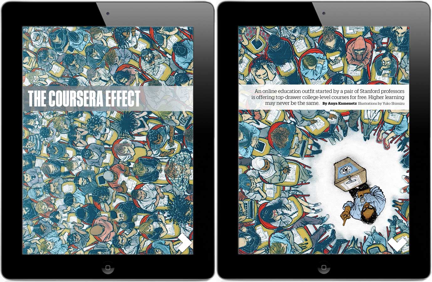
I cannot believe I finished this! And this is how it looks in the magazine. (They flipped it the other way) What’s cool is I subscribe to the iPad version.

To be honest, I am not sure where I had the energy and stamina to start and finish this on time. But, isn’t it also what I love about my job?: accomplishing something unknown, scary, and not sure if you are able to do it. Then you just do it, and the satisfaction you get from getting it done!

Last but not least, big thank you to Creative Director Florian Bachleda (who has been extremely nice and supportive since I was just starting out) and Art Director Alice Alves. Thank you for challenging me with creativity.
And here is a little extra: the view from Fast Company office! Oh wow.

posting on Facebook realtime (and talking to strangers while I work).

One time a friend jokingly said that I have a ‘full time position at Facebook’. What she meant was, that I was on it a lot. Yeah, OK, true. Especially when my studio-mates or neighbors are away and I am the only one on the floor. I need some social life.

I have a private page that I only accept people I personally know as ‘friends’, where  I mainly talk about non-work. And, there is this public page where anyone can join and post or comment. Initially I was a bit skeptical. I felt it was a bit too arrogant, or something like that. But the more I do, the more I like it.

I get e-mails from total strangers often. Asking for questions or favors, and sometimes messages can be long and take time to read them all. It can be a bit heavy and charged, and often I don’t have enough time to write a nice answer back. So, I put them aside, and end up never having time to write back. But with Facebook, everything is short and quick, and I can jump into conversation short and quick too.

I like watching other artists’ process. It is like peeking into the back stage. So, I want to do the same on my page too. However, often, there is non-disclosure agreement, or I have to be careful what I can show and not show because the clients have the first publishing right.
Some clients can be a bit easy on artists though, like DC Comics whom I have been working monthly for close to four years. They usually put the finished art up on the web the day after I submitted it.

So, here came my first experiment to put every step on FB  real time, from sketch to the final.
Some of you may have already seen them all, but I thought it was nice to keep the record here. And it was really fun communicating with strangers while I kept working and making progress. 

1) July 17 (Tuesday)
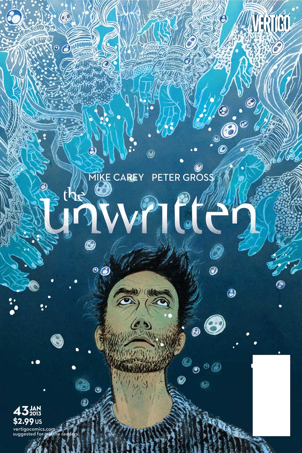
sketching Tuesday morning… cover for The Unwritten’s latest issue #43. We usually starts earlier in the month, but I was busy as well as the team was at ComiCon the weekend before.
Editor Shelly Bond’s memo was: “I think Tom should be on the cover, since we haven’t had him in a while, and besides, Tom has a new scruffy look, which is very attractive. But I also would love to see your drawing of unicorn too” .

2) July 20 (Friday)
Sketch got accepted in a day or so. I was finishing up other projects. Starting to ink this one as final.

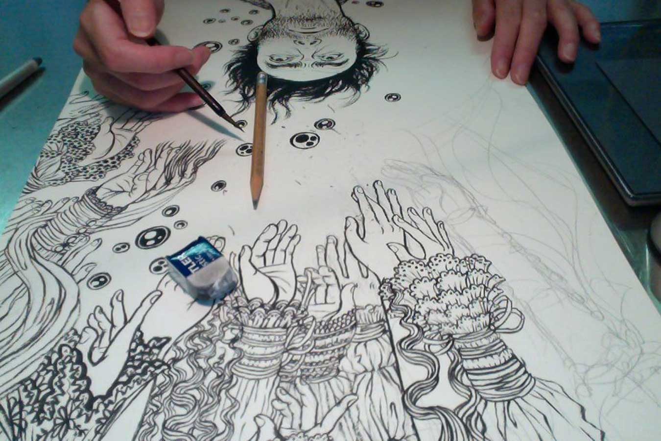
3) same morning, trace the sketch onto watercolor paper and started penciling. My pencil underdrawings are usually so much looser, but this one is all about his face, so I go into details. Paper is TH Saunders Waterford cold press, pencil for underdrawing is usually HB so it is light and erases easily. (pencil for sketches are usually 3B to get the drawing down quickly)

4) same afternoon around 3PM. This is what I wrote on FB:
Face is pretty much done inking. Now I can take a late lunch break before a conference call at 4PM (with another client).
I usually don’t use photos for face, but this is such big part of the image, I decided to downloaded whole bunch of photos of men looking up for reference. Though, it doesn’t look like any particular one of the photos at the end. (just small details count, like how the eye balls sits, etc. )
india ink is from Dr. Ph. Martins Black Star Matt. Brush is a Japanese calligraphy brush. (more details on my supplies on FAQ page)

5) July 23 (Monday)
I worked till late on Friday, and took the weekend off to spend with a house-guest from Paris. Back to drawing table again. Close! The hands are of Victorian ladies. Used fantastic Fashion book from Taschen as reference and inspiration to get all the details in. when it is all about simple and graphic composition, balance between bold composition and intricate small details becomes the key. It cannot be too much about the details, or too much just about compositions.

6) July 24 (Tuesday)
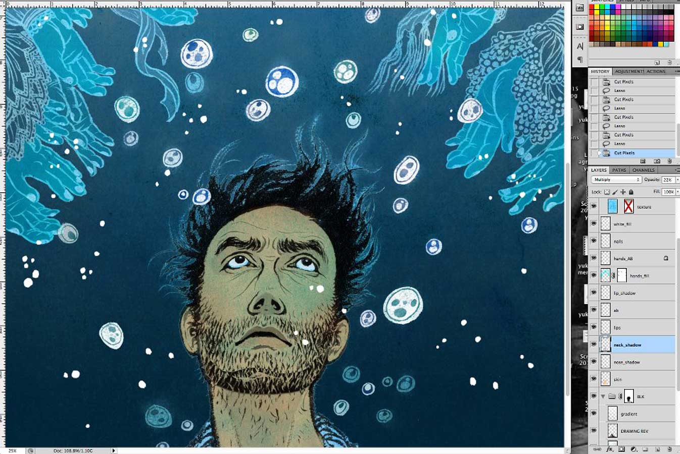
One week from the sketches got started was the deadline day. I jump started on coloring the night before, and got most of the color scheme and details done. With fresh eyes, more into minor details, then to graphic design laying out all the text and logo. (I have been doing most of designs since issue #28)  Color is entirely done on Photoshop CS5.5.  Very long and complicated process. I often get asked things like ‘how do you color the lines?’ or ‘how do you put textures?’ But really, there is no one simple answer to those questions. Many different ways to color different part of a drawing. Hours and hours, and hours, of work.

7) same day in the afternoon.  Tadaaaaaa! It’s DONE. I had spent way too much time laying the text out, but finally I was happy.  I wanted the text to to sort of flow up the water with the bubbles. Editors let me do a lot smaller title treatment, and the title is fading out…

As you can see, this issue won’t come out for a while, but other issues keep coming out every month.
Thanks for reading! And, hey, talk to you on Facebook?

The Man Who Sailed His House

The Man Who Sailed His House illustrationDear Yuko,
I really enjoyed reading your postings on Drawger (as a lawyer who’d rather be an illustrator it is a nice escape from reality!), but it seems like these days you don’t update Drawger very often – I think your most recent post is January 12. The reason I like your postings so much is that you explain how you do things, which is really useful for rank amateurs like myself. I was wondering if you post more regularly on another website? If so, are you able to let me know what that website is?
Kind regards
I saw this e-mail in my inbox this morning when I got to my studio.
Yes, I have just been thinking about updating my Drawger. Actually, for quite a while. Whenever I go on a business trips to different schools, often students or instructors tell me how much they like my posts because they show not just the final piece, but the process where they can learn.Life is not easy. We never have time. Work load has been a bit of insane status since beginning of this year, second semester in teaching is always more work than the first semester (not sure why, but winter weather adds to it, definitely). Multiple business trips to lecture and teach (because travel is my hobby and reason for me to get outside of NYC), also, getting my website redesigned, by awesome web design studio, but I still have a lot of work to do myself…. yada yada yada… We never have time. That is true. But the e-mail this morning woke me up. I’VE GOT TO UPDATE MY BLOG RIGHT NOW!
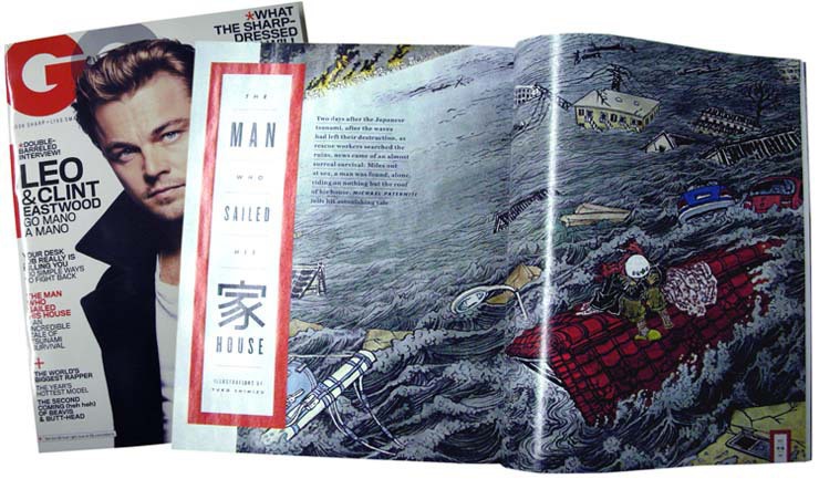
So, before going into the regular routine of a day’s work in the studio, I am posting this now. It is for you, Mr. A.C.G. Since the new Communication Arts Illustration Annual came out, I decided the first post after hiatus is one of the winning piece, which I worked with GQ for their October 2011 issue. AD was Chelsea Cardinal.
The Man Who Sailed His House illustration 2
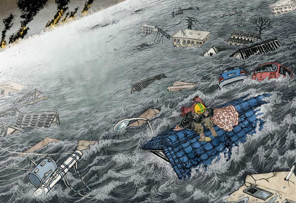
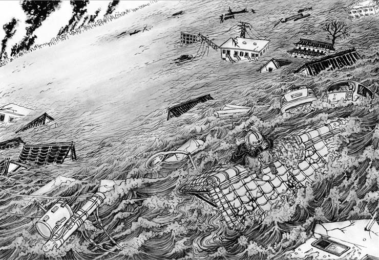
The story, titled The Man Who Sailed His House, was an amazing story of survival of one man during Japan’s earthquake/tsunami in March 2011. He was washed about 1Km ashore on the roof of his house when he was rescued days later. Above is the b/w version of the drawing for a double page opener. About 30″ x 22″. India ink with brush on watercolor paper.
The Man Who Sailed His House illustration sketch
I made three initial rough sketches and sent them to Chelsea. She picked the bottom left, from which I made more fefinied sketch (which is still rather loose).
The Man Who Sailed His House illustration references

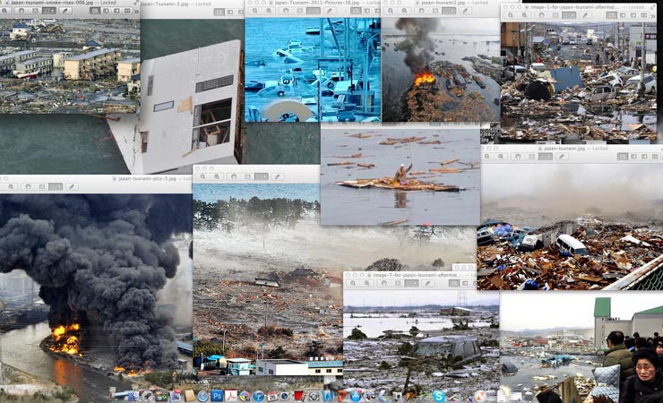
There are way more than what you see here, but some of the reference materials I had found on various news sites on internet. Really charged photos… to be honest, it wasn’t so fun staring at them for days, although the project itself was fun. The one in the middle with a man waving his hand is the only photo there was of Hiromitsu, the main character of this story. (And thus I knew why they needed to hire an illustrator for this project).

The Man Who Sailed His House illustration 3

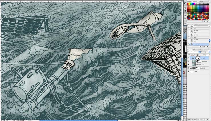
Screenshot of the beginning of long and tedious coloring process on Photoshop CS3 (since then I had switched to CS5.5)

The Man Who Sailed His House illustration 4

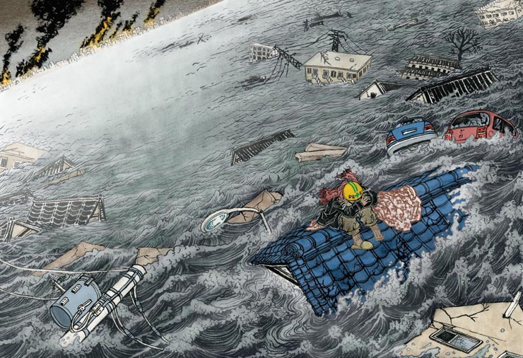
I was quite happy with the color. Very nutral, with only bright thing behing his helmet, which is the same color as the big fire far away.

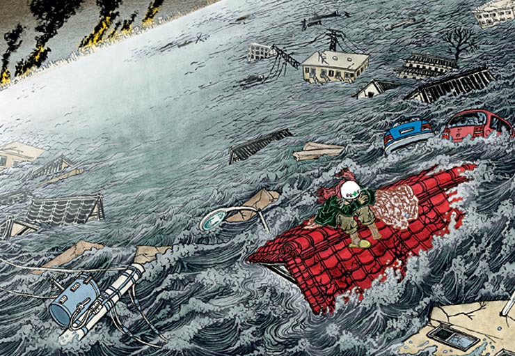
… then some emergency happens right before the image goes to print. The full article was not available when I finished my illustration. And we found out that there are specific color references clearly written in the final article. So, the color needs to be tweaked around. But it was such a last minute decision, GQ production department had to take care of it.

Below is the final result. Red roof, yellow shoes, white helmet….

The Man Who Sailed His House illustration 5

The Man Who Sailed His House illustration magazine

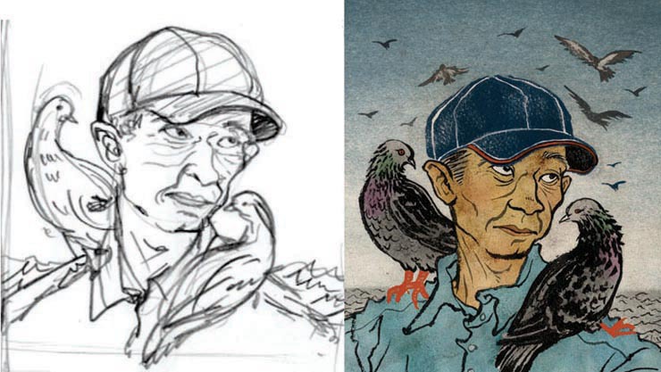
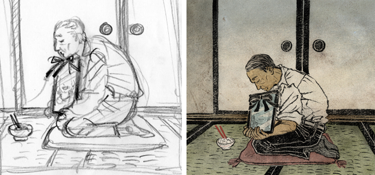
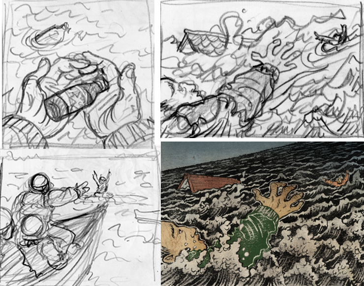
There was one more spot illustration in the print version of GQ, which was Hiromitsu’s portrait. Also, what was new to me, was that they asked a few more on top for the iPad version of the magazine, some of which are posted below the portrait.

The Man Who Sailed His House illustration 6


The Man Who Sailed His House illustration 7


The Man Who Sailed His House illustration 8

If any of you are interested in this amazing story, you can read the article on GQ website.

On another note, I will try (TRY!) to post at least one or two process from now on. I will either post other works that got accepted in Communication Arts, or related Japan tsunami piece I recently did for Japan Times.
Til then…

Killed Job Of The Year 2011

Kill Job illustration 2011

It’s December. This is the time of the year when I look back and give the light of the day to the sadly killed jobs for one reason or another. Yap.

This year, it happened in January, and I knew immediately that it was going to be my “killed job of the year.”
My first TIME Magazine cover that never was.
Yap.

When TIME called and asked me to do an illustration, that, by itself, I was really excited. I have worked with TIME in past, but not so often, so phone call from them is always exciting. I think the good thing was that when they initially said ‘half a page or full page” later turned into “maybe possibly cover”, then “maybe possibly a cover and interior illo”, I didn’t take it too seriously.

Oh of course, I did take the job very seriously. But I have worked long enough to know not to keep my hopes too high when I hear something that sounds just too good to be true. (Although, I know Tim and Edel and a few others here on Drawger have done multiple TIME covers in past. For me, it is still a dream. And I am in peace with it. )

When eventually, the magazine has decided to go with a photo for the cover, I wasn’t surprised. The photo felt more like TIME to me anyway.

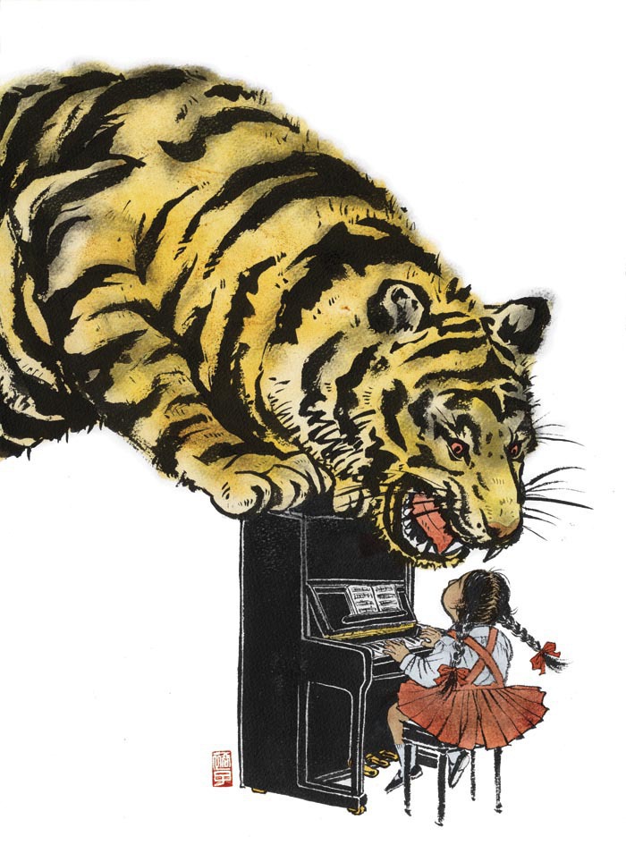
It was a bit sad when eventually neither of my illustrations got published. But hey, the one with the tiger and piano got accepted into both American Illustration and Society of Illustrators annual, and then published in my first monograph (I will talk about this book some other time). I cannot ask for more. Thank you Andree Kahlmorgan and Emily Crawford for giving me an opportunity to work on an image that I am really proud of.

Kill Job illustration 2011 sketch

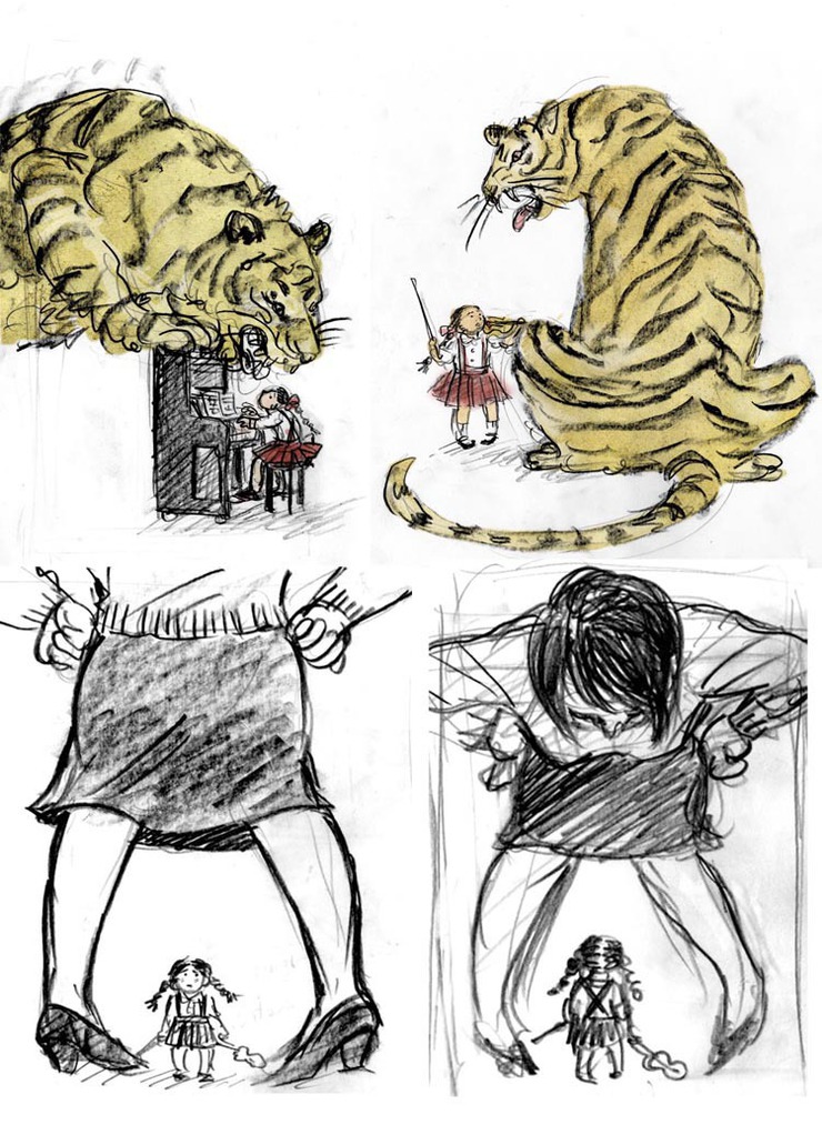
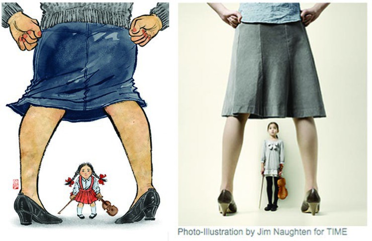
It was an article about tiger mothers. Remember, it was all the rage in early 2011? So, initial cover ideas were on top, drawing actual tiger. Then they asked me to draw the big mother and small daughter, which would look great as photos, but not so interesting as illustrations, I thought.


Kill Job illustration 2011 another illustration

I found the image on the right on TIME website. Works so much better in photo than illustration, I think.


Kill Job illustration 2011

This was my pitch for the cover, and although killed, I am still very happy with the image. Most of the illustrations I do have a lot of details, but I am a big fan of simple graphic image.


The Influentials

The Influentials small image

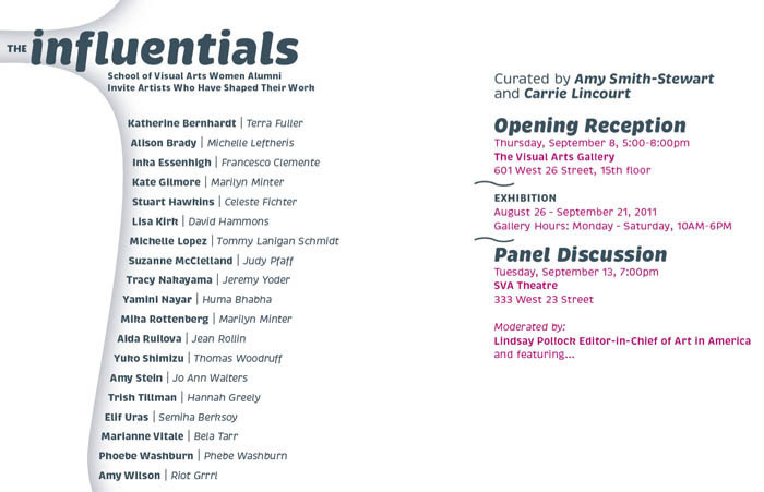
Tomorrow evening at The Visual Arts Gallery is an opening for a show The Influentials. It is a show of SVA female alumni and their mentors showing works together side by side. I don’t know how I got to invited to be in this show of mainly fine artists, many of them very established, but anyway, I will be showing, together with Thomas Woodruff, who was my undergraduate illustration instructor, then grad school personal advisor, and currently my boss/chair at BFA Illustration program where I have been teaching since 2003.

I wasn’t sure what to show at first. I wanted to show something I hadn’t shown anywhere, which, in process, is not illustration.

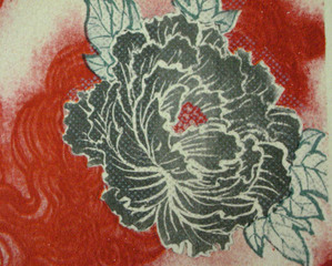
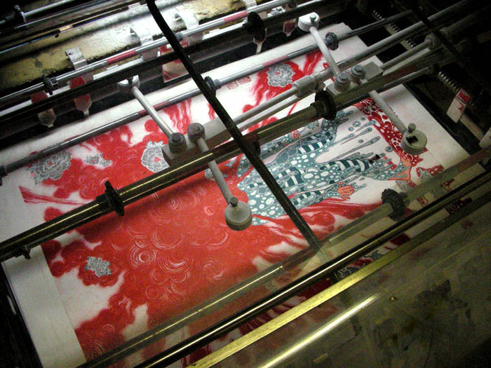
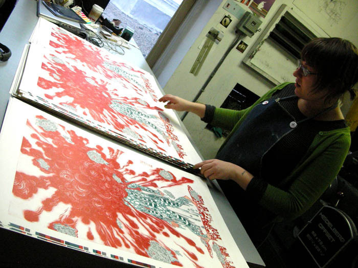
When last severely cold winter was getting started, University of the Arts kindly invited me to participate in the Von Hess Artist Residency, to create a limited edition multi separation offset print with the master printer Amanda D’Amico. Since the print got finished, I was looking for an opportunity to show. So, this will be what I will be showing. Without Amanda’s literary ‘master’ skill, I would have never be able to make this 6 color separation prints. Although the original image was created last year for Blowup show at the Society of Illustrators, this new version is nothing like digital print outs.

Opening reception is tomorrow. (invite on the bottom of this post).
If you have time, or if you are already planning on opening hopping at Chelsea’s new gallery season, please schedule a stop at The Visual Arts Gallery.

Big thank you to everyone at the gallery, everyone at UArts, especially Matt and Amanda, and Thomas Woodruff.

The Influentials process 1

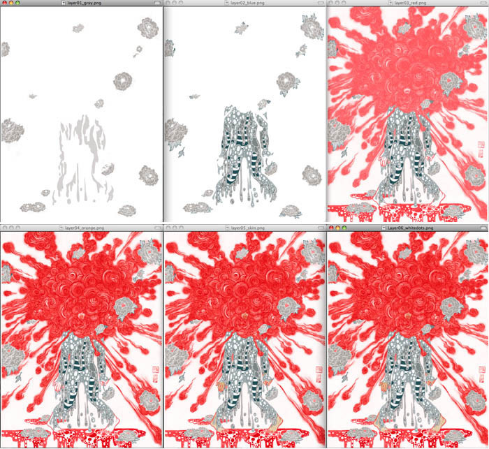
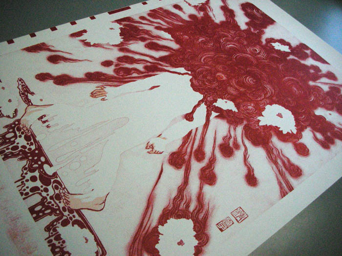
These are the six separations. 1)gray 2)blue gray 3)first red 4)second red 5)skin color 6)white dots for flowers


The Influentials process 2

The Influentials process 3

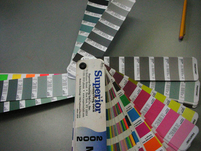
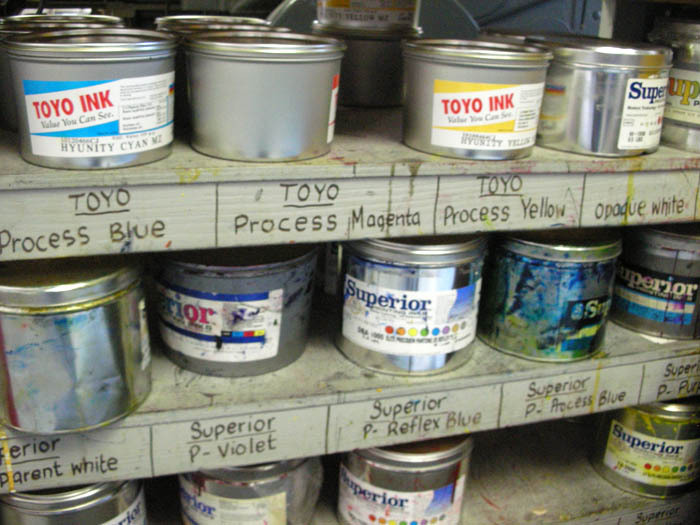
I had no idea any color on Pantone is pretty much be mixed from generic print ink


The Influentials process 4

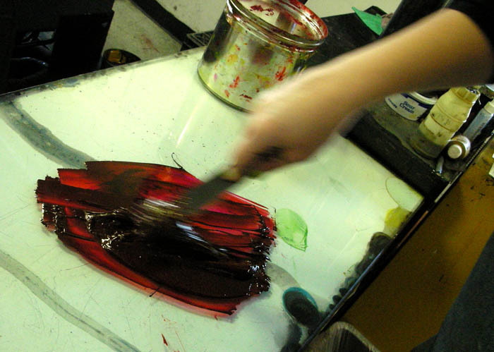
inks, inks, pretty but stinks.


The Influentials process 5

cleaning the plate before printing


The Influentials process 6

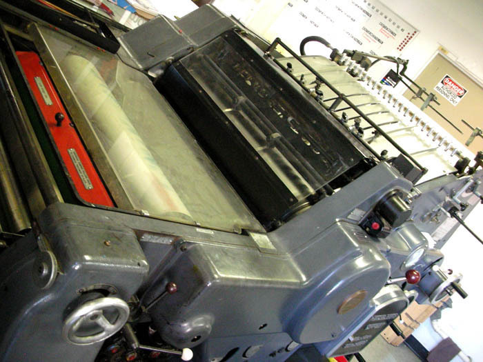
Very old fashioned offset printer. It is a machine, but the result depends on how the master printer adjust the machine according to the image as well as the weather of the day and other factors.


The Influentials process 7

color getting printed…


The Influentials process 8

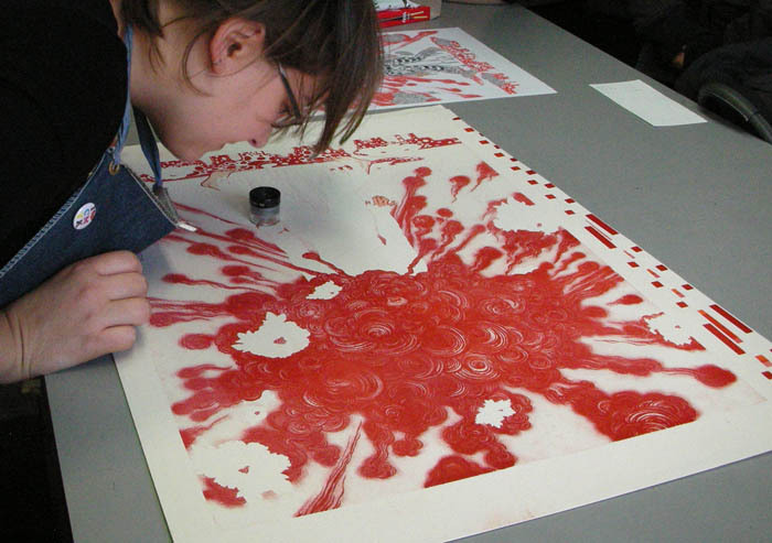
Amanda checking the alignment. Minor adjustments are made often.


The Influentials process 9

almost there.


The Influentials process 10

final prints finished on the machine.


The Influentials process 11

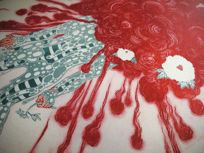
This is the beauty of the print that never exist in digital output. White dots are printed last with white ink. To make the color crisp, white was printed twice. For 6 color separations, print was pulled 7 times for the result.


The Influentials process 12

Done! Yay! Amanda, you rock.


The Influentials process 13